Colour Theory Monday – Pattern and Pixels
Hey kids, it’s colour theory Monday! Today we talk a bit about how displays work, how the eye works, and how to take advantage as a designer.

Visual perception is a funny thing. If we are shown 24 sequential drawings in a second, we perceive motion, as in animation. Any less than that, and we are able to perceive a jerkiness in the motion. This is film – when we’re watching a video monitor, we’re seeing alternating lines in rapid succession.
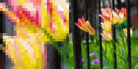
Similarly, when we look at a computer display, we can see blended colour in a pixel grid display.

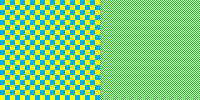
The image on the left illustrates how your eye performs this trick – a large blue and yellow grid is clearly two separate colors, but as the image grid is made smaller, it looks green. If you want to make “flesh tone” you can simply alternate red, yellow, and white pixels in a non-contiguous grid – it’s the same way the printing process colour halftoning works, in principle. From a 256 colour palette, a full range of photographic colour can be perceived without pixellation, provided that the dpi is sufficiently high (computer screens are generally 96 dpi). A computer screen will display images with the same pixel resolution at the same size regardless of print resolution. On a computer, if an image is 300 px (pixels) wide, it will always display at 300 px whether the image’s native resolution is 300 dpi or 3000 dpi. Dpi only comes into play when an image is being printed – a 300×300 pixel image with 300 dpi will print 1″ by 1″ square. In any case, I digress – the point here is that the juxtaposition of pixels in a specific pattern are what give the impression of blended colours.

Why this works is a matter of physiology that basically comes down to how the cells in your retina work.
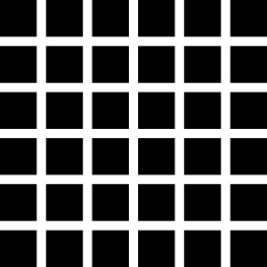
Similar to how opposite colours creating a shimmering border when they touch, if your rod and cone cells get overexcited, they will average things out, like in this example known as the “Hermann grid”.
Your rod cells perceive light and dark, and in this high contrast grid are overexcited to the extent that you see grey squares at each grid intersection that aren’t there.
In design, this is known as “colour averaging”, and our eyes do this all the time depending on their colour sensitivity as perceived by the retinal “cone” cells.
Current understanding is that the 6 to 7 million cones can be divided into “red” cones (64%), “green” cones (32%), and “blue” cones (2%) based on measured response curves. They provide the eye’s color sensitivity. The green and red cones are concentrated in the fovea centralis . The “blue” cones have the highest sensitivity and are mostly found outside the fovea, leading to some distinctions in the eye’s blue perception.
– Index to Hyperphysics
Red-green colour blindness is the most common form of colour blindness, and colour blindess is more common in men that women. What numbers do you see here?
 If you didn’t see 2 and 5, go make an appointment with an optometrist.
The kind of averaging that we see with a Hermann grid or the blue-yellow grid provides designers with another tool – by using different colours together in pixel patterns, we can create some interesting colour effects, like how we can use contrast of temperature, simultaneous contrast, or complementary contrast. By using these contrasts in creating patterns, we can create more dynamic colour relations. For example, in the two patterns below, a subtle stripe effect can be achieved using what we know about colour contrasts and colour averaging. In each panel, the pattern is shown on the right and a 4X version is shown on the left so it is easier to see what colours are used in creating these patterns. In the left panel, a warm grey/cool grey pattern with a pale orange to bring out the blue in the cool grey. On the right, a much paler version of the same. Because the pattern is quite small, the eye perceives it as simple stripes, but actually a far more complex interplay of contrasts is going on, creating a more interesting design. These two patterns, for instance, were used as a tiling background on a web page – unobtrusive, but far more interesting than a solid tone.


