GREYNOTGREY
  • Home.
  • About.
  • Portfolio.
  • RSS Feed.
 Probably the best art blog ever
Home » Typography and fonts
R.I.P. Adrian Frutiger, 1928-2015

R.I.P. Adrian Frutiger, 1928-2015

September 14, 2015 · by Ian Rogers · in Art History, Art News, Typography and fonts

Adrian Frutiger, one of the best-known typeface designers of the 20th century, has died. His work includes such ubiquitous font families as Univers, Avenir, and of course, Frutiger. We’re talking a guy whose career started in the era of metal…

Share this:

  • Tweet
  • More
  • Share on Tumblr
  • Click to share on Reddit (Opens in new window) Reddit
  • Click to email a link to a friend (Opens in new window) Email
Valentine's Day Cards

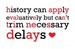
Valentine’s Day Cards

February 13, 2013 · by Ian Rogers · in My Sketchbook, Typography and fonts

Hey kids, you have a special someone you’d like to impress with a witty yet sentimental Valentine’s day card but you’re stuck for ideas even though there’s only one day left? Not to worry, I have a bunch. Maybe too…

Share this:

  • Tweet
  • More
  • Share on Tumblr
  • Click to share on Reddit (Opens in new window) Reddit
  • Click to email a link to a friend (Opens in new window) Email
Luca Barcellona - Carhartt logo treatments

Luca Barcellona

June 13, 2012 · by Ian Rogers · in Branding and Logo Design, Calligraphy and Lettering, Illustrators, Typography and fonts, Video

Luca Barcellona is a really incredible calligrapher. He has his own studio in Milan, where he works as a freelance graphic designer and calligrapher. Letters are the main ingredient of his creations. He teaches calligraphy with the Associazione Calligrafica Italiana…

Share this:

  • Tweet
  • More
  • Share on Tumblr
  • Click to share on Reddit (Opens in new window) Reddit
  • Click to email a link to a friend (Opens in new window) Email
Do Not Use Comic Sans

Do Not Use Comic Sans

June 8, 2012 · by Ian Rogers · in Design Theory, Typography and fonts

One of my friends recently noted that when visual artists incorporate text into their work, choosing the wrong font cheapens the overall impression. The first was a video work of majestic nature projected on an entire wall, and I was…

Share this:

  • Tweet
  • More
  • Share on Tumblr
  • Click to share on Reddit (Opens in new window) Reddit
  • Click to email a link to a friend (Opens in new window) Email

Search

Top Posts & Pages

  • Meghan Howland
  • Cassius Marcellus Coolidge - A Friend in Need
  • Chuck Close - Francesco I
  • Walton Ford - Audubon meets Bosch
Want Grey not Grey in your inbox?
Enter your email address:


BEST GIFT IDEA EVER!

Abecedary - Ian Rogers
ebook (iBook format) $2.08
Soft Cover $33.61
Hard Cover $38.88

* all prices USD + shipping & tax

All work shown copyright of respective creator or owner, otherwise Copyright © 2025 GREYNOTGREY

Powered by WordPress