By now most of you have probably heard of Pinterest, the relatively new social media platform that, as they say, “lets you organize and share all the beautiful things you find on the web”.
Many art magazines have a presence on Pinterest, including Juxtapoz Magazine. Juxtapoz has a quite dedicated web presence, including all the social media outlets one would expect – but also their own forums. Within these forums, there is a Reader Art forum that has a lot of excellent work, but it takes some digging going through post by post. Some of it is selected for publication, and what they choose is showcased here but while an extensive and informative selection, it represents many pages and a lot of clicking.
Fortunately for the impatient amongst us, Juxtapoz has a board on Pinterest that showcases some of the best Reader Art, which they regularly update. Some names you may recognize as established artists and illustrators, others are more of the “fresh blood” variety – it’s worth checking out as there is a lot of excellent work showcased on the Juxtapoz Reader Art Pinterest board.
Here’s a very few examples of the many delights that await:
Hey kids, it’s colour theory Monday! Today we talk a bit about how displays work, how the eye works, and how to take advantage as a designer.

Visual perception is a funny thing. If we are shown 24 sequential drawings in a second, we perceive motion, as in animation. Any less than that, and we are able to perceive a jerkiness in the motion. This is film – when we’re watching a video monitor, we’re seeing alternating lines in rapid succession.
Similarly, when we look at a computer display, we can see blended colour in a pixel grid display.
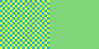
The image on the left illustrates how your eye performs this trick – a large blue and yellow grid is clearly two separate colors, but as the image grid is made smaller, it looks green. If you want to make “flesh tone” you can simply alternate red, yellow, and white pixels in a non-contiguous grid – it’s the same way the printing process colour halftoning works, in principle. From a 256 colour palette, a full range of photographic colour can be perceived without pixellation, provided that the dpi is sufficiently high (computer screens are generally 96 dpi). A computer screen will display images with the same pixel resolution at the same size regardless of print resolution. On a computer, if an image is 300 px (pixels) wide, it will always display at 300 px whether the image’s native resolution is 300 dpi or 3000 dpi. Dpi only comes into play when an image is being printed – a 300×300 pixel image with 300 dpi will print 1″ by 1″ square. In any case, I digress – the point here is that the juxtaposition of pixels in a specific pattern are what give the impression of blended colours.
Why this works is a matter of physiology that basically comes down to how the cells in your retina work.
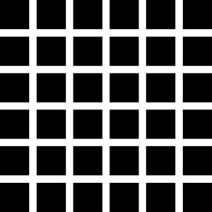
Similar to how opposite colours creating a shimmering border when they touch, if your rod and cone cells get overexcited, they will average things out, like in this example known as the “Hermann grid”.
Your rod cells perceive light and dark, and in this high contrast grid are overexcited to the extent that you see grey squares at each grid intersection that aren’t there.
In design, this is known as “colour averaging”, and our eyes do this all the time depending on their colour sensitivity as perceived by the retinal “cone” cells.
Current understanding is that the 6 to 7 million cones can be divided into “red” cones (64%), “green” cones (32%), and “blue” cones (2%) based on measured response curves. They provide the eye’s color sensitivity. The green and red cones are concentrated in the fovea centralis . The “blue” cones have the highest sensitivity and are mostly found outside the fovea, leading to some distinctions in the eye’s blue perception.
– Index to Hyperphysics
Red-green colour blindness is the most common form of colour blindness, and colour blindess is more common in men that women. What numbers do you see here?
 If you didn’t see 2 and 5, go make an appointment with an optometrist.
The kind of averaging that we see with a Hermann grid or the blue-yellow grid provides designers with another tool – by using different colours together in pixel patterns, we can create some interesting colour effects, like how we can use contrast of temperature, simultaneous contrast, or complementary contrast. By using these contrasts in creating patterns, we can create more dynamic colour relations. For example, in the two patterns below, a subtle stripe effect can be achieved using what we know about colour contrasts and colour averaging. In each panel, the pattern is shown on the right and a 4X version is shown on the left so it is easier to see what colours are used in creating these patterns. In the left panel, a warm grey/cool grey pattern with a pale orange to bring out the blue in the cool grey. On the right, a much paler version of the same. Because the pattern is quite small, the eye perceives it as simple stripes, but actually a far more complex interplay of contrasts is going on, creating a more interesting design. These two patterns, for instance, were used as a tiling background on a web page – unobtrusive, but far more interesting than a solid tone.

There’s been some buzz in the air as of late up here in Soviet Canuckistan; it seems that nudity is still “a thing”. Granted, it’s a nude painting of the Prime Minister riffing off the whole “Emperor has no clothes” thing in a reclining pose invoking classical nude studies… but it’s rather quaint that people would bother to get worked up about it in this day and age to the extent that our national broadcaster, the CBC, bothers to repeat the story. Granted there appears to be more titillation than shock. The only person really upset seems to be the artist, all steamed up about censorship – apparently her work is on display at a local library and they take it down or cover it up when the space it is displayed in is used for children’s activities. The horror.

Margaret Sutherland – Emperor Haute Couture (detail)
In any case, congratulations to artist Margaret Sutherland (links to nudity, of course) for generating this much buzz with such an old chestnut. I must say, Harper is portrayed as more of a daddy bear than I would have imagined but that’s what makes it art, I suppose.

Untitled Film Still #13
Cindy Sherman is probably the most popular living American photographer. Sherman is best known for her staged self-portraits, particularly the “Untitled Film Stills” series, officially 1977-1980 but some work from the series is dated 1975-1981. In these staged self-portraits, Sherman changes her appearance and poses herself in a variety of scenes, evoking a wide variety of stereotypes that make you wonder – which is the “real” subject, or is it all an implied narrative built on conventions of feminine context?
Through a number of different series of works, Sherman has sought to raise challenging and important questions about the role and representation of women in society, the media and the nature of the creation of art.
– Wikipedia
Sherman’s early work in this vein is very popular – Untitled Film Still #96, for instance, was the image used as the poster for the travelling Cindy Sherman retrospective (1999-2000). It recently sold at auction for $2.8 million – more than the entire revenue of its former owner, the Akron Art Museum from all other sources the year previous. Purportedly they will use this money to add newer work by Sherman to the collection.

Untitled Film Still #96
This raises the question – why is it that Cindy Sherman’s later work does not command the same prices? Cat Weaver (some images in the linked article NSFW) suggests that the reason is, to paraphrase, that Sherman’s early work is pretty pictures of a pretty lady, her later pictures are ugly pictures of an ugly lady.
It is crucial for anyone who talks about Sherman to say that her career has been an exploration of roles and role-playing — gender roles, most centrally, but also social and even existential roles.
Yes, I said existential, but you can just say that her dark period is underrepresented at the MoMA because it’s about aging and bodies and death. You can also note that the horrid, shallow collectors won’t buy those images and that the benighted MoMA went wrong in reflecting that capital-driven sentiment.
BTW, you’re not going to spoil the fun by pointing out that it’s easy as shit to get prosthetic limbs to resonate. Put ‘em anywhere and they scream love and death. Just try it. Pull off a doll leg and stick it in a tree. Sammy Beckett roll over! A few entrails and a plastic vajayjay and we’re knee deep in the absurdity of the human condition.
How to Talk About Art: Cindy Sherman Edition (some images in the linked article are NSFW)

Untitled, 2002
The art world likes to pretend that Sherman’s earlier “Untitled Film Still” series is celebrated as a critique on the objectification of women, but it can’t be ignored that these are also well-composed photos of an attractive young woman dressing up in costumes. Pretty easy on the eyes, compared to her later work which plays with darker images, including prosthetics, images of death, clown makeup, false noses, and yes, plastic vajayjays.
 There are some examples of graphic design so universal that it’s hard to imagine anyone ever had to invent them. Who designed the first checkmark indicating approval? Lost to history. Who designed the red circle with a red line through it indicating prohibition? Nobody knows. Who designed the generic human form of a simplified silhouette and a floating head, immortalized worldwide on a million crosswalk signs? Well that, we do know, or at least we can figure out who the originator of this design convention was.
PED XING is a common variant throughout the United States. The familiar floating, perfectly round head surmounts a squared-off, simplified body. There is a succinctness and graphic immediacy that makes this sign easy to read for a driver and immediately recognizable from a great distance.
As the wikipedia entry on Traffiic sign design notes, “Warning signs give a warning of that there are dangerous or unusual conditions ahead. Often these signs have a greater more conspicuous presence than a regulatory sign. These signs often do not have much text on them, as they should be internationally understood due to the nature of the message that they are conveying.” That this style of depicting a pedestrian is seen all over the world speaks to how effective a design it is.
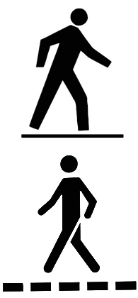 A similar design is used in Canada, with both the squared off body and also a more rounded, graphically elegant version that looks suspiciously familiar to students of graphic design. The rounded “hands”, the strong repetition of 90 and 45 degree angles, reminiscent of another international symbol …
Oh that’s right, it looks like the signs used to indicate bathrooms, so ubiquitous that you can buy generic ones at hardware stores.

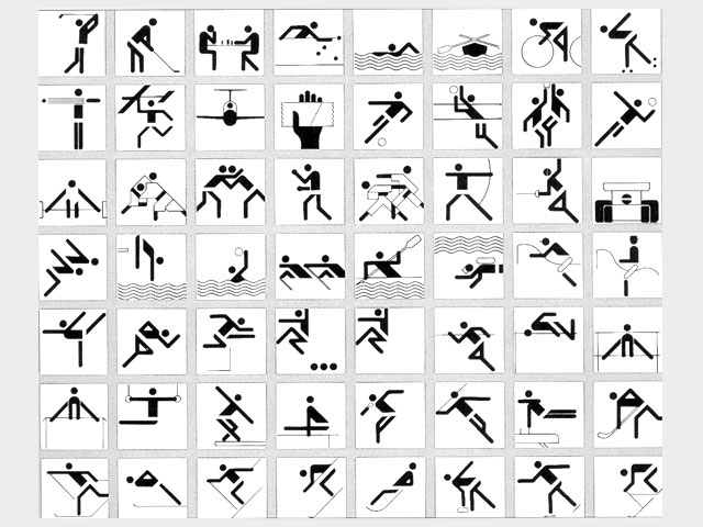
 This is where the real detective work comes into play – where did that bathroom sign come from? This one we definitively know the answer to: it was designed as part of the incredibly detailed graphic system developed for the 1972 Munich Olympics by Otl Aicher, one of Germany’s most respected graphic designers. Not only did Aicher design a series of pictograms for each sporting event based on the 1964 Tokyo game designs according to a very specific grid system, he designed (among pretty much everything else) posters, programmes, uniforms, the München 1972 logo and the first Olympic mascot, a rainbow-striped dachsund named Waldi. And, of course, signage.
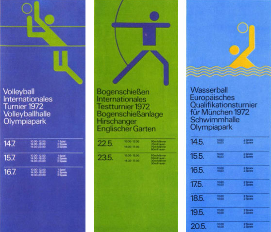
The pictograms for the sporting events proved so popular that they were adopted by the 1976 Montreal Olympics and continue to be used to varying extents by the Olympics. Most pertinent to this discussion, however; we know for sure that Aicher invented the floating head that inspired the PED. Next time you see a pedestrian crossing or a bathroom sign, remember Otl Aicher, one of the 20th century’s greatest graphic designers.
Should you be inclined to learn more about Otl Aicher and his work, there is an excellent and in-depth article that talks about Aicher’s life and work on the cycling blog Cycling Inquisition, along with many excellent images – a couple of which I used in this blog post.
//edit I see the blogger behind Cycling Inquisition decided to talk about the bathroom sign in his post now, I call it blogosphere cross-pollination! He makes a very insightful comment –
Like a paperclip, we don’t think of Aicher’s pictograms as designed objects per se, but rather as the objects themselves. The chairs we own are someone’s take on a chair. That’s not the case with the average, everyday paperclip. It is what it is, a paperclip. That’s it. Objects at this level of comprehension are simply there. They feel as though they have always been there, and did so from the moment they were presented to the masses. In every country, in every city, they are simply there. In the case of Aicher’s icons they’ve become shorthand that everyone can understand, a set of simple shapes that successfully tells us where to go when we need to use a bathroom.
Strangely there aren’t many books specifically about Otl Aicher’s design work for the 1972 Olympics but there is a fascinating book by David Gibson on this type of design titled The Wayfinding Handbook: Information Design for Public Places. If you really must have a book on Aicher’s work and have deep pockets, Markus Rathgreb has a compendium simply titled Otl Aicher
that is both thorough and exceptionally informative. Then again, if you just want to see some visual examples of Aicher’s work for the Munich Olympics in print, there’s always Sports Illustrated Magazine August 28, 1972 (Olympics Issue)
.


