Gestalt in Design
Most designers know about gestalt theory as it applies to art and design. Even if you’ve never heard of the term before, the principles of this cognitive theory explain how we perceive 2-dimensional compositions, and we use them every day even if only intuitively.
At its simplest, gestalt theory describes how the mind organizes visual data. The stronger the clarity of form, the more effective the design.
– Michael Tuck
Gestalt is a German term meaning “whole”, or “form”, and was originally developed as a theory of psychotherapy. In essence, how an individual derives an understanding of something based on the relationships of its parts. Its application for designers is in how it explains the workings of visual perception. Although opinions vary, I think that gestalt theory can be broken down into 4 major components: closure, continuance, similarity/proximity, and alignment.
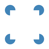
 Closure is how we “fill in the blanks” – for example, in the image to the left, we see four circles framing a square. The square is completely implied, but we read it in much the same way as we can recognize a person’s face even if it is partially obscured.
This is useful in a number of ways – like using a dotted line to create a divider in a page layout without the heaviness of a solid line, or in using negative space in logo design like the arrow in the FedEx logo. It can also be used to establish groupings within a page layout, in the sense that strongly defined boundaries create an active negative space – if you have a darker background, it draws attention to your main layout; if you have a clearly defined boundary in one area, the adjacent areas will be defined accordingly.
 Continuance is how a viewer’s eye is drawn through a composition. The circle on the right grabs your attention first. Part of the reason is that it’s bigger, but also, it’s the direction you’re used to moving your eye across a page.As audiences in the western world read text left to right, top to bottom, it takes a bit of effort to guide a viewer’s eye and keep their interest. you can group all of your important information at the top left of a page, but there are other methods at your disposal, too.
 In this cutting-edge example (okay, it’s meant to be descriptive, not get an Oscar for graphic design), the circle on the right clearly takes precedence. To ensure that the most important elements in a composition attract sufficient attention, a designer has several tools at their disposal: shape, like an arrow, pointing hand, or angled layout grids implying perspective; text, such as call-to-action or descriptive phrases; design conventions, like making URL links stand out from copy with different colour or underlining.
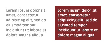
Another way to manipulate continuance (or change focus, draw the viewer’s eye, etc.) is through the use of colour, such as intensity and contrasts. Another example common in web design is to place text on a coloured panel, making it stand out more as in the example shown below. This also serves to illustrate another point – text on a coloured background appears slightly smaller – the font on the left and the font on the right are the same size. This is why, when reversing out text (making the text lighter than the background) it’s important to make it slightly bigger so it looks the same as other text on the page.


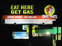
Poor sign gestalt
Similarity is how we categorize things in a composition, like how we visually recognize the difference between the figures from the background in a painting. Designers create a hierarchy of meaning in a page layout like titles, headers, and body text by using size, colour, and shape. Another important aspect of similarity is proximity. Close edge is especially important in letterspacing and implied continuity – bad kerning can transform “FLICK” into a profanity, for instance.
Close edge also affects how we recognize groups – touch evokes strong grouping, and overlap, the strongest. Too much space between phrases or not enough can change the meaning of a phrase, like the unintentionally hilarious sign on the left.
An excellent example of this element of gestalt design can be seen in drop-down menus – main areas of interest are presented as top-level navigation categories, and when the user clicks on one of them, the subcategories are displayed – an efficient way to display hierarchical navigation links that is easy to understand.
Similarly, If design elements are too similar to one another, a conflict arises in that it’s difficult for the viewer to recognize what they are being presented with. In laying out a form on a web page, for example, it is important to clearly separate blocks of information, such as grouping item description fields separately from name and address fields in a shopping cart interface so the user can readily identify information groupings.
Alignment is another way that elements are recognized as a group – 2 columns of left-aligned text are easier to recognize as separate groups than 2 columns of center-aligned text. Going a step further, using a design grid allows a designer to not only imply grouping but also to guide the viewer’s eye, and create a sense of harmony in a composition.
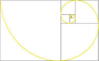
 The most important element of alignment is using a design grid. The simplest version of a design grid is the rule of thirds, related to the golden ratio. If you aren’t familiar with design grids, the rule of thirds, and the golden ratio I strongly urge you to follow those links, they will make your life and work as a designer much, much better. If you take nothing else away form this article, at the very list understand design grids!
So there you have it, gestalt in design: Jedi mind tricks for the cunning designer.


[…] know about Prägnanz or Gestalt Theory. If not a buddy of mine has a blog that discusses it: Gestalt in Design by GreyNotGrey.com. I might eventually do my own discussion but for now I’m going to discuss a little about […]
[…] illusions are an interesting cognitive stumble that can be explained through gestalt theory – but a simple shorthand is to say that what we are seeing doesn’t match up with what […]