Do Not Use Comic Sans
One of my friends recently noted that when visual artists incorporate text into their work, choosing the wrong font cheapens the overall impression.
The first was a video work of majestic nature projected on an entire wall, and I was totally distracted by the use of comic sans for the captions at the bottom. This was a painter crossing over into other areas, which is great, but that font made no sense…
– Chris Healey (the ALP Blog)
This got me to thinking – what is a “bad” font, and why is comic sans one of them? People love to hate comic sans, not just because of its ubiquity and subsequent misuse, but because it’s poorly crafted. Its weights are uneven, and its kerning is so poorly done that legibility suffers. Reading an entire page of comic sans is like trying to walk briskly through the ball pit at Ikea. There are options, of course – if you want a rounded font there’s lots of well-crafted ones like Futura round SG, or if you want to stick to Microsoft fonts, Arial Rounded MT. The important question to ask yourself, however, is whether comic sans is even appropriate.
That typography and font choices communicate meaning is one of the core principles of graphic design, as Carolyn Knight and Jessica Glaser point out in a Smashing Magazine article discussing “the interaction between the look of type and what type actually says” :
The role — and, in fact, the obligation — of the designer in establishing a tone that adds meaning to the verbal message is a matter of regular debate. Many graphic designers and academics argue that the designer has a responsibility to add “flavor” to their work, not only helping to convey and enhance meaning, but also making the message enjoyable and encouraging to “read” and also memorable.
– When Typography Speaks Louder Than Words
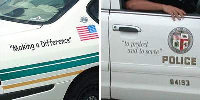
In this example, we have an Orange County, Florida squad car on the left, and a Los Angeles squad car on the right.

The implied insincerity communicated in both examples by a shocking misuse of quotation marks aside, the LA example is clearly superior. The impression it gives is sophisticated yet casual; there’s a reassuring early 60’s-esque quality to the font that makes you think of the police as a homey kind of institution, shades of the Andy Griffith Show. The Orlando example, on the other hand, could be written on the awning of a daycare and not look out of place. It’s not just inappropriate – it’s disrespectful of the importance of city police, and of their relationship with the community at large. Why, the designer that came up with this must be some kind of TRAITOR.
Well, maybe that’s going too far.
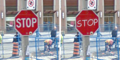
 There’s also the question of legibility – imagine if a city decided to use comic sans for its traffic signage instead of Highway Gothic. Hideous AND hard to read. Of course, legibility isn’t the only concern, but it’s often an important one – not just in traffic signs or body text, but in branding.
To my mind, the strongest argument against using comic sans in any situation is that it’s simply trite. While it may be conventionally appropriate to uses like play areas and daycares, the font is so overused that it has become the equivalent of Chinese restaurants that use faux brush script on their signs; the message comic sans gives is “this place is lame at best”.
So there you have it – next time someone says, “I know designers hate comic sans, but why?”, you can simply explain that comic sans is a sloppy, hard to read, insincere font that even where hypothetically appropriate is so overused it will make anything you use it for look like a joke.


I’m sorry but I hardly ever see Comic Sans MS used anymore. Now if you want to really talk about overused fonts we can talk about Helvetica any time.
p.s. That isn’t an Orlando PD car; it is either Seminole County or Orange County Sheriff’s Car.
Thanks for the clarification on the Florida police car, Ryan – since I know you’re a Floridian I’ll take your word for it. Let’s say Orange County for the sake of brevity.
Sadly I still see comic sans all over the place, but if it’s less common in your neck of the woods, well, I’m glad to hear it.
Cheers!