
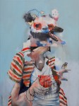
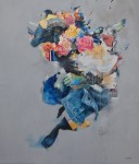
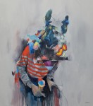
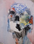
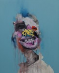
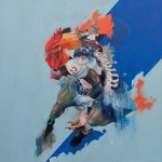
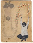
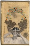
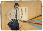
Joram Roukes is a Dutch artist living and working in Groningen. On a totally unrelated note, my dad’s now-deceased 3rd wife was from Groningen and my half-sister grew up there after her mother left my dad… but that’s another story. Also, my now-deceased grandfather was stationed in Groningen in World War II. It’s a very nice city in any case. Joram Roukes makes paintings that could not be called very nice by any but the most inattentive viewer – they are more challenging than that, but in a good way. These are oil paintings, but he handles the medium in such a way as to suggest a variety of media – collage, graffiti, marker – it’s an unsettling effect but I find it accurately evokes the pastiche of everday life as a kind of onslaught of impressions. Plus I just like the imagery on a personal level. Maybe it’s the Groningen thing.
- The Mexican Shirt
- Black Sheep
- Five Scoops
- Hobo Jungle
- Red Eye
- The Linebacker
My oil paintings are reflections on daily life situations in western society, filtered and reassembled in a collage-like manner. These works have been shown throughout Europe with shows in Copenhagen and London.
– Joram Roukes
More of Roukes’ work can be seen on his website, or on his gallery pages: www.galleryb15.dk & www.signalgallery.com.
Share this:

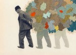
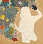
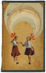
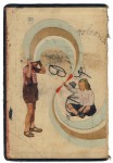
Hollie Chastain is a collage artist from Chatanooga. She does a ton of work, from album and book covers to collectible artwork, all using a mixed media approach. Chastain uses vintage source materials as both subject matter and surface, which she combines with drawing to great effect.
There is a kind of nostalgic quality that infuses her work. You can attribute that to some extent to the old-timey source material, but there’s more to it than just that. There’s also the flip side of nostalgia – the uncertainty of memory. When I look at Chastain’s work I feel like I’m treading familiar ground that is somehow twisting away from me, but I’m not at all unhappy with where it takes me. There’s a delightfully hallucinatory Wizard of Oz/ Yellow Submarine quality to it. Chastain is one of those artists whose work reminds me a bit of a whole bunch of other artists: a little bit of Hannah Hoch; a little bit of Henry Darger; a little bit of Joseph Cornell, a little bit of Max Ernst… but in the end, completely unlike them in that her work exists very much in itself. You couldn’t mistake Chastain’s work for the work of any of those artists, and it really stands on its own.

- We Choose the In-Between
- Afterthought

- Bestow
- Burn A Paper Moon to Ash
- Doppelganger
- Fresh Courage
- Gilbertville Public Library
- Greet her Ghost
- Knowledge of Her
As much as I enjoy Chastain’s work oh-so-very much, she’s one of those elusive types whose work is scattered all over the web so it can be a bit hard to track down. You can check out some of her work on Flickr, you can visit her facebook page, browse her etsy shop or you can go to her website. Each has some different content, they are all well worth checking out. Chastain has had a ton of writeups over the years on the web and in print, sells quite a bit of her work both in original and print formats (check out her facebook page for more details in that regard), and exhibits pretty regularly. In short, she’s pretty awesome, so expect to see more of her. I certainly look forward to it.
Share this:

Franklin Booth (1874-1948) was an American illustrator best known for his pen drawings that are nothing short of mind-boggling. Perhaps amusingly, his intricately detailed drawing style arose as a misunderstanding of printing processes – as a young boy growing up in rural Indiana he learned to draw by copying what he thought were pen and ink illustrations from contemporary publications but they were in fact woodcuts that were copies of other sources, executed by master craftsmen to emulate shading effects. The world is richer for this misunderstanding.
Click any of the following images to see a larger version – it’s essential to grasping the incredible lushness of Booths’ textures.

Franklin Booth -Tiger Hunt
While Booth worked almost exlusively as a commercial illustrator, the richness of his line work influenced generations of illustrators in a variety of areas such as Maxfield Parrish, Howard Pyle, and Frank Frazetta. He has also influenced legions of comic artists like Bernie Wrightson (Frankenstein, Creepy, Eerie, Vampirella, etc.), Alan Moore (Watchmen, V for Vendetta, From Hell, etc.), and Hal Foster (Tarzan, Prince Valiant, etc.). It’s not hard to see why.

Franklin Booth – Burial Hill
Even though Booth’s work is public domain, it’s kind of hard to find all that much of his work on the vast reaches of the interwebs. It’s strange that he’s not more popular given his influence and the staggeringly epic greatness of his work. Maybe it’s because the detail of his work reproduces poorly on wee computer screens. That said, a pretty decent collection of his work is available on Golden Age Comic Book Stories – scans from “Franklin Booth” published by Robert Frank in 1925.

Franklin Booth – Echoes
I think closing with this quote from Bernie Wrightson is appropriate, because it’s pretty hard to argue with: “Franklin Booth always will be so much better than practically anyone who ever picked up a pen.” You said it, Bernie.
Share this:

My charming and talented wife is 40 today! Quarante is forty in French, we live in Montreal, you get the idea. Happy birthday, babes!

Share this:

I’ve always been a fan of Otl Aicher’s designs for the 1972 Munich Olympics, particularly his iconography system. A design system that resonates so strongly is bound to inspire parody, however – enter Virus Fonts, re-examining the set for the 2012 London Olympics.
In 2004 Jon Barnbrook’s foundry VirusFonts reinterpreted the Olympic pictogram in a series of designs that “acknowledged the complex contradictions of the modern Olympics.” Launching today, a new range of Olympukes symbols has been created to reflect on London 2012…
“The occasion of the London 2012 games gives us an opportunity to revisit this concept,” say the studio on their blog, “not only because VirusFonts is based in London but also much has changed globally in the last eight years.”
– from Creative Review

The 2012 games come at a time of great economic and political uncertainty. Since 2008 the global economic system has lurched from one crisis to the next; Greece – the host of the 2004 games – now sits at the epicentre of a crumbling Eurozone. Ironically, the last time London hosted the Olympics, they were nicknamed the Austerity Games. Sixty-four years later, we find ourselves back in an era of austere cuts which serves to highlight the absurd expense of the 2012 games. Another aspect of the Olympics that is back for 2012 is the unfettered commercialism – if you think the games are about sport alone, think again. In Beijing we took it for granted that a dictatorial one-party state would suppress human rights in order to deliver the perfect games. What was a little more unexpected is the excessive security measures due to be employed by a supposedly liberal democracy. But then again, in a country with an estimated 1.8 million cctv cameras, maybe we shouldn’t be so surprised.
– from Virus Fonts

The entire set is a great remix of the Olympic-style graphics we have all come to know and love, a playful yet pointed indictment of the crass commercialization and over-policing that we have come to expect from the Olympic games.

Countless hours went into researching accurate and thought-provoking stories, presented here in pictogram form. Olympukes 2012 is available in dark and light weights in the multi-platform OpenType format.
Olympukes 2012 is available for free download for personal (non-commercial) use. To download the font, please create an account, then select the Olympukes 2012 non-commercial purchasing option and follow the normal checkout process.

