
Sometimes people talk about an artist being a “a painter’s painter”. This is a painter who really revels in painting itself, and whose work is more about actually painting than about making paintings “of” things. Stephan Balleux is like that.
Balleux is a Belgian living and working in Berlin – but still sells most of his work in Belgium. Why not, right? Berlin is a lovely city.
Stephan Balleux is a painter’s painter, but in a much more conceptual sense. His work nods to historical traditions of painting and is quite conceptual in its play with surface – as – subject that has been such an important part of art theory in regards to painting over the years. What does it mean when the brushstroke is not only visible but is replicated with photorealistic techniques? It’s all very meta.

- Stephan Balleux – Gerd (2009)

- Stephan Balleux – Vanity #4 (2007)

- Rene Magritte – La trahison des images (1928-29)

- Gerhard Richter – Portrat of Liz Kertelge (1966)

- Roy Lichtenstein – Brushstroke (1965)

- Stephan Balleux – the Catch (2008)
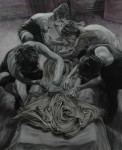
- Stephan Balleux – the Lesson (2008)

- Stephan Balleux – the Portrait (2007)

- Stephan Balleux – Sisters (2008)

- Stephan Balleux in his Studio
There’s a bit of Mark Tansey’s obsession with art history & art theory, a bit of the playfulness of pop artists like Lichtenstein or surrealists like Magritte, and a bit of the photographic techniques of Gerhard Richter.
- Stephan Balleux – Gerd (2009)
- Stephan Balleux – Vanity #4 (2007)
- Rene Magritte – La trahison des images (1928-29)
- Gerhard Richter – Portrat of Liz Kertelge (1966)
- Roy Lichtenstein – Brushstroke (1965)
- Stephan Balleux – the Catch (2008)
- Stephan Balleux – the Lesson (2008)
- Stephan Balleux – the Portrait (2007)
- Stephan Balleux – Sisters (2008)
- Stephan Balleux in his Studio
Balleux gets compared to Richter a lot. I can see it insofar as he uses some of the same techniques like selective focus and blurring, but it seems cheap to identify commonalities artists have with other artists and say “oh it’s just like what ____ was doing”.
My immediate impression of Stephan Balleux’s paintings at Wardlow Studios was that they were a cross between Gerhard Richter and Glenn Brown. On closer inspection, I found that they were both intriguing and superbly done. His paintings combine the blurry Richteresque photographic style with highly detailed renderings of globs of textured paint. In some paintings, historical photographs are reworked with luxuriant splotches of parasitic paint which contour and obscure the subject’s faces. Landscapes and animals are transubstantiated into swirling animistic paint. In other paintings faces emerge from vivid colour fields of sticky oil paint. I feel as though I am using the word paint far too much here but I’m not sure how to get around this, these are paintings of paint. Even the pastel drawings were about paint.
– Tony Lloyd / Art Info
Nobody makes art in a vacuum – your style, content, and approach are all influenced by everything around you. It’s not quite as simple as Descarte’s dualist notion of a purely objective and purely subjective interpretation of the world around us – usually referred to as Cartesian dialectics. ‘Sayin. Edmund Husserl (the guy who came up with phenomenology) called this mutual development of culture, communicaton, and our understanding of how communication has meaning “intersubjective”. Not quite subjective or objective but a kind of interdependently developed understanding of the world around us. All this to say that I see Stephan Balleux getting compared to Gerhard Richter all the time and think that’s both an oversimplification and a raw deal.

Stephan Balleux in his Studio
More of Stephan Balleux’s work can be seen on his website.
Share this:

Lori Nix is a NYC-based photographer. To digress briefly, a few days ago I wrote about Ray Caesar:
For those of you who haven’t worked with 3D software, imagine being a highly skilled painter who only paints on sculptures that you have built yourself from the armatures up. Now create lighting and atmospheric effects to make this all more realistic. Be sure not to make it look stiff or posed! OK, now take a photograph of it, taking depth of field, camera angle, and compositional values into consideration. The mind boggles, it truly does.
Well, Lori Nix does just that. She makes wee dioramas of terrible things then takes photos of them. Post-apocalyptic scenarios, accidents, natural disasters, and suchlike with the deftness of a photojournalist and the precision of a miniaturist.

Lori Nix – Ice Storm 1999
In my earliest work “Accidentally Kansas” I relied heavily upon manufactured models for railroad hobbyists. I used a shallow depth of field to give it a dreamy quality, like the fuzziness of memories…
The scenes I build today are mostly made by hand. … My scenes can be as small as 50×60 centimeters and as large as 182 centimeters in diameter. It takes approximately seven months to build and photograph a scene. I build it for one angle of view and never move my camera from that spot. I will change the lighting, the placement of the objects and re-shoot until I’m fully satisfied with the results. I shoot with an 8×10 large format camera and film. I print my own photographs quite large.
There is an inherent sense of humour about these works for all the gravity of the subject matter; the impression I get from Nix’s work is that these are meant to still look like dioramas, not “actual” events. The elements of modelling and play bring me back to my own childhood, setting up plastic army men in complex battles – pretty much your classic child-at-play scenario but with the gruesome reality of killing and dying implicit in the act of play itself.

Lori Nix – Library 2007
I am interested in depicting danger and disaster, but I temper this with a touch of humor. My childhood was spent in a rural part of the United States that is known more for its natural disasters than anything else. I was born in a small town in western Kansas, and each passing season brought its own drama, from winter snow storms, spring floods and tornados to summer insect infestations and drought. Whereas most adults viewed these seasonal disruptions with angst, for a child it was considered euphoric. Downed trees, mud, even grass fires brought excitement to daily, mundane life.

Lori Nix – Museum of Art 2005
I can relate. I lived on a farm in my childhood, too, and my otherwise bucolic, slow-paced life was tempered by my father’s insistence that nuclear war was coming and we had better be prepared to survive. I have had dreams of ruined cities and abandoned landscapes my entire life; Nix’s work resonates with me very strongly. There is something evocative and eerie about an art museum not only abandoned (plague? radiation? war?) but home to giant colonies of honeybees.
More of Nix’s work can be seen on her website or her blog. She exhibits fairly regularly, and is currently exhibiting at Bau-Xi Gallery in Toronto (Canada) until July 21 so you had better hustle down to Dundas Street between Beverly & McCaul if you want to catch the show – only one day left.
Share this:

The video for the Spinto Band “The Living Things” is a playfully animated journey by Phil Davis into realms of deep weirdness. Catchy tune, too.
Here’s a few stills:


via Pikaland
Share this:

Heather Diane Hardison (or simply Heather Diane as she seems to prefer) is an illustrator and sign painter out of Berkeley CA. She runs a blog called Illustrated Bites that is both informative and visually engaging – she makes illustrations of ingredients and recipes that incorporate hand lettering and drawings to excellent effect.

This being summertime, her guide to avocados is an easy win, replete with a very tasty-sounding recipe for guacamole. I’d add roasted garlic, myself, but to each their own.

More of Heather Diane’s work can be seen on her portfolio site.
Share this:

Chris Ware is a fantastic illustrator/ comic artist best known for Jimmy Corrigan, Smartest Kid on Earth & his Acme Novelty Library series. He designed the poster for this year’s Small Press Expo that is nothing short of awesome. The Expo itself looks really interesting, with some great speakers – Dan Clowes, Los Bros Hernandez (Jaime and Gilbert), Françoise Mouly, Chris Ware, etc. …

I particularly enjoy the wee cavemen in the background of the paleolithic panel. Look closely and be amused.

Chris Ware SPX 2012 poster panel 1
Check out a HUGE version of the poster here.

