
Mark Tansey is an American painter whose work is usually considered within the context of realist representationalism, but goes beyond that into a sort of hypercritical allegorical mode strongly informed by art history, philosophy, and art theory.
")
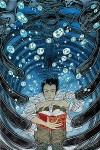
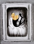
Mark Tansey, Action Painting II, 1984, Oil on canvas, 193 x 279.4 cm, Collection of the Montreal Musée des Beaux-Arts
I really enjoy the his work-as-objects, but I must admit that the thought that goes into his work is what makes me think of him as truly exceptional. A deep thinker, this one.
For instance, his thoughts on the importance of illustration via Artchive :
If in paintings there have been problems in linking image and idea, one key may be found buried deep in the practice of illustration. Illustration, having been banished from high art as commercial and slavish to an assigned message, nevertheless is where art begins. The only significant difference that I can find at this point between illustration and art is that the former traditionally involves doing someone else’s idea rather than one’s own. But of particular value in good illustration is the function of embedding the idea in the image. It’s common practice in contemporary art to rely heavily on critical supplements to provide the conceptual content. But in illustration, the critical content and image can be structured together metaphorically. This involves the invention or search for a new metaphoric structure that acts as a transformational link between the idea and image. For instance, reflection, as metaphoric structure, can link the idea of equivalence of opposites to an image where an object and its reflection are interchangeable. Mont Sainte Victoire is an example of this.
Another value of illustration is its hyperfictional capacity. Because it is rhetorically out front, it has great latitude of reference and freedom to extend or condense space and time. It is not paralyzed with guilt about the impurities of reference or of metaphor. On the contrary, new metaphoric relations are its substance and aesthetic vehicle. It’s at the door of metaphor that illustration transforms into “metaphoric redescription.” Metaphoric redescription (Richard Rorty’s term) is a function that is becoming increasingly interesting in light of the inadequacies of the term “representation,” in that pictures don’t actually represent anything.
– Mark Tansey: Visions and Revisions Arthur C. Danto
")
Mark Tansey, Recourse, 2011. Oil on canvas, 65 x 99 “
Share this:

Have you ever had one of those moments where you’re just idly enjoying something, then you find out something about whatever it is you’re checking out that turns everything upside down and BLOWS YOUR MIND? That’s what happened to me just now, looking at Ray Caesar’s work.


- Ray Caesar – Calamity 2010

- Ray Caesar – From Such Foulness of Root Does Sweetness Grow 2009

- Ray Caesar – La Chasse 2011

- Ray Caesar – Pollux 2005

- Ray Caesar – Sunday 2010

- Ray Caesar – Sunny Side Up 2012

- Ray Caesar – La Chasse 2011

- Ray Caesar – Little Voyageur 2012

- Ray Caesar – Wallflowers Study 2008
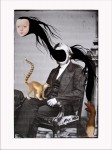
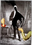
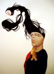
Ray Caesar is a Toronto-based artist who has been a rising star on the “alternative contemporary” scene for quite some time, or whatever contemporary art that you won’t see at the Venice Biennale is called these days. I’ve seen his work plenty of times in the past and I’ve very much enjoyed seeing his unsettling visions evolve over the years. What I didn’t realize up until well, just now, is that he makes these pieces using 3D software (Maya, specifically). Any of you who have worked with 3D will immediately grasp the level of skill required to create these detailed, lush, organic, painterly scenes. For those of you who haven’t worked with 3D software, imagine being a highly skilled painter who only paints on sculptures that you have built yourself from the armatures up. Now create lighting and atmospheric effects to make this all more realistic. Be sure not to make it look stiff or posed! OK, now take a photograph of it, taking depth of field, camera angle, and compositional values into consideration. The mind boggles, it truly does.
Ray Caesar was born in 1958 in London. At an early age, his family moved to Toronto, Canada, where he currently resides. From 1977—80 he attended Ontario College of Art, followed by 17 years from 1980—96 working in the art & photography department of theHospital For Sick Children in Toronto, documenting disturbing cases of child abuse, surgical reconstruction, psychology, and animal research. Coupled with inspiration from surrealists Kahlo and Dali, Caesar’s experiences at the hospital continue to influence his artwork. His haunting imagery is created digitally using 3D modeling software called Maya, mastered while working in digital animation for television and film industries from 1998—2001. In 1999, Caesar received a Primetime Emmy Nomination for Outstanding Special Effects in a series.
– Jonathon LeVine Gallery
So, um, yeah. Ray Caesar’s charmingly nightmarish visions are informed in part by a rather disturbing career as a photographer. I’m a big fan of old medical textbooks like dental surgery, pathology & plastic & reconstructive surgery, but I’m not sure I could deal with documenting child abuse and animal experiments as a job. Certainly rich fodder for shaping artistic vision, however. Coupled with incredible skill and a strong background in fine art, and well, there you go. Ray Caesar. Wow, and then some.
Caesar has (as you might imagine) had tons of magazine articles, newspaper reviews, a zillion online articles like this one extolling his virtues, a pile of exhibitions, and all that kind of thing. In 2011 alone he had a solo show at the Jonathon LeVine Gallery in NYC and another at the Cory Helford Gallery in LA. He had an exhibition at Richard Goodall Gallery in Manchester, UK that just finished last month.
Also, he is not a dog as his bio claims. Here he is at the opening for his show last year at the Cory Helford Gallery in LA.

More of Caesar’s art can be seen on his website or his blog. He is represented by Gallery House in Toronto.
Share this:

I was checking out brwnpaperbag and it turns out there’s been a bunch of new stuff going on for Yuko Shimizu. I wrote about Shimizu a while back but as a quick recap, she was born in Japan and worked 11 years doing corporate PR in Tokyo until burning out (her only office job before switching to art), at which point she moved to NYC where she had lived briefly in her childhood. Once in NYC, Shimizu got an art degree, and is now an award-winning illustrator & teacher. Not bad, right?
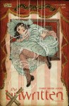
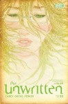
Anyway, she’s still doing tons of work for clients like the NY Times, Atlantic Magazine & the Progressive, and she spoke at ICON7 (the Illustration Conference) in June. The reason I’m posting about her again isn’t so much “new” news but “news-to-me”. I found out in that brwnpaperbag article I was talking about that Shimizu’s doing covers for Hugo Award-winning series the Unwritten (DC Comics / Vertigo). You can see a library of all the covers of the Unwritten from 2009 on the Vertigo site. Why only 2009? Because the DC website is really disorganized, that’s why. Here’s a few examples of Shimizu’s covers, I like them quite a bit.
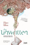
- Yuko Shimizu – the Unwritten cover issue # 1
- Yuko Shimizu – the Unwritten cover issue # 33.5
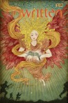
- Yuko Shimizu – the Unwritten cover issue # 34.5
- Yuko Shimizu – the Unwritten cover issue # 35

- Yuko Shimizu – the Unwritten cover issue # 36
- Yuko Shimizu – the Unwritten cover issue # 19
You can see more of Shimizu’s work via her website or her blog.
Share this:

I first noticed Christina Bothwell’s work on Pinterest, a cast glass and ceramic sculpture of what looked suspiciously like a woman’s spirit rising from her dead body. Of course, being Pinterest, there was no info on the artist or even the name of the piece. I am more thorough on my own Pinterest posting habits, je t’assure.

When You Sleep – cast glass and raku fired clay 9 x 19 x 8 inches
 Beyond the immediate impression of ghosts and soforth, this piece reminded me of old Doctor Strange comics, a staple of my childhood. Steven Strange, Sorceror Supreme, would leave his earthly body in astral form to wage mystic battle as the situation demanded. You don’t get to be Master of the Mystic Arts without learning a few tricks. This is based on a fairly common aspect of cultural beliefs about the spirit – astral projection, lucid dreaming, aboriginal Australian dreamtime, that sort of thing. It’s not hard to think of examples of cross-cultural reverance we have for the dreaming mind. People often talk about out-of-body experiences at the point of death, and I suspect that in some ways dreaming is related to beliefs about the soul, in the same way that sleep is related to death. In a strictly cross-cultural spiritualist sense anyhow, for whatever that’s worth. What I’m getting at here is that this piece of art resonated very strongly with me and I found it really engaging.
Anyway, back to the artist – looking around on the interwebs, I found out Christina Bothwell’s name and hey, it turns out she is quite prolific and has made many of these small, engaging sculptures using a variety of media, though rooted in this ceramics & cast glass approach. They don’t all deal with this soul leaving the body idea but the idea of the body as a vessel does carry through much of her work. For example, many of Bothwell’s pieces have smaller objects embedded in them.
Here’s what Bothwell herself has to say about it:
In my work I am drawn to the processes of birth, death, and renewal. What lies below the surface fascinates me and I try to capture the qualities of the “unseen” that express the sense of wonder that I feel in my daily existence. I am attracted to glass because it can do everything that other sculptural media can; in addition, it offers an inner space and transmits light.

Centaur – cast glass, raku clay, oil paints, and found object 21 x 21 x 11 inches
In some cases the vessel suggests pregnancy, like this recent piece:

Soul of My Soul – 2011, cast glass, raku clay, oil paints, wood, 16″ x 12″ x 12″
While that seems pretty obvious, Bothwell has a more complex point to make:
My subject matter includes babies, animals, and children as they embody the essence of vulnerability that is the underlying theme in my work. Currently I am exploring metamorphosis as a topic, and have been incorporating figures within figures in my pieces. Within each glass figure there is a smaller figure seen through the surface of the glass.
I think of these pieces as souls, each being pregnant with their own potential, giving birth to new, improved versions of themselves.

Nature Girl – cast glass, cast aluminum, ceramics,and antlers 46 x 11 x 7 inches
Bothwell exhibits quite a bit. Most recently she has had a solo exhibition at Obsolete Gallery in Venice, CA. She is also represented by the Heller Gallery in New York City & Echt Gallery in Chicago.
More of Bothwell’s work can be seen on her site.
Share this:

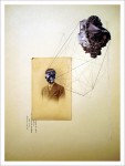
Eva Eun-Sil Han is a South Korean-born collage artist living and working in Brussels, Belgium. She has worked in a variety of styles over the years (with many exhibitions) but I first noticed her work some years ago and found her work both original and compelling in her approach to incorporating drawing with non-digital collage.
2 styles in particular really perked up my mental ears: the first, an unusual geometric approach reminiscent of crystallization, ballistic diagrams, and architectural schematics; the second, a streaming, organic flow like a dark spirit leaving one body to possess another (or the roots of a tree, or a stylized spume of blood), connecting disparate elements. I’ve never seen anything quite like it before or since, though the geometric approach is reminiscent of early Dada collage (which makes sense as Han lists the collages of Max Ernst as a major influence) and the spirit-plumes remind me somehow of anime / manga influences. Both are fairly early in her career so she doesn’t talk about them much, which is a shame in one sense but also leaves interpretation delightfully open.

Han has talked about her work, though, in conjunction with her 2009 show, Measured Emotions :
My work has involved the creation of conceptually based psychological objects and I use many geometric lines which helps me express my subconscious mind. For the show, I decided to call the name ‘Measured Emotions’ because there is a lot of geometry in your new works. The geometric lines remind me of schematic drawings and diagrams that are used for measuring things. But, instead of measuring objects or scientific things, they are maybe diagrams of emotional states. They are like ‘raw’ emotional states.
We can see people’s face emotions but how about if we can measure their emotions through shapes of geometry. Our emotions play an important role throughout the span of our lives because they enrich virtually all of our waking moments with either a pleasant or an unpleasant quality. I was wonder if we can measure our emotions with shapes of geometry.
“Measured emotions” might contain two meanings. One could be measured emotions as fear, amusement, anger, relief, disappointment, hope, etceteras instead of one isolated emotion and the other could be meaning that I measure all these shapes of geometry when I cut them or make lines for process my work. All shapes must be all in good measurement otherwise the shapes cannot be fitted each other. I measure my emotional statement when I work at the same time I measure these shapes of geometry.
To realize this emotional state in geometric shapes, I use many other type of colors and patterns papers cutting out images from magazines or vintage books using collage technique with mixed media such as oil painting or an acrylic.
Han’s work is quite different now, but is still non-digital collage, and she continues to explore relationships of form and surface. More of her work can be seen on her website.

