
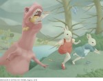
I came across an intriguing image on Art Listings Professional by Jill Hadley Hooper.
There’s something quite haunting about it. I’m reminded of the odd visual effect of seeing snow fall in front of a dark wall – against the sky, snow looks dark, against a wall, it looks light. And a horse? Well, why not? I’m sure she meant something by it, but it doesn’t take away from my enjoyment of the piece not to know.
")
Jill Hadley Hooper: Floating / Falling (2010)
Naturally curious fellow that I am & not being familiar with the artist, I looked up her up. It turns out that as well as being a fine artist, she’s a very widely published illustrator (peruse this selection of her delightful spot illustrations, for example) or this wonderful piece:

Jill Hadley Hooper – All Songs Considered
Floating / Falling was part of her fine art work,. She mentions that the paintings tend to be quite large, compared to the more constrained space of illustration. As a working practice that seems like a good way to stretch all your creative muscles.
The illustration work is done with traditional materials, water-based paint and ink, that are scanned in and assembled in Photoshop. I used to work in oils until once the protective tissue stuck to the final art I had fedexed and the art director published the image with paper intact (my work looked different back then so it wasn’t as odd a mistake as it sounds, it actually helped the piece. And the AD was David Carson). But the dry time with the oils was too difficult, when I switched media my work changed too and became more graphic.
The paintings are created using different transfer and printmaking techniques. I like to work large, perhaps because of the size restrictions of illustration. And it’s nice to stand and wave my arms around. Text is often the armature that I use to start a painting, among the works I’ve returned to are; Julio Cortazar’s Hopscotch and his short stories, Goethe’s Faust, Marquez’s One Hundred Years of Solitude and Annie Dillard’s For the Time Being.
I live in Denver where it’s bright (too bright) and dry. I share a 100 year old house with my partner of 20 years, Hugh Graham, and my dog of 3, Maddie. Someday I hope to live where it’s not so contrasty.
Hadley Hooper is quite prolific, and also recognized. For instance, she won a silver medal from the The 48th Annual of the Society of Illustrators for her poster of the opera, Popea (Central City Opera).

Her style is really impressive. I enjoy the combination of printing and drawing and the deceptive simplicity she employs to block out very graphic forms with very lush, painterly surfaces.

Jill Hadley Hooper – Wall St. Journal

Jill Hadley Hooper – Wine Spectator
You can see more of Hadley Hooper’s work on her portfolio site. There’s quite a lot of it & it’s very enjoyable, so take your time.

Jill Hadley Hooper – All Angels Are Terrifying
Share this:

Thinking about what to write about today, I found myself looking at comics. Or graphic novels, if you prefer. A while back (OK, in 2009), Time magazine published a list of what their editors consider to be the top ten graphic novels like, ever. At the time I responded to it on an internet forum I hang out on, and I think my assessment is still accurate. Plus I like lists. I’m cranking up the internet time machine… can you hear the thunder of its mighty gears engaging? Here we go…
… OK, I keep thinking about the all-time best graphic novels list and how except for a couple of picks how wrong, wrong, wrong it is.
- Berlin: City of Stones (2000), by Jason Lutes
- Blankets (2003), by Craig Thompson
- Bone (2004), by Jeff Smith
- The Boulevard of Broken Dreams (2002), by Kim Deitch
- The Dark Knight Returns (1986), by Frank Miller
- David Boring (2000), by Daniel Clowes
- Ed the Happy Clown (1989), by Chester Brown
- Jimmy Corrigan: The Smartest Kid on Earth (2000), by Chris Ware
- Palomar: The Heartbreak Soup Stories (2003), by Gilbert Hernandez
- Watchmen (1986), by Alan Moore & Dave Gibbons
A “greatest” graphic novel should have top-notch art and a top-notch story that really stands out from other works. The list should have been (allowing only one title per author, in no particular order) :
- Maus: A Survivor’s Tale by Art Spiegelman (1986)
It should be a no-brainer to have this on any graphic novel list. - Like A Velvet Glove cast In Iron by Dan Clowes (1998)
David Boring? Really? How pedestrian, at least pick Ghost World if you’re being uninspired. - Arkham Asylum by Grant Morrison & Dave McKean (1990)
These guys DOMINATE the latter 20th century graphic novel landscape, for good reason. - Black Hole by Charles Burns
Collected edition of volumes originally released 1999-2008) (A genius artist & great writer by any standard whose strong influence has been felt since the 80’s. - The Nikopol Trilogy Enki Bilal (1980-92)
It’s not just Americans making comics, duh, and Bilal is GENIUS. - The Hard Goodbye (Sin City Book 1) Frank Miller (1991)
Far superior in plot and art to Dark Knight. - Adventures of Tintin: Tintin in Tibet Hergé (1958)
Again, show some love to the non-American masters, graphic novels didn’t begin in the 1980’s. - Safe Area Gorazde: The War in Eastern Bosnia Joe Sacco (2000)
You like plot, little boy? Comics journalism at its finest. - Perla La Loca (Love & Rockets) los Bros. Hernandez
Rerelease of volumes originally published roughly 1985-1989) (they picked Palomar? come ON. - Hellboy Library edition vol.1 Mike Mignola
Rerelease of volumes originally published roughly 1994-1998) (Colour! Line & shadow! Plot! …this guy out-Kirbys Kirby.
I like Lutes, Thompson, Smith, Dietch, and Brown – but best of all time? Hardly. And Watchmen, while a great story (though it shouldn’t have been on the best fiction list either), had pretty uninspired art. There, I said it.
I guess you could exclude Bilal & Hergé as they weren’t originally published in English … In which case I’d include Black Kiss Howard Chaykin (1988) (Seriously underrated artist who can also write a hell of a noir vampire transexxual hooker corrupt police detective story) … and / or Tank Girl Martin & Hewlett (1991 rerelase of early material) (C’mon, Tank Girl. Seriously influenced pop culture and graphics for years, forget the stupid movie version) … or maybe Hellblazer: Dangerous Habits Garth Ennis (1994) (This is where the series really started to blossom IMO & Garth Ennis made his reputation outside the UK. Again, forget the stupid movie version).
Share this:

Thinking about what to write about today, I remembered Eric Fischl. When I was in art school he was one of my favourite painters, but I don’t hear much about him so I tend not to think that much about him. Imagine my surprise, given writing about Chuck Close yesterday, that Fischl recently (ish) painted Chuck Close’s portrait.
")
Eric Fischl – Chuck and Sienna (2012 Oil on Linen 82×68′ )
There is something charmingly meta about paintings of paintings.

Eric Fischl – Chuck and Sienna detail
It’s good to see that Fischl is still painting, regardless of all the critics’ blithe assertions that painting is dead. Screw them. More of Eric Fischl’s work can be seen here.
Share this:

Chuck Close is a pretty interesting painter, insofar as most of his career has been about not being a painter in the traditional sense. When he was doing his MFA at Yale he was known for his excellent brushwork, so around 1967 he simply gave up using a paintbrush in the traditional way.
“I chose to do things I had no facility with. The choice not to do something is in a funny way more positive than the choice to do something. If you impose a limit to not do something you’ve done before, it will push you to where you’ve never gone before.”
Mostly known as a photorealist, Close is an anomaly in that he does large-scale (REALLY large-scale) representational realist portraits, but employing image reproduction techniques he replicates by hand such as 4-colour process, halftone, or pixellation. He has worked with many diverse media from irregular bits of coloured paper to his own fingerprints. The approach I personally like best is the one shown here in “Francesco I”, a portrait of fellow artist Francesco Clemente (and, as it happens, an artist whose work I like a lot, too).
 detail 1")
Chuck Close – Francesco I (oil on canvas, 1987-1988, 100×84″) detail 1
You can see the approach he’s using here – highly contrasting colours in small concentric blobs that as you move further away give the impression of more even colour:
 detail 1")
Chuck Close – Francesco I (oil on canvas, 1987-1988, 100×84″) detail 1
An interesting fact: Chuck Close has Prosopagnosia (face blindness). He says that working on portraits helps him remember faces better.
")
Chuck Close – Francesco I (oil on canvas, 1987-1988, 100×84″)
Although his later paintings differ in method from his earlier canvases, the preliminary process remains the same. To create his grid work copies of photos, Close puts a grid on the photo and on the canvas and copies cell by cell. Typically, each square within the grid is filled with roughly executed regions of color (usually consisting of painted rings on a contrasting background) which give the cell a perceived ‘average’ hue which makes sense from a distance.
… His first picture with this method was Big Self Portrait, a black and white enlargement of his face to a 107.5 in by 83.5 in (2.73 m by 2.12 m) canvas, made in over four months in 1968, and acquired by the Walker Art Center in 1969. He made seven more black and white portraits during this period. He has been quoted as saying that he used such diluted paint in the airbrush that all eight of the paintings were made with a single tube of mars black acrylic.
Later work has branched into non-rectangular grids, topographic map style regions of similar colors, CMYK color grid work, and using larger grids to make the cell by cell nature of his work obvious even in small reproductions. The Big Self Portrait is so finely done that even a full page reproduction in an art book is still indistinguishable from a regular photograph.

Chuck Close at work
Anyhow, Chuck Close is a pretty neato artist and has been super-influential. I highly recommend that you find out more about him if you’re notfamiliar with his work – a good place to start is the wikipedia article on him, or his website.
Share this:

Well it’s been an exciting Saturday chez casa Grey not Grey, backing up the household computers and upgrading operating systems. If Google’s not making money from Apple by telling Mac users to upgrade to Snow Leopard lest they cease to receive Chrome updates, well, I don’t know what to think about that kind of missed revenue opportunity. Cross-leveraging your synergies, I believe business types call that sort of thing. I work in an office weekdays, I know the drill.
While backing up my charming and talented wife’s computer, I was browsing through some of my favourite sites and I happened upon the ever witty and engaging blog, the Jealous Curator. Today’s feature is an artist from Taipei named Hsiao Ron Cheng. Not being well-versed in Chinese onomastics, I am going to go out on a limb and guess this artist is female. So basically we’ve got the Taiwanese female Mark Ryden on our hands. I can live with that.

You can see more of Cheng’s work on her portfolio site or her blog.

