I saw an article over on Colossal Art & Design on a new show by Vik Muniz, and thought I’d share it here. Muniz was born in Sao Paolo, & now lives & works in Brooklyn. Over the years he’s done a lot of “experimental collage” for want of a better description, working with: sugar; fake diamonds; cigarette butts and ashes; toys, and (as in this case) magazines. Without too much commentary on what it is or is not, I was quite taken by his reworking of “Starry Night” by Van Gogh. There is something pleasantly obsessive about recreating brushstrokes with torn bits from magazines.
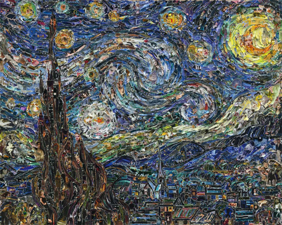
Vik Muniz – Pictures of Magazines 2 Starry Night, after Van Gogh
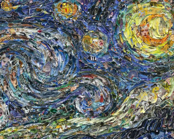
Vik Muniz – Pictures of Magazines 2 Starry Night, after Van Gogh (detail
Also charming is his reworking of “Picking Flowers in a Field” by Mary Cassatt.
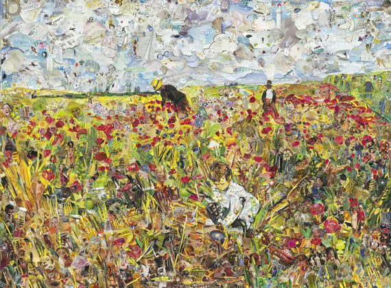
Vik Muniz – Pictures of Magazines 2 Picking flowers in a Field, after Mary Cassatt
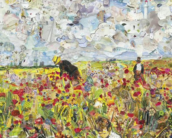
Vik Muniz – Pictures of Magazines 2 Picking flowers in a Field, after Mary Cassatt (detail)
This series is currently on display at Galerie Xippas (Paris). Click here to view more works from the series and/or get more information.
Lots of interesting stuff on the interwebs today like this excellent flickr set of Chinese firecracker labels (via metafilter) but instead of posting an article, I’ve been messing around in illustrator again – so here’s a self-portrait. According to my charming and talented wife, it’s “Pretty f*ing accurate”.

Isabelle Arsenault is a Québecoise illustrator, originally from Sept-Îles (the northernmost town in Quebec with any significant population), now based in Montreal. She got a design degree from Université de Montréal but quickly changed gears and became an illustrator. This, as it turns out, was an excellent idea.
Arsenault started doing editorial and other illustration work, and in a short space of time got a lot of attention for her work as she won several prestigious competitions including Applied Arts, American Illustration, Communication Arts and Grafika.
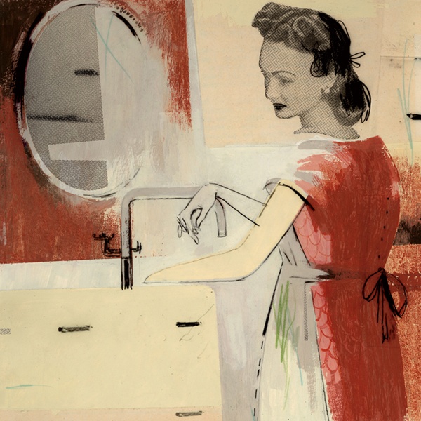
In 2005 she won the Grand Prix Lux in the illustration category (a very prestigious award in Quebec) as well as the Governor General’s Award (the most prestigious award in Canada) for her illustrations for her first children’s book, Le cœur de monsieur Gauguin. Yes, you read that correctly : her first children’s book won the Prix Lux and the GG award.
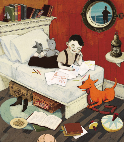
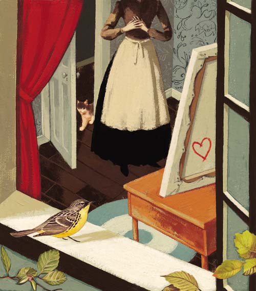
Le cœur de monsieur Gauguin is the rather sad (and mostly fictional) but uplifting tale of the young Paul Gauguin:
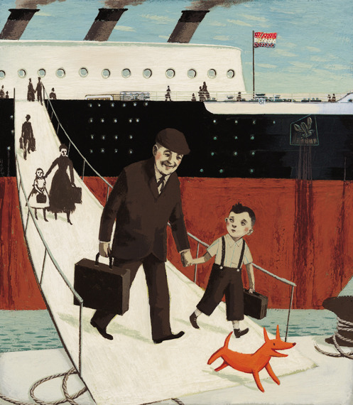
… Young Paul Gauguin sailed from Denmark to Peru with his family: his mother, his father, his sister, Marie, and his odd-looking, imaginary orange dog. At first being on the boat was fun; he loved to walk his dog on the ship’s bridge. Then one day, Paul found his mother in tears; his father had died.
When the ship docked, Paul refused to leave. Then an old man took him by the hand and in a few brush strokes, he had stirred a passion that lay just beneath the boy’s surface. He had shown Paul how to paint, but, more than that, he taught him how to bring his memories to life.
– Tundra Books
A few samples from the book:
Anyhow, after that first success with children’s books, Arsenault decided that she wanted to change her style to be more kid-friendly.
“This was my first experience with (a) children’s book … That project made me reconsider my style and the main focus of my production to create more for … kids.”
– Seven Impossible Things
Arsenault now works in a more light-hearted, accessible (for kids) style that is very appealing and expressive. Here’s the cover from another of her books, Migrant, one of the New York Times Book Review’s “Best Illustrated Children’s Books” picks for 2011 :
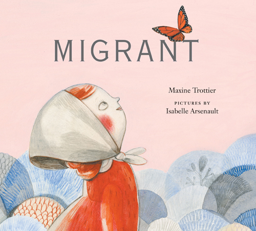
Each spring Anna leaves her home in Mexico and travels north with her family where they will work on farms harvesting fruits and vegetables. Sometimes she feels like a bird, flying north in the spring and south in the fall. Sometimes she feels like a jack rabbit living in an abandoned burrow, as her family moves into an empty house near the fields. But most of all she wonders what it would be like to stay in one place.
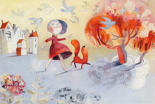
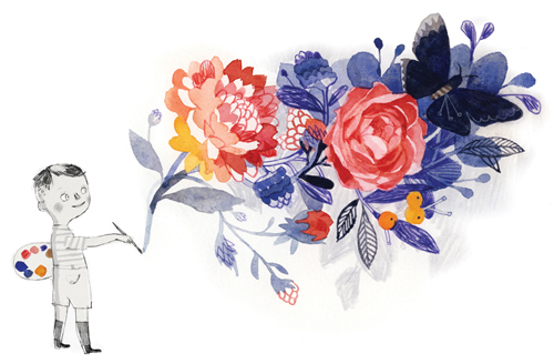
Here’s some more of Arsenault’s work in this “kid-friendly” style :
I see from reading Arsenault’s blog that she has just finished a new project, a graphic novel, Jane, the Fox & Me :
I’m finishing today the graphic novel that kept me busy for the last few months. A hundred pages long, “Jane, le renard & moi” tells the story of Hélène, a girl who finds hope in the world of Jane Eyre to escape the bullying that she is victim of, at school. Written by author Fanny Britt, the book is coming out this Fall in its original French version, at La Pastèque and good news! – it will also be published in English by Groundwood books, in 2013.
So yeah, Isabelle Arsenault. Super-talented, prolific, versatile, and all-round fantastic. I’m sure we can look forward to seeing lots of work from her for many years to come.
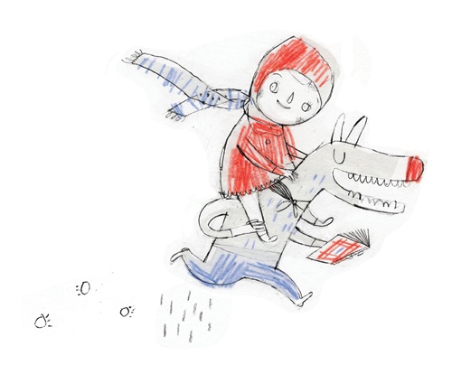
As a final note, here is a charmingly playful piece from Arsenault’s sketchbook :
I found a really compelling site that is essentially a gallery of chrome logos – mostly, but not all from vehicles – chromeography. Here’s a few samples:

Chevrolet Corvette Stingray

Dodge Panel van

GMC Custom Camper
This next one’s from eBay, not chromeography – this is the fender emblem from a mid-to-late 70’s Plymouth Fury – I used to have one of these tacked to my leather jacket back when I was a troubled youth.
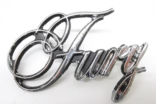
1975-78 Plymouth Fury Emblem
The thing I like about this style of logo is that it reminds me of ye olden tymes before computers and graphics software, when everyone that went to design school learned hand lettering. Film title screens, posters, print ad headers, logos – you name it – were all done by hand. Nowadays the only time most designers learn the technical aspects of hand lettering is if they get into calligraphy or drafting.
There are, of course, a lot more hand-drawn typography pieces out in recent times given the (relatively) recent trend towards the hand-drawn look, like the kind of work you see on typeveverything or typophile gangsta. I find it charming, but often intentionally anachronistic as the point is to create an “artisanal” effect, probably a response to the hyper-slickness of most corporate branding (I’m looking at you, Apple).
As I’ve mentioned before, I enjoy calligraphy and lettering, so here’s my stab at it working in this style with a bit of an updated approach so as not to look too pseudo-vintage-y :

Ian Rogers – Grey not Grey revisited
No, I’m not rebranding, just enjoying myself. I don’t think I quite nailed the automotive aspect, it’s bit too fun and pretty – but I bet it would look swell in chrome.
UPDATE: I found another great collection here via LogoDesignLove. A couple of samples:


Martin Wittfooth is a painter who lives and works in Brooklyn, NY. He was born in Toronto, Canada in 1981 but spent most of his childhood in Finland. He’s a heck of a painter, with a focus on animals and apocalyptic imagery. He does address religious themes in his work but more from a conceptual point of view than a strictly religious one – I suppose you could say he deals with the same themes religions often deal with.
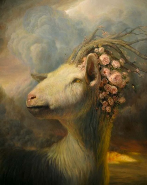
Martin Wittfooth – “the Devil’s Playground”
In an interview regarding his 2011 solo exhibition in NYC at Lyons Weir, “The Passions”, Wittfooth states:
The theme behind The Passions is a bit more specific than my previous series have attempted to tackle. This time around I wanted to start exploring something I’ve spent a fair amount of my time musing over and having ongoing dialogues with people about: the destructive nature of blind faith. Specifically in this series, I’m interested in exploring the idolization of violence, self-sacrifice, and suffering that are central to the faith-based notions of martyrdom and sainthood. Saints and martyrs appear in blood-soaked abundance in the histories and holy texts of the dominant religions of the world, and however civilized and enlightened we may think of ourselves in the 21st Century, we don’t need to strain ourselves all that much to witness and admit that these ideologies are still held sacred by an alarming percentage of the population.
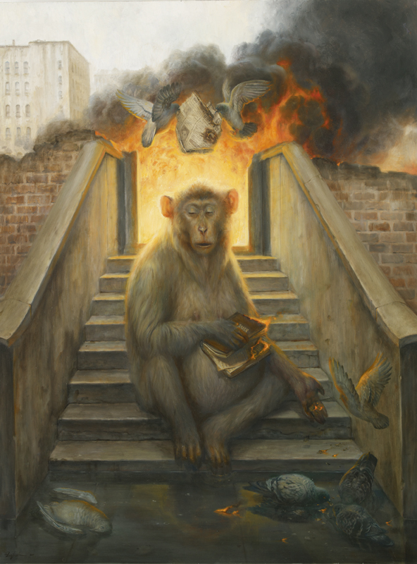
Martin Wittfooth – “The Coronation”
Uh, wow. Pretty heavy, right? Not to say that I am not inclined to like this kind of work, but it’s pretty rare these days to see a representational realist painter working in fine art dealing with these kind of, well, non-conceptual themes. I find it refreshing, to say the least. Having gone through art school myself and being immersed in the prerequisite “ivory tower of academe” approach to meaning in art, it’s heartening to see an artist who hasn’t let the “painting is dead” meme common to contemporary art theory hold him back and even more to the point, it’s heartening to see an artist who doesn’t feel compelled to justify themselves according to conceptualist dialectics.
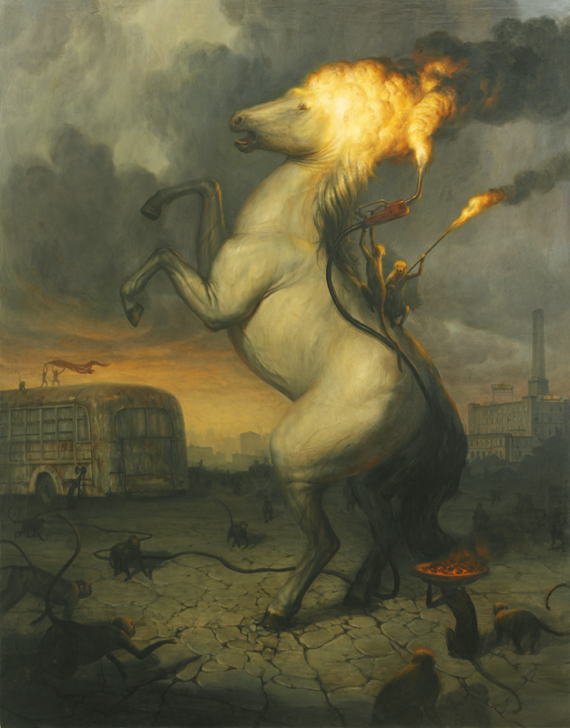
Martin Wittfooth – “the Sacrifice”
This is not to say that he doesn’t have a conceptual angle to his work:
The abandoned and decayed remnants of mankind make such a common appearance in my work for a couple of reasons. The first is conceptual, and aims to point at the idea that we, the collective viewer, are still somehow present in these works, yet the rust and decrepitude of these relics suggests their uselessness, and our own abandonment of – and thus helplessness to affect – the scenes that unfold in the paintings. The second reason for conjuring up this imagery on such a regular basis is that I find these textures compelling to paint, and this makes my job less boring. There is a third reason, too, I guess: I live and work in somewhat of an industrial wasteland in Brooklyn, so I never have to venture out very far to find reference.
Having spent my formative teen years in something of an industrial wasteland myself, I can relate. So yes, without any hesitation, I can boldly assert that I love Wittfooth’s work & that it’s all kinds of awesome.
Wittfooth’s next show is at Corey Helford Gallery, Los Angeles, CA, in September.


