Wandering around the interwebs I sometimes find artists I really don’t know much about, and can’t find out much about. That doesn’t keep me from enjoying their work.
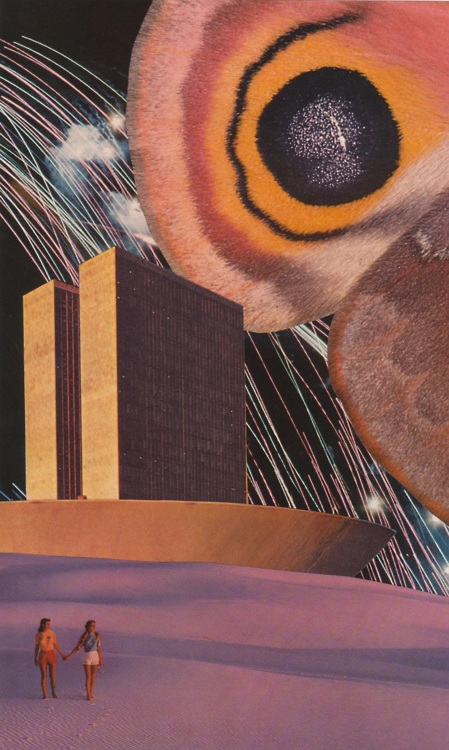
Bryan Olson is one of those artists. He does hand-made/ mixed-media collage using a variety of vintage and contemporary sources.
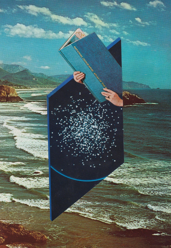
Apparently he is 27, lives in North Carolina, and is also a musician. He describes his work variously as “mixed media collage landscapes”, “vintage surreal sci-fi”, and “hand-cut ultrastructures”. That’s what I’ve gleaned from the tags on Glass Planet, his tumblr account, anyways.
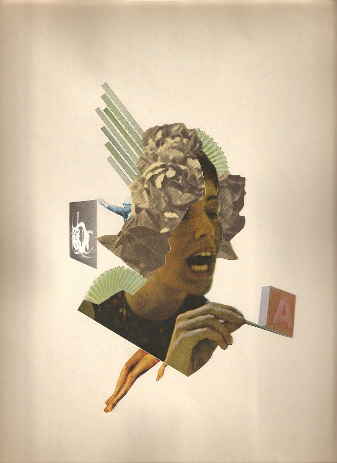
Vaguely reminiscent of futurist & suprematist approaches to collage, even hints of Berlin Dada – but ultimately this kind of collage always evokes other collage, how can it not? If you use vintage engravings it looks like Max Ernst, if you use magazine photos it looks like Hannah Hoch. Does it even matter? Not really.

Olson’s work does seem familiar. I’m not sure if he’s one of those people whose work I’ve seen reshared on countless tumblr and image aggregate sites for years, or if he’s new at this. I do like his work quite a bit, though, and ultimately that’s all that matters.
When we’re taught the colour wheel in art class, we learn the 3-primary colour wheel. Red, yellow, and blue are the primary colours, orange, green, and violet are the secondary colours. This is where we get complementary (opposite) colours as I explained in my post about simultaneous complementary contrast with greys.
The thing is, there’s a bit more to it than that. The 3-primary colour wheel is how to mix colours. If we are talking about how we actually see colours, there are four primary colours, not three.

The 3-primary colour wheel was developed by Goethe in 1810 (yes, the guy that wrote Faust was also a scientist, lawyer, linguist, poet, etc.).
The 4-primary colour wheel was first published in 1878 by Ewald Hering, a German physiologist specializing in colour perception. I know, what’s with the Germans and colour? Anyhow, I digress.
Instead of seeing complementary colours as in the 3-primary wheel, Hering described “opposing” colours: blue and yellow; red and green, and black and white. Essentially, this is based on the physiology of visual perception.
Cone cells in your retina see colour. Rod cells see light and dark. Although people usually talk about cone cells seeing red, green, and blue, they actually respond to short, medium, and long wavelengths in the colour spectrum. Short wavelengths are towards violet in the spectrum, long wavelengths towards red.

So that’s the spectrum as we see it, the “visible spectrum”. A thin wedge between gamma rays(10-14 nanometers), x rays, and ultraviolet on the short wavelength end, and infrared, radar, FM, TV, shortwave and AM (104 meters) on the long wavelength side. Not much to work with, but somehow we make do.
Now, back to physiology – we actually do see red, green, and blue (for the sake of simplicity) but our brain filters input from the cone cells.
Here’s an excellent explanation of how this works from Jason Cohen:
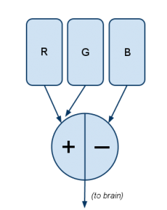
Filter #1 works like this:
Explanation: The more R there is, the more positive the signal; the more G, the more negative the signal. If there’s relatively equal amounts of R and G — whether neither of both, a little of both, or a lot of both — the signal is zero.
This explains why there’s no “greenish-red.” …
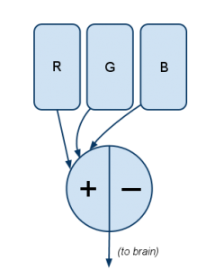
Knowing that blue/yellow is the other opposite pair, you can probably guess what (Filter 2) is:
Here blue (B) is opposed with a combination of both the R and G channels. The R and G cones are stimulated either when there’s literally both red and green light (like when a CSS coder turns on both red and green as
#FFFF00to create yellow), or when 570nm light (yellow, on the visible spectrum) stimulates both R and G cones.Filter #3 is simple:
In short, it measures the quantity of light without regard to what hue it is. This is “how bright,” or “luminance” in color-theory parlance.
And magenta? It comes from full R and B with no G, activating Filter #1 full-positive, Filter #2 at zero. It’s not a physical wavelength of color, it’s just a combination of outputs from two filters.
– Jason Cohen via A Smart Bear
One nitpick – Cohen is incorrect in saying “This explains why there’s no “greenish-red.” Red with a little bit of green is brown, or when desaturated with white, it is grey. This is true of all complementary colours – or, in the 4-primary system, opposing colours. It’s a lot more complicated than we need to go into here but essentially the filtering system is a good description of colour perception and how the 4-primary system makes more sense physiologically.
Interestingly, the 4-primary colour wheel is often used in industries that work with colour a lot such as paint manufacturing, as it more accurately decribes colour as the eye naturally perceives it. For example, Hering’s 4-primary colour wheel is the basis for the NCS (natural colour system), the default colour reference for Sweden, Norway, and Spain.
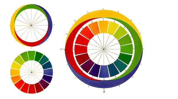
Ewald Hering’s 4-primary colour wheel showing warm and cool colour
Got some time on your hands? Oh, good.
One of the sites I like to visit each day is the Art Cake, an excellent art blog that posts stuff pretty much daily – today one of the posts featured the work of Meg Hunt, a Portland, Oregon-based illustrator who amongst other things did a series of illustrations of Alice in Wonderland. Hunt’s illustrations are engaging and original – no small task considering how many other extremely well-known illustrators have tackled this book, yet seemingly most turn back to the same approaches and even scenes as the original illustrations by Tenniel.
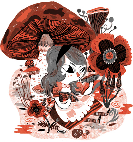

Drilling down through the links, I found the project Hunt’s illustrations came from – Picture Book Report. 16 illustrators, 21 books, one year. The breadth of the work is truly astonishing and inspiring.
We are launching Picture Book Report as an experiment of sorts– fifteen illustrators creating a new scene from their favorite books every month, posted one per day for three weeks! Think about that– that’s half a month of brand-new content, every month! That’s crazy, and beautiful, and honestly the idea swells me with love and gratitude for all the people involved.
– Meg Hunt, from the first entry on Picture Book Report
OK, Hunt says 15, but I counted 16 in the sidebar.
…There is a certain kind of magic to books and stories that is hard to beat and for that I will always be excited to crack that next book open. At the same time, there’s this stigma against books with pictures, that they’re something you leave behind after you get to a certain age.
The urge to make our own mark upon this format is immense. To give back to that tradition of storytelling and share our own along the way…
Picture Book Report is an extended love-song to books. Fifteen illustrators will reach out to their favorite books and create wonderful pieces of art in response to the text that has moved them, shaped them, or excited them. …Together we will try to excite readers both new and old and capture some of that magic of storytelling.
We hope you enjoy the results of this experiment!
– Meg Hunt, from the “About” section
I do, I do! Given the range of books and illustrators, there’s a little something for everyone here, no matter how your taste may run.
For example – Brave New World, illustrated by Emily Carroll:
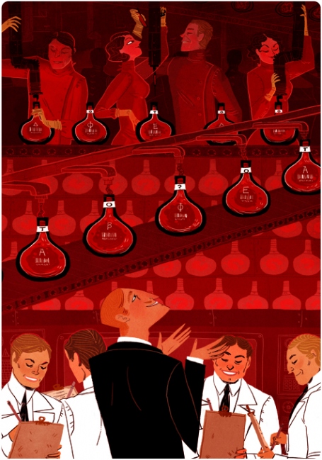
“Embryos are like photograph film,” said Mr Foster waggishly, as he pushed open the second door. “They can only stand red light.”
…or Charlie and the Chocolate factory, illustrated by John Martz:
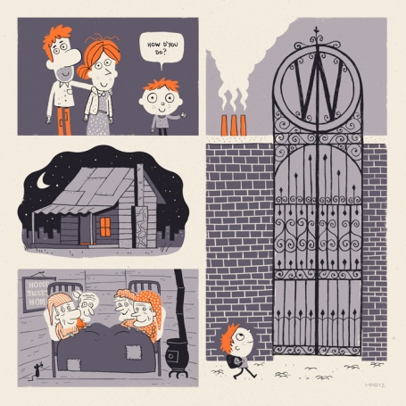
The whole of this family — the six grownups (count them) and little Charlie Bucket — live together in a small wooden house on the edge of a great town.
Their house wasn’t nearly large enough for so many people, and life was extremely uncomfortable for them all. There were only two rooms in the place altogether and there was only one bed. The bed was given to the four old grandparents because they were so old and tired. They were so tired, they never got out of it.
And, as a final taster, the Neverending Story as illustrated by Chuck Groenink:
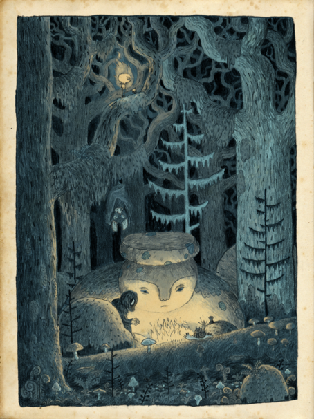
In short (he says at the end of a lengthy post) there is a lot of fantastic work in the Picture Book Report – hours of fun with a lot of great material to both read and look at. Enjoy!
I happened to stumble across the work of Nicolas Delort, a Parisian illustrator. He works in a variety of styles and media but I was most impressed by his work with this scratchboard-y technique – very time-consuming and requiring a lot of finesse. Check out these examples to see his process – pretty dang impressive.
‘Harry could smell salt and hear rushing waves; a light chilly breeze ruffled his hair as he looked out at moonlit sea and star-strewn sky.’
- Nicolas Delort – the Cave (sketches)
- Nicolas Delort – the Cave (sketches)
- Nicolas Delort – the Cave (sketches)
- Nicolas Delort – the Cave (work in progress)
- Nicolas Delort – the Cave (work in progress)
- Nicolas Delort – the Cave (work in progress)
- Nicolas Delort – the Cave (work in progress)
- Nicolas Delort – the Cave (final)
More of Delort’s work can be seen on his blog, or on tumblr.
So hey, I’m back from New York! On an artistic level my visit to the MoMA was unquestionably the high point, not only because they have a number of my favourite modernist art works on display, but for the current exhibitions. In particular, a while back I posted about James Rosenquist’s monumental F-111 currently on display at MoMA and holy cow, was it ever more impressive in real life – and not just because it really is quite enormous.
Rosenquist’s playfulness with material really doesn’t come across in reproduction; seeing F-111 “in the round” is a breathtaking experience. Rosenquist really knows paint and his obvious appreciation of its subtleties is very evident – he’s a real painter’s painter in this sense. Some of the panels were aluminum, with varying transparency of paint application, some areas of wallpaper-like patterning, paints of varying glossiness including metallic, enamel, and matte… you could really see that his background as a commercial billboard painter allowed an incredible fluency as an artist. Rosenquist’s deftnesss with mixed media in F-111 is simply astonishing. Added bonus? Working sketches on display nearby.
- James Rosenquist F-111 detail
- James Rosenquist F-111 detail
- James Rosenquist F-111 detail
- James Rosenquist F-111 detail
- James Rosenquist F-111 detail
- working sketches – James Rosenquist F-111
F-111 is on display at MoMA until July 30 2012, as originally displayed in 1965 at the Leo Castelli Gallery.
This installation marks the first time F-111 has been presented at MoMA as it was initially exhibited at the Castelli Gallery in 1965. From seeing it personally in the past, and from studying detail images in textbooks and slides, I felt I had garnered at least a basic understanding of the work’s important political message about the economic implications and consequences of war. But it was not until we finished installing and I first stepped inside the intimate environment created by the vividly colored wraparound panels that I really registered the painting’s immersive effect.
This was no accident. Rosenquist has often cited a keen interest in the phenomenon of peripheral vision as a driving force behind his decision to make a room-scaled painting. Whatever our eye focuses on at any given moment is necessarily influenced by information at the outermost perimeters of our field of vision, which in turn plays a profound, yet often subconscious, role in our sensory perception.
– Cara Manes, Collection Specialist, Department of Painting and Sculpture MoMA
If you have the chance, you really must go.


