If you haven’t heard of Kevin Cyr before, he’s a Brooklyn-based artist that does a bunch of different very interesting stuff but is best known for his paintings of old, beat up, graffiti-covered delivery vans. He got the inspiration while working as a bike messenger, taking photos of delivery vehicles in his neighbourhood then making silkscreened prints onto wood panels he would then paint on top of, based on the photos. There’s something very meta about paintings of graffiti & the whole painting on top of prints concept that appeals to me in a very basic way. Plus, of course, they’re simply great to look at.
In a culture in which people are easily lured by the appeal of status-enhancing symbols, I find beauty in derelict cars and unkempt landscapes. I have always been interested in painting vehicles and scenes that have defined the evolution of the American landscape.
– from the artist’s website
You can read more of what he has to say about his work in this interview from Arrested Motion.
Kevin Cyr – Van Series (click for larger)
Hey, Roy Lichtenstein fans! Planning a trip to the windy city (and I don’t mean Winnipeg) in the near future? Well, you’re in luck because there is a HUGE retrospective at the Art Institute May 22 to Sept. 3.
Over 160 drawings, paintings, and sculptures are included in the exhibition, which explores the evolution of (Lichtenstein’s) practice from abstractionist to refined avant-garde painter of “Bratatats,” “Varooms,” “Whaams,” and many wild-haired women with their dryly witty thought bubbles. Visitors will have a chance to dissect his characteristic Ben-Day dotted style, as the exhibition attempts to expose Lichtenstein as a true formalist master.
If you’d like to learn more about why Lichtenstein is such a big deal and why you should care (and you should, really) , you can read the rest of the article that quote is from: WHAAM! Obsessive-Compulsive Pop Artist Roy Lichtensteins Biggest-Ever Retrospective Hits Chicago | Artinfo.
It’s actually pretty interesting to see Lichtenstein’s work in retrospective format – we’re all used to the iconic images of teen romance comic books and soforth but when you consider his work within its conceptual framework you can see that he’s really performing a very witty act of deconstruction, poking fun at conventions of modernism while employing the same modernist tactics at a very high conceptual level. There’s something charmingly anarchic about that. If you get I chance I recommend you check out the show.
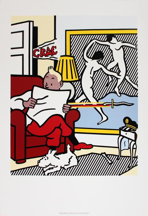
 I don’t know if this piece will be on display but it’s my favourite so I’m going to include it here just because I want to. I’m particularly fond of his take on Matisse, in the background.
On the other hand, if you’re like me and probably won’t be able to swing a trip to Chicago, you can always spend some time checking out the Roy Lichtenstein Foundation (warning: Flash site) or browse through some of his work.
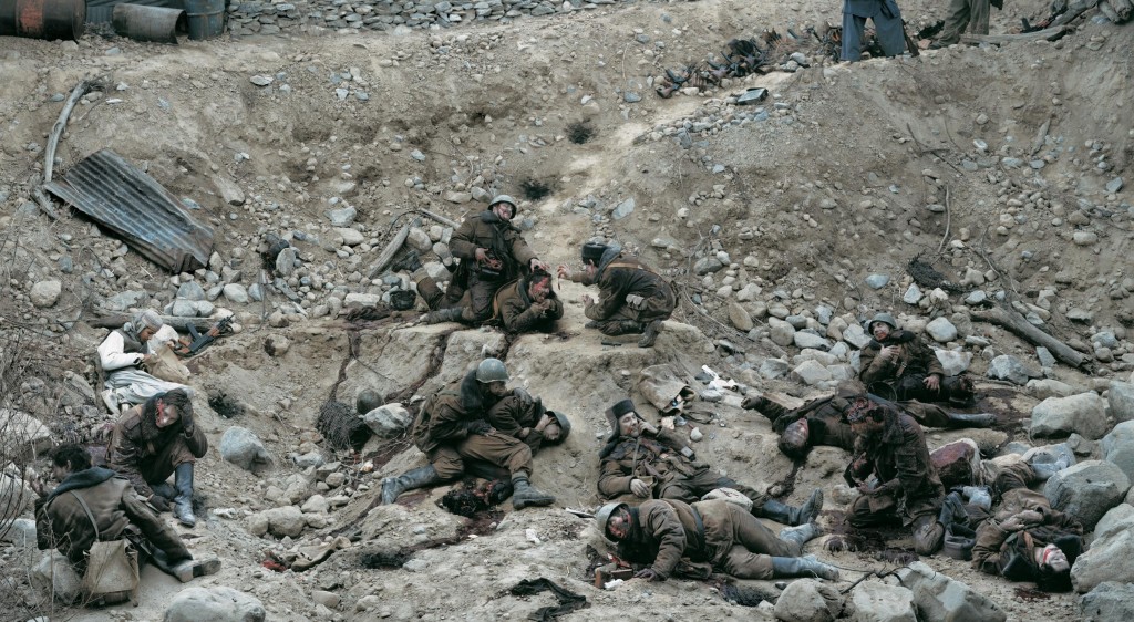
A 1992 photomontage by Canadian photographer Jeff Wall, Dead Troops Talk (A Vision after an Ambush of a Red Army Patrol, near Moqor, Afghanistan, Winter 1986), has fetched more than $3.6 million at auction. Golly.
- Dead Troops Talk (1992) – click for larger image
“A gruesome, large-scale battlefield picture of conversing corpses by acclaimed Canadian photographer Jeff Wall has smashed the artist’s all-time price record and become the single most valuable photographic artwork ever produced in this country.
The 1992 photograph titled Dead Troops Talk, in which Wall set up a macabre scene showing a group of Soviet soldiers talking to each other after being killed in the Soviet-Afghan war in 1986, sold Tuesday for more than $3.6 million at a Christie’s auction in New York.”
– Read the full article from the Vancouver Sun
I’ve had the good fortune to see this work on display and it really is quite moving and an impressive piece of work, and also a serious bit of craftsmanship given Wall’s complicated photomontage approach.
Here’s what Wall has to say about this piece:
The Afghan War was current when I began thinking about the subject, sometime in the 80s, I don’t remember exactly when. Then, as the war wound down and the Soviets withdrew, it all seemed to get forgotten. The collapse of the USSR overshadowed the Afghan conflict and Afghanistan disappeared from the world’s attention until the Taliban and so on in 2001.
The sense that the war was forgotten attracted me, and gave me a concrete basis to develop the picture. I liked the idea that, when the picture was finished (which would be in 1991 or 92), the Afghan war would be the furthest thing from ‘news’. So I could play with elements of journalism and history quite freely…
– interview with Gordon MacDonald in Photoworks no.5
Photography has been making some pretty big sales at auction lately, like Cindy Sherman’s Untitled #96 (Film Still) selling for $2.8 million or of course Andreas Gursky’s Rhein II breaking all records for price fetched at auction by a photo with $4.3 million … Worth noting, Gursky cites Wall as a major influence.
If you’re the type that likes art books, I suggest Jeff Wall: Complete Edition, which presents an excellent overview of Wall’s ouevre including “Dead Troops Talk” and provides a great deal of insight into his process and thinking behind his works.
Last week I explained how simultaneous complementary contrast can be used to make a low-saturation composition appear more dynamic. Carrying that idea one step further, I’m going to explain contrast of temperature and show how warm and cool greys can be used to make your designs “pop”.

You will often hear people describe colours as “warm” or “cool”. In the simplest sense, “warm”colours tend more towards yellow, and “cool” temperatures tend more towards blue.
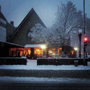
For example, take a look at this photo I took of a Montreal coffee shop on a snowy early winter evening – the warm yellow and orange hues of the interior contrast strongly with the blue tones of the early evening exterior light. The interior light creates complementary contrast as orange and blue are opposites on the colour wheel, but at the same time there is a contrast of temperature – the orange seems warmer, and the blue seems cooler. Similarly, the red of the traffic light contrasts strongly with the blue, but less so as there is less yellow – but it still contrasts more than the nearly white light a bit down and to the left from the traffic light even though they are nearly the same intensity of brightness.
 When you use a cool colour and a warm colour together in a design, it creates a vibrant contrast with a lot of dynamic qualities.
There are many obvious examples of this kind of colour composition, such as the flags of countries like the United States, France, the United Kingdom, or Cuba. You can also see this colour combination in many corporate logos, such as Citibank, Sears, NexTag, the NBA and the NFL.
Think about other high colour temperature contrasts – orange and green, yellow and blue, brown (dark orange) and light blue – these contrasts are used in a wide variety of applications. This striking, high-contrast colour composition is so popular because it draws a lot of attention and creates an impression of boldness, dynamism, and quite simply grabs the viewer’s attention.
The same trick works when using less saturated colours, particularly when using warm and cool greys.
 If you take a neutral grey and overlay it with 5% yellow (as seen on the right), it is a warm grey. Similarly, if you overlay 5% blue (as on the left), it is a cool grey. Side by side they create a much more vivid contrast than either used separately. This is useful in creating subtle contrast that is more pleasing to the eye than a lot of vivid colours that might overwhelm your audience. For example, you could use a slightly warm or cool grey as your body text colour on a web page instead of neutral greys to create more contrast in relation to the dominant colour scheme of your page.
 The reverse is also true – if there is a dominant colour temperature in a design, it will make neutral greys appear to be warm or cool by contrast (the same way that your eye compensates for juxtaposed opposite colours). In the example shown here, you can see how exactly the same tone of neutral grey in the centre looks like quite a different colour depending on the background it is superimposed against – your eye compensates for the intensity of the background colour by adding a little bit of colour to the grey.
 Here’s another useful example of how to use colour temperature to add some zing to your designs. On the right, temperature contrast is used in the choice of the very pale warm grey background and the text colours. Compare this to the relatively dull colour scheme on the left, made up entirely of neutral greys.
Once again, grey is not always “just” grey.
Did you know Salvador Dali collaborated with Disney? Well, it happened. The project started in 1946 and was only finished in 1999 (10 years after Dali’s death), and released in 2003. I’m reminded a bit of Aeon Flux.
Check out the full video and an informative article via Juxtapoz – Destino: Disney and Dalí. For those of you interested in Dali, there’s a great bio here.


