
It’s a well-known fact that women are under-represented in most histories of art, especially before the 1960s. When we look at even modernist art movements, it’s rare to see women really talked about in books or represented in museum collections. When we think about surrealism, for example, one of the most iconic works of the movement is Meret Oppenheim’s “Object”, a teacup and saucer covered in fur – but when we read about surrealists, it’s usually about Dali & Magritte, or some other man.

Meret Oppenheim – Object (Luncheon in Fur) – 1936
It gets worse when we go pre-modernist as the areas of art that women traditionally worked within are undervalued; friezes, frescoes, and sculptures we hear about – but embroidery & weaving? Not so much.
In 1985 Guerilla Girls formed to showcase the undervaluing of women in the arts.
Guerrilla Girls were formed by 7 women artists in the spring of 1985 in response to the Museum of Modern Art’s exhibition “An International Survey of Recent Painting and Sculpture”, which opened in 1984. The exhibition was the inaugural show in the MoMA’s newly renovated and expanded building, and was planned to be a survey of the most important contemporary artists.
In total, the show featured works by 169 artists, of whom only 13 were female.
wikipedia
Now, I know I’m hammering on the same nail here, but the point of the Guerilla Girls bears repeating…
According to (the Guerilla Girls), male artists and the male viewpoint continued to dominate the visual art world. In a 1989 poster (displayed on NYC buses) titled “Do women have to be naked to get into the Met. Museum?” they reported that less than 5% of the artists in the Modern Art sections of the Met. Museum were women, but 85% of the nudes were female.
Over 20 years later, women were still under-represented in the art world. In 2007, Jerry Saltz (journalist from the New York Times) criticized the Museum of Modern Art for undervaluing work by female artists. Of the 400 works of art he counted in the Museum of Modern Art, only 14 were by women (3.5%). Saltz also found a significant under-representation of female artists in the six other art institutions he studied.
wikipedia
![[no title] 1985-90 by Guerrilla Girls null](http://greynotgrey.com/blog/wp-content/uploads/2014/02/Guerilla-Girls.jpg)
The dearth of women being represented in the arts doesn’t end with art history texts and museums, though, it’s also evident in progressive metatexts like wikipedia. Why aren’t female artists as well represented as male artists? Well, not to make to fine a point, but quite simply nobody has been submitting female artists to the collective knowledge base.
Enter the Art+Feminism Wikipedia Edit-a-Thon.
Last Saturday, about 600 volunteers in 31 venues around the globe engaged in a collective effort to change the world, one Wikipedia entry at a time.
In the United States, Canada, Australia, Italy, the Netherlands, and the United Kingdom, in nonprofits and art schools, in museums and universities, these people—mostly women—set out to write entries, uncredited and unpaid, for the fast-growing crowd-sourced online encyclopedia.
They had answered a call for the Art+Feminism Wikipedia Edit-a-Thon, a massive multinational effort to correct apersistent bias in Wikipedia, which is disproportionally written by and about men.
One of the things I like best about the internet is how it enables diverse groups of people to interact with one another meaningfully in knowledge-sharing and in creating stronger networks . This kind of effort is exactly the sort of thing that puts the lie to early pooh-poohers of the internet that said nobody would contribute their knowledge for free… People not only do contribute to the internet for free, but revel in it.
As an opportunity for feminist history, the internet is unequalled – it is egalitarian in that the only information that exists is the information entered into it. When it hits a network with wide dispersal like Wikipedia, the only limitation is the involvement of the public.
101 Women Artists Who Got Wikipedia Pages This Week
There is some very cool work in here that I have to admit I was not aware of before; it is absolutely worth checking out.
My personal fave from the project is Eve Mosher:
Eve Mosher is an American environmental artist living and working in New York City. She is best known for her public art installation HighWaterLine, which premiered in New York City in 2007. Her predictions about where waters would rise due to climate change were validated by flood levels during Hurricane Sandy in 2012…. Eve Mosher used topographic maps, satellite images, and data from NASA’s Goddard Institute for Space Studies at Columbia University, to predict the locations likely to be subject to flooding. Then Mosher walked 70 miles of New York coastline to draw a 4″ blue chalk line on the ground, marking the predicted water levels.
Eve Mosher – The High Water Line
I like this piece in particular in that it turned out to be prophetic – when Hurricane Irene hit New York it flooded to pretty much where Mosher predicted, destroying many of the Chelsea galleries.
In any case, check out the project. You will find an inspiring artist you have never heard of, in all probability.
And now that you’re inspired, add to the profile of a woman artist on Wikipedia, or start a new one. I can think of a couple of existing profiles I’d love to flesh out offhand, Genevieve Cadieux, Jana Sterbak, Betty Goodwin, and Irene Whittome – for a start.

Trou de Memoire – Geneviève Cadieux

Jana Sterbak – Vanitas: Flesh Dress for an Albino Anorectic

Betty Goodwin – Swimmer Number 3

Irene Whittome – Room 901
Share this:

It’s that time of year again… hope you get lots of smooches!
Don’t eat too much chocolate.

Share this:

Brooks Shane Salzwedel is a California-based artist whose mixed-media art juxtaposes man-made constructs and nature. He’s been around for awhile, but I was unfamiliar with his work until I came across a recent post on one of my favourite art blogs, the Jealous Curator.

Brooks Shane Salzwedel – Held Up. 2008
Salzwedel’s art evokes an ephemeral world shrouded in mist, like classical Chinese ink & wash paintings addressing post-industrial themes . There’s also a vaguely unsettling quality to his work that hints at the post-apocalyptic, but the overall impression is more of a momento mori than scenes from Armageddon.
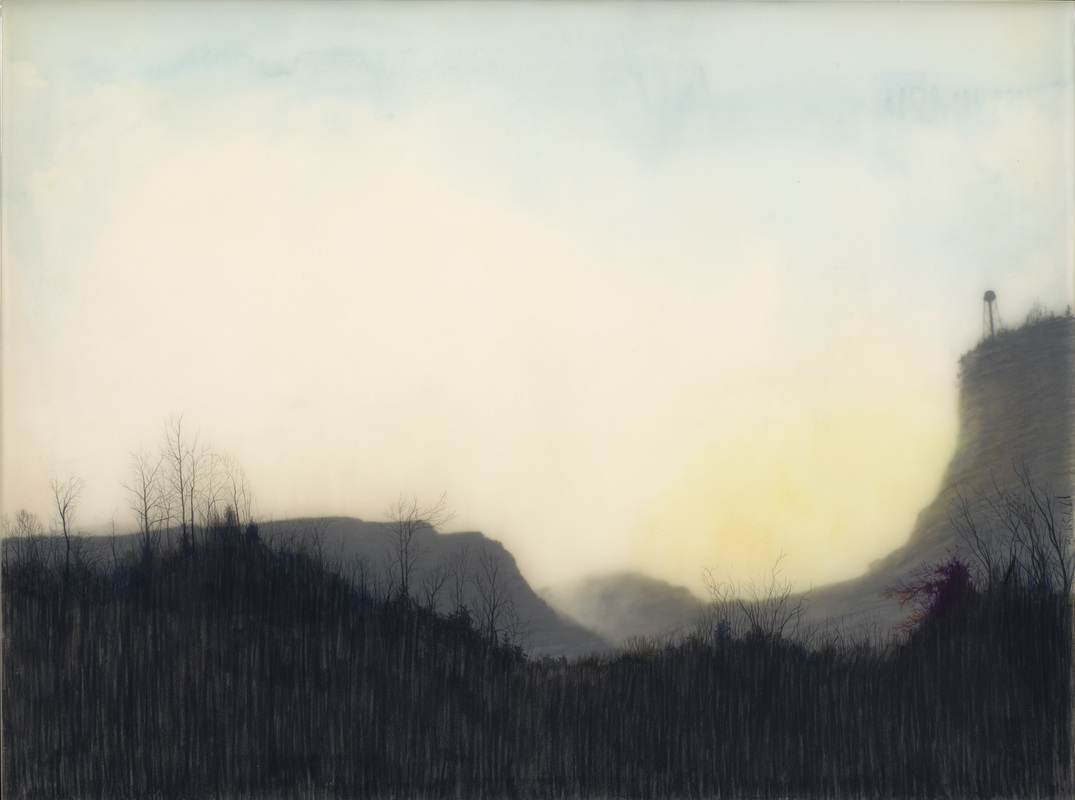
Brooks Shane Salzwedel – Cliff with Misplaced Water Tower. graphite, tape, coloured pencil, spray paint on mylar and resin on panel, 18 x 24″ 2013
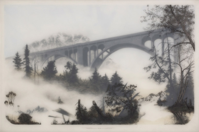
Some of his work consists of mountainous landscapes that look like a scene from the winter after a forest fire. In others, bridges, trestles, and partially dismantled towers loom out through the fog. Floating nests of broken trees emerge from polluted clouds. Monumental bones merge with snow-covered mountains, or drift through polluted skies.
Brooks Shane Salzwedel – the Pass. Graphite, tape, mylar & resin on panel, 25.5×37.5″, 2012
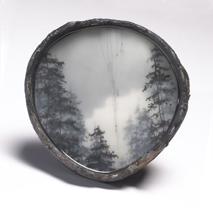
While some of Salzwedel’s work is quite large, as much as 72.5″ across, most of it is on a more intimate scale. Going by his portfolio site, his more recent work is usually on small panels, about a foot square. He also occasionally creates miniatures in old pill boxes or using cross-sections of old pipes as frames, like tiny lockets, which makes sense as he mentions vintage daguerrotype photos as an artistic inspiration.
Brooks Shane Salzwedel – Tangled 2007
His technique has evolved over time, but in essence his process is to draw on layered sheets of paper with varying opacities then coat the finished piece with resin. He layers sheets of Mylar, Duralar, and acetate, drawing on each layer with combinations of graphite, coloured pencil, or charcoal, sometimes adding watercolour paint, spraypaint, or ochre-tinted adhesive tape. The varying opacity of each layer creates a sense of depth that is finally sealed in place with a coating of resin. The overall collage/ assemblage effect is vaguely reminiscent of a diorama or shadow box – but not the sort of collage in say, the work of Joseph Cornell, but more graphic, almost like layered animation cels.

Brooks Shane Salzwedel – Ship Wreath. Graphite, tape, color pencil on mylar on panel, 16×12″ 2013
Interestingly, Salzwedel developed this technique exploring different media while still in art school. It’s pretty unusual to see artists taking advantage of the translucent effects of materials like drafting paper or mylar – the only other one I can think of off the top of my head is the Canadian artist Betty Goodwin. When I was in art school a lot of people were inspired by Goodwin to work on drafting mylar but the idea of using it to create actual planes of depth and then seal them in place like Salzwedel does is completely novel to me. There’s a finality to it that’s very appealing.
I would say that my practice is primarily about drawing, but in the end I use a variety of different mediums. Once I’ve dipped the piece in resin, there’s no going back. I can’t change anything, which is sometimes annoying. Sometimes I want to go back and modify an element, but my mistakes are trapped in the resin forever.
– translated from French, from an interview with Thomas Lapointe in Entre
Salzwedel describes his work as a tension between natural forces and the built world, especially urban development, and explains that in part his use of extremely toxic resins is meant to reflect pollution and degradation. In the end, though, the landscapes are of his own invention, populated with hypothetical relics of human existence. The resulting work is simultaneously intimately ephemeral, and removed from time – like a scene from a possible future, trapped in amber.
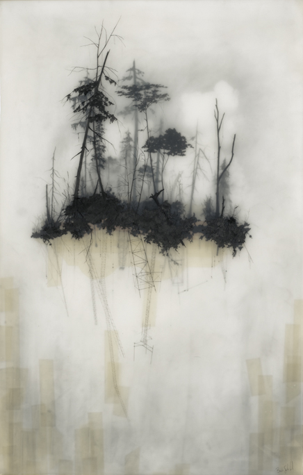
Brooks Shane Salzwedel – Reflection. 2010
You can see more of Salzwedel’s work on his portfolio website or on his Facebook page. If you happen to be in the Okland, CA area, he currently has a show (until Jan. 18, 2014) at Johansson Projects on Telegraph & 23rd.
Share this:

The art world is a pretty exciting place but it’s not too often you hear about an artist having to flee for his life with the Zimbabwean army on his heels. I wrote about Petro Wodkins before, but to quickly recap he’s an installation artist/ prankster who likes to shake things up.
Here’s the email I got from his assistant, Tala:
Hi Ian!
Last week the Russian artist Petro Wodkins barely made it alive out of Zimbabwe after a daring art stunt.
Wodkins, who previously has been behind a series of art happenings covered by global media, well you know about it – you’ve written about him, had been invited to a workshop in Zimbabwe, but instead choose to put up a HUGE golden statue of himself singing a weird song mocking Mr Mugabe. The government reacted with brute force, pulling down the statue, both police and army was involved in trying to arrest Petro who managed, by using different cars, evade the pursuers and escape to Zambia.
Since filming in Harare is forbidden everything had to be filmed with hidden cameras.
Today Petro is releasing the song and this filmed material for the first time!You can see the whole story HERE!
Petro are quite upset and buisy planning for next strikes right now, but he likes you and asked me to get in touch to offer you one of very few interviews about this.
You just can’t make this stuff up. As Wodkins said, “If art can make people dance, sing and laugh in the face of a dictator this is reason enough for me to keep doing art, this and the face of a furious dictator”. Um… OK. More power to you, Petro Wodkins. I salute you!

Petro Wodkins – My Gift to Mugabe
Share this:

First post of the new year – happy 2014, everyone!
Lately I’ve been on something of a paint marker kick, and have tried out a few different brands. I’ve found that I prefer latex markers as enamel markers tend to soak into my sketchbook and leave weird stains all over, and they totally stink of xylene. So yes, latex markers get my thumbs-up. My biggest complaint about most of the brands I’ve tried is that when you draw with them in your sketchbook, after a couple of weeks a ghost impression starts showing on the opposite page. If you like to draw on both sides of the page as I do, you have to get used to that dusty imprint of the facing page. This is not the case with Molotow markers, though. I’ve been using Molotow 127 HS markers – they’re not that pricy & the opacity/ coverage is fantastic (even white), brightness of the colour is great, they have excellent permanence (100% UV resistant) and they seem good for not getting clogged up. Even better, they’re refillable and you can replace the nibs. Basically, they are much easier to work with than any other brand I’ve tried. I’ve mostly been working with the 2mm nibs which sound pretty fat for a small sketchbook but they are rigid & keep their point fairly well, so you can get a surprising amount of detail out of them once you get used to them. Buy some, you won’t regret it.

I’ve mentioned before that like to use Moleskines because they hold up to a pretty fair amount of abuse. You can get Moleskines with a more absorbent cold press finish (watercolour paper) or the version I go for that’s more hot press finish (smooth). If you like to beat the heck out of your sketchbooks and are looking for a nice pocket-style book, you should get a Moleskine for yourself.

