Rethinking the Colour Wheel
When we’re taught the colour wheel in art class, we learn the 3-primary colour wheel. Red, yellow, and blue are the primary colours, orange, green, and violet are the secondary colours. This is where we get complementary (opposite) colours as I explained in my post about simultaneous complementary contrast with greys.
The thing is, there’s a bit more to it than that. The 3-primary colour wheel is how to mix colours. If we are talking about how we actually see colours, there are four primary colours, not three.

The 3-primary colour wheel was developed by Goethe in 1810 (yes, the guy that wrote Faust was also a scientist, lawyer, linguist, poet, etc.).
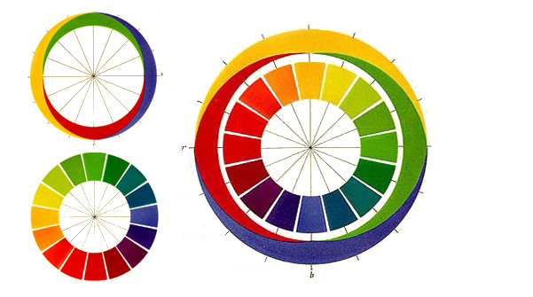
The 4-primary colour wheel was first published in 1878 by Ewald Hering, a German physiologist specializing in colour perception. I know, what’s with the Germans and colour? Anyhow, I digress.
Instead of seeing complementary colours as in the 3-primary wheel, Hering described “opposing” colours: blue and yellow; red and green, and black and white. Essentially, this is based on the physiology of visual perception.
Cone cells in your retina see colour. Rod cells see light and dark. Although people usually talk about cone cells seeing red, green, and blue, they actually respond to short, medium, and long wavelengths in the colour spectrum. Short wavelengths are towards violet in the spectrum, long wavelengths towards red.

So that’s the spectrum as we see it, the “visible spectrum”. A thin wedge between gamma rays(10-14 nanometers), x rays, and ultraviolet on the short wavelength end, and infrared, radar, FM, TV, shortwave and AM (104 meters) on the long wavelength side. Not much to work with, but somehow we make do.
Now, back to physiology – we actually do see red, green, and blue (for the sake of simplicity) but our brain filters input from the cone cells.
Here’s an excellent explanation of how this works from Jason Cohen:
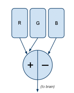
Filter #1 works like this:
Explanation: The more R there is, the more positive the signal; the more G, the more negative the signal. If there’s relatively equal amounts of R and G — whether neither of both, a little of both, or a lot of both — the signal is zero.
This explains why there’s no “greenish-red.” …
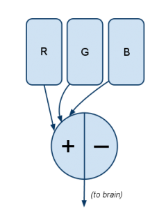
Knowing that blue/yellow is the other opposite pair, you can probably guess what (Filter 2) is:
Here blue (B) is opposed with a combination of both the R and G channels. The R and G cones are stimulated either when there’s literally both red and green light (like when a CSS coder turns on both red and green as
#FFFF00to create yellow), or when 570nm light (yellow, on the visible spectrum) stimulates both R and G cones.Filter #3 is simple:
In short, it measures the quantity of light without regard to what hue it is. This is “how bright,” or “luminance” in color-theory parlance.
And magenta? It comes from full R and B with no G, activating Filter #1 full-positive, Filter #2 at zero. It’s not a physical wavelength of color, it’s just a combination of outputs from two filters.
– Jason Cohen via A Smart Bear
One nitpick – Cohen is incorrect in saying “This explains why there’s no “greenish-red.” Red with a little bit of green is brown, or when desaturated with white, it is grey. This is true of all complementary colours – or, in the 4-primary system, opposing colours. It’s a lot more complicated than we need to go into here but essentially the filtering system is a good description of colour perception and how the 4-primary system makes more sense physiologically.
Interestingly, the 4-primary colour wheel is often used in industries that work with colour a lot such as paint manufacturing, as it more accurately decribes colour as the eye naturally perceives it. For example, Hering’s 4-primary colour wheel is the basis for the NCS (natural colour system), the default colour reference for Sweden, Norway, and Spain.

Ewald Hering’s 4-primary colour wheel showing warm and cool colour


If I am remembering correctly, we were actually taught the 4-color wheel in school. The 3-color wheel doesn’t make much sense to me.
Even in primary school? My kids are still taught the red, yellow, blue system along with “what do you mix to make orange” approach. That’s what I was taught, too. I didn’t encounter the 4 primary system until relatively recently, myself, though I’ve been using for years without realizing it. Maybe it would be different had I studied design instead of fine art & art education.
For people who are tetrachromats and naturally see more greens and yellows in the world, THANK YOU