R.I.P. Adrian Frutiger, 1928-2015
Adrian Frutiger, one of the best-known typeface designers of the 20th century, has died. His work includes such ubiquitous font families as Univers, Avenir, and of course, Frutiger. We’re talking a guy whose career started in the era of metal press and he continued to be extremely influential throughout the advent and eventual dominance of digital typography. He’s one of the fathers of Swiss design, one of his fonts (ASTRA-Frutiger) is used on all Swiss highway signs. I could go on and on.
His work is so well-known that you’ve probably been looking at it your whole life without knowing it.
Ondine (1954) President (1954) Meridien (1955) Egyptienne (1956) Univers (1957) Apollo (1962) Serifa (1967) OCR-B (1968) Iridium (1975) Frutiger (1976) Glypha (1977) Icone (1980) Breughel (1982) Versailles (1982) Linotype Centennial (1986) Avenir (1988) Westside (1989) Herculanum (1990) Vectora (1990) Linotype Didot (1991) Pompeijana (1992) Rusticana (1993) Frutiger Stones (1998) Frutiger Symbols (1998) Linotype Univers (1999) Frutiger Next (2000) Nami (2006) Frutiger Arabic (2007) Frutiger Serif (2008) Neue Frutiger (2009) Univers Next (2010)
I really can’t even begin to describe the breadth and influence of his work in any meaningful way other than to say just go read the wikipedia entry, it’s a list of achievements that is nothing short of astounding: https://en.wikipedia.org/wiki/Adrian_Frutiger
Even his lesser known work is mind-blowing. This font is till incredibly on point in 2015… “The CGP typeface (first called Beaubourg) used in the Centre Georges Pompidou from 1976-1994 is by Hans-Jörg Hunziker and Adrian Frutiger” (description & image below couretesy Luc Devroye)
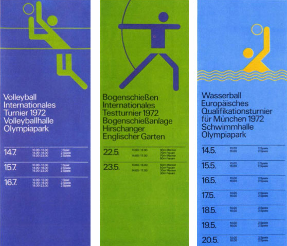
On an interesting side note… Frutiger did the type design for the 1972 Munich Olympics, using his typeface Univers, with graphics designed by Otl Aicher.
Aicher also designed the typeface Rotis, the official typeface for the City of Montreal.


