GREYNOTGREY

  • Home.
  • About.
  • Portfolio.
  • RSS Feed.

 Probably the best art blog ever

Page 43

Dino Valls

June 15, 2012 · in Contemporary Art, Painters

Dino Valls is pretty intense. This self-taught Spanish artist was born in 1959 & completed a degree in Medicine and Surgery in 1982 … and gave it up to be a painter. His medium of choice is the notoriously difficult egg tempera, which he uses to create incredibly detailed images referencing religious art, medical textbooks, and his own psychological landscape suffused with the luminosity and richness of colour of the masters. As hard as it may be to believe, he does not work from models. A lot of people see sadism and torture in his work, but for anyone that has taken the time to leaf through surgery and pathology textbooks or seen paintings of the Holy Martyrs, the imagery is familiar. Less torturous than taxonomical, Valls has essentially created his own private genre. The overall effect is quite terrific, in both senses of the word.
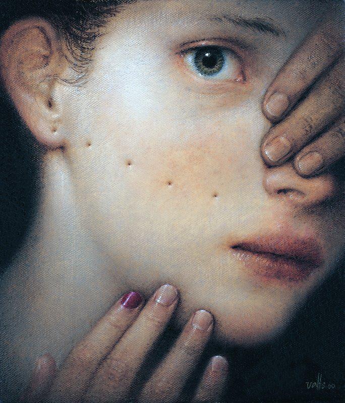
Dino Valls, "Forabilis", 2000

Dino Valls, “Forabilis”, 2000

(…) he is a Spanish representative of a new and intriguing kind of art which is beginning to subvert some of the most cherished assumptions of 20th century Modernism, and which, in addition, radically challenges established notions about what is, and is not, avant-garde. (…)
In Valls’ paintings it is the psychological situation itself which is the subject. His figures, not painted from life as I have said, earlier, are essentially vessels, containers for emotional events, which they hold up for our inspection rather as we look at liquid held in a transparent vessel.
(…) His figures now confront us in their own right. What they embody is something which does not have struggle to be modern or contemporary as these terms are usually defined. These are not comforting pictures. They bear no resemblance to a good armchair, which is what Matisse said a successful painting ought to be. They impress because of their skill, and the delicate poetry which informs them. All the same, what is true memorable about them comes from elsewhere: It is the accuracy with which they reflect the uncertain spirit of our times. What makes this impress as much as it does, is not accuracy alone, but the intellectual sophistication with which what the artist has to say is communicated. At a time when we have almost forgotten what good painting can be like, what it can in fact do, here are the products of an artist who is fully conscious of his own powers.
– Edward Lucie-Smith

Dino Valls - Introitus I - II - III - 2000

Dino Valls – Introitus I – II – III – 2000

Valls’ work is, in many instances NSFW, but if you can peruse an excellent selection of fairly large images in slideshow format on his site.

Dino Valls - "Lectio", 2006

Dino Valls – “Lectio”, 2006

Share this:

  • Tweet
  • More
  • Share on Tumblr
  • Click to share on Reddit (Opens in new window) Reddit
  • Click to email a link to a friend (Opens in new window) Email

New Artwork – Ian Rogers

June 14, 2012 · in Calligraphy and Lettering, My Sketchbook

So as those of you who visit regularly probably realize, I like lettering and calligraphy. After checking out a pile of videos of Luca Barcellona at work, I felt all inspired so I sketched out one of my favourite quotes in Illustrator.
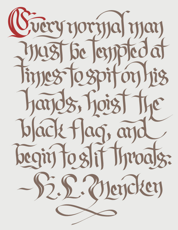
H.L. Mencken - Every normal man must be tempted at times to spit on his hands, hoist the black flag, and begin to slit throats.

Share this:

  • Tweet
  • More
  • Share on Tumblr
  • Click to share on Reddit (Opens in new window) Reddit
  • Click to email a link to a friend (Opens in new window) Email

Luca Barcellona

June 13, 2012 · in Branding and Logo Design, Calligraphy and Lettering, Illustrators, Typography and fonts, Video

Luca Barcellona is a really incredible calligrapher.

He has his own studio in Milan, where he works as a freelance graphic designer and calligrapher. Letters are the main ingredient of his creations. He teaches calligraphy with the Associazione Calligrafica Italiana and holds workshops in several European cities. The means of his work is to make the manual skill of an ancient art as writing and the languages and instruments of the digital era coexist.
– Luca Barcellona

I first came across Barcellona’s work through his work for the streetwear brand, Carhartt. Having worked with sport and streetwear garment brands myself, I know the multi-brand approach well – many labels use dozens of different logo treatments in any given category and season. Barcellona’s creativity and skill is really showcased in the range and fantastic execution of this series.

Luca Barcellona - Carhartt logo treatments

Luca Barcellona – Carhartt logo treatments

When I was very young, mother made me play this game in the car so that I could recognise and read the store signs. I was really fascinated by the letters. So big, so many colours, and each sign so different.   … Letters are the codes we use to communicate. A phoneme becomes a graphic sign, and the letter designer’s job is to give those signs form, or to use the right one. As far as appearances go, it might seem like a minor discipline that most people ignore, but everyone benefits from it somehow or another. In a society founded on the image and on communication, letters are fundamental.

– Luca Barcellona: Letters are Languages

Barcellona is a real master calligrapher, which in many ways seems like something of a lost art – it’s refreshing to see hand-made type coming back in style but a real calligrapher with an understanding of branding is a real rarity these days.

Luca Barcellona’s website is lucabarcellona.com – that the white text on a vivid red background is nearly illegible seems a bit counter-intuitive, but it’s a great starting point to seeing more of his work.

Share this:

  • Tweet
  • More
  • Share on Tumblr
  • Click to share on Reddit (Opens in new window) Reddit
  • Click to email a link to a friend (Opens in new window) Email

Laëtitia Devernay

June 12, 2012 · in Illustrators

The French illustrator Laëtitia Devernay is a graduate of the Art Academy in Strasbourg, and the National Academy for Applied Arts in Paris. She also works as a graphic designer, and teaches illustration for children. She may be focusing on her illustration more in the near future.

Devernay recently won large at the 2012 V&A illustration awards for her 3rd book, “The Conductor” – Book Illustration Award and Overall Winner 2012. This book without words “tells” the story of a conductor who transforms a forest into flocks of birds. Devernay’s use of line and pattern expresses a playfulness that is quite enchanting.

Laëtitia Devernay "The Conductor"

Devernay has won plenty of awards before, including Teatrio’s International Illustration Competition “A Fabulous Yellow” (Venice), the 3rd CJ Picture Book Award 2011 (Korea), and an honorable mention at the Bologna Ragazzi Award 2011. Not bad, especially considering she’s only 29 at the time of the V&A awards – I imagine we’ll be seeing more from her for a long time to come. In the meantime, you can check out her blog or buy a copy of the Conductor of your very own.

Share this:

  • Tweet
  • More
  • Share on Tumblr
  • Click to share on Reddit (Opens in new window) Reddit
  • Click to email a link to a friend (Opens in new window) Email

Alexandra Levasseur

June 11, 2012 · in Contemporary Art, Painters

As I often do, I was browsing through BOOOOOM today. There, I saw some work by Alexandra Levasseur and fell in love. Levasseur is a native of Shawinigan, Quebec, and now lives & works in Montreal.
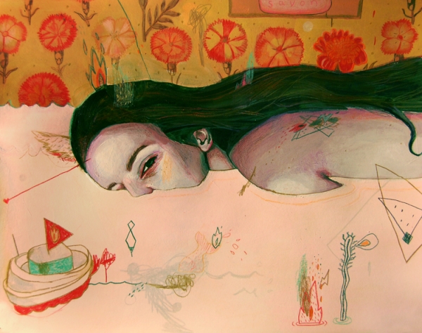
Alexandra Levasseur

Her tagline is “I prefer drawing to talking”. I can respect that.
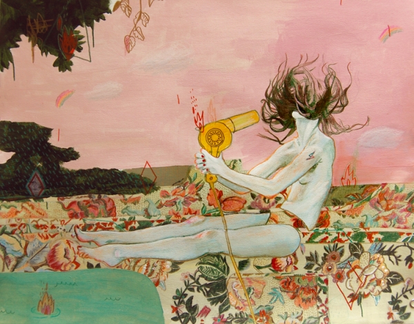
Alexandra Levasseur

Levasseur has a show on until June 30, “Diary of Seasonal Emotional Transmutations” at Glamort – Tattoo and Art Gallery (4411 Notre-Dame W., Montreal).
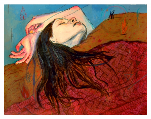
Alexandra Levasseur

Share this:

  • Tweet
  • More
  • Share on Tumblr
  • Click to share on Reddit (Opens in new window) Reddit
  • Click to email a link to a friend (Opens in new window) Email
← Previous 1 … 42 43 44 … 52 Next →

Search

Top Posts & Pages

  • Jonathan Yeo
  • Franklin Booth
  • Impossible Objects
  • Max Ernst - Europe After the Rain II
  • Robert Rauschenberg - Monogram
  • Jeff Wall - Dead Troops Talk
  • Cassius Marcellus Coolidge - A Friend in Need
  • Humour in the Work of Marcel Duchamp
  • Chuck Close - Francesco I
  • Wolfgang Beltracchi - Master Art Forger
Want Grey not Grey in your inbox?
Enter your email address:


BEST GIFT IDEA EVER!

Abecedary - Ian Rogers
ebook (iBook format) $2.08
Soft Cover $33.61
Hard Cover $38.88

* all prices USD + shipping & tax

All work shown copyright of respective creator or owner, otherwise Copyright © 2025 GREYNOTGREY

Powered by WordPress