James Rosenquist is an American painter who was one of the artists identified with pop art, and is still a working artist. If you suspected that he has a large and legendary body of work, you’d be absolutely correct.
They (art critics) called me a Pop artist because I used recognizable imagery. The critics like to group people together. I didn’t meet Andy Warhol until 1964. I did not really know Andy or Roy Lichtenstein that well. We all emerged separately.
– James Rosenquist
Trained as a billboard painter (back when such an occupation existed), Rosenquist applied his technique and sensibility to collage-like juxtapositions tending toward the enormous. Take the painting below, “I Love You with My Ford”, measuring 6 feet, 10 and 3/4 inches by 7 feet, 9 and a 1/2 inches. Rosenquist once mentioned that he uses images of canned spaghetti in his paintings a lot because he ate a lot of it early in his career. I wonder how often these kind of recurring images have such mundane reasons behind them in the work of famous artists…

James Rosenquist, “I Love You with My Ford” (1961)
Rosenquist’s juxtapositions of images aren’t limited to simply plopping one image on another; he works with his source images to create quite complex compositions – take this portrait of Marilyn Monroe created shortly after her death; the image is cut, inverted, reversed, and has the Coca-Cola logotype running through it, nodding to Marilyn’s commodification and the commercialised fracturing of her identity into prepackaged units.

James Rosenquist – “Marilyn” (1962) Oil and spray enamel on canvas 93 x 72¼ inches
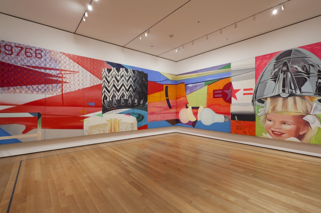
The main reason I decided to write about James Rosenquist today is that I stumbled across a truly excellent interactive section of the MoMA website: JAMES ROSENQUIST: F-111 .
F-111 a really remarkable piece, essentially a multi-panel painting of an experimental aircraft. It is a condemnation of the military industrial complex at the height of the Vietnam war, that is no less relevant today than it was when he began painting this 85 foot long masterpiece in 1964.
I remember thinking, How terrible that taxpayers’ money is being spent on this war weapon that is going to rain death down on some innocent population halfway around the world for some purpose we don’t even understand, while at the same time this warplane is providing a lucrative lifestyle for aircraft workers in Texas and on Long Island…I asked myself…Why is this new plane, the F-111, being built? For defense? Defense against what? When you think of the conflagrations and all the money spent on obsolete weapons that could have gone into health research, hospitals, and public works, it was such misguided thinking. So, one idea I wanted to include in this painting was about the lapse in ethical responsibility. We were paying income taxes for what seemed to be an already obsolete fighter plane, for a war machine that was this monstrous vacuum cleaner for taxes. Under the Johnson administration, we were being subjected to an even bigger vacuum cleaner: the Vietnam War.
– James Rosenquist
The interactive website is quite ingenious in its use of interface to allow the user to explore the different elements of the painting, complete with explanations from the artist as to what he intended, and social media links so users can comment on individual sections, the work as a whole, engage in discussions on the site itself or link back to a variety of social media platforms. This really one of the best interactive sites for an art museum I have ever seen, and is an excellent way to get a better understanding of such a remarkable piece of art.
If you would like to learn more about this period of Rosenquist’s work, James Rosenquist: Pop Art, Politics, and History in the 1960s by Michael Lobel is a great place to start.
“James Rosenquist: Pop Art, Politics, and History in the 1960s provides a new perspective on the work of Rosenquist, a key but neglected artist of the Pop Art movement. Michael Lobel, who bases his study on detailed contextual research as well as close visual analysis, highlights the themes of obsolescence, novelty, and ephemera in Rosenquist’s images and effectively relates the artist’s interests to broader questions of consumer culture and urban planning in 1960s New York. Clearly written and thoroughly engaging, this book makes a significant contribution to our understanding of the artist and of Pop Art.”
-Cécile Whiting, author of Pop L.A.
My favourite logo design EVER is the 1978 redesign for Kentucky Fried Chicken by the design agency Lippincott and Margulies.

Amongst many, many other iconic projects, this agency designed the classic logos for Betty Crocker & Chevron, the classic Campbell’s soup can immortalized by Andy Warhol, and they created the white swoosh brand for Coca-Cola.
In the 1940s, our founder Gordon Lippincott coined the term “corporate identity”.
He proposed that companies brand themselves with the same thoughtfulness and creativity typically reserved for their products.
– Lippincott.com
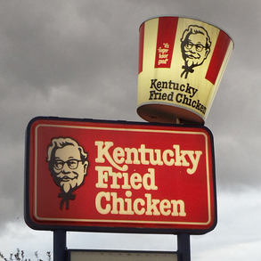
Lippincott & Margulies designed the original Kentucky Fried Chicken branding in 1952, and revisited the brand in 1978, which, to my mind, is the “classic” brand. True, this is the version I grew up with, but the departure that makes this brand redesign significant is that it was the first in which the face of Colonel Sanders was used separately as a logo from the “Kentucky Fried Chicken” logotype – in some applications, at least. The drawing style was also made less realistic, more stylized, and more iconic, creating a graphic presence with much stronger impact. In effect, by elevating the face of the Colonel to iconic status, it was able to represent the entire Kentucky Fried Chicken brand by itself. It was sometimes used by itself on backlit signage to indicate a Kentucky Fried Chicken store in a food court setting, on container lids and other packaging, and in a few instances, glorious illuminated chicken-bucket-shaped watertowers that would glow in the night along city highways, the immediately recognizable Colonel’s face like a beneficient deity of comfort and hominess. Are you hungry, weary traveller? Then eat of my chicken.
The Kentucky Fried Chicken logo was revisited in 1991 with its “new look” horizontal pseudo-gradation and the usage of KFC instead of “Kentucky Fried Chicken”, reputedly to disguise the “fried” aspect. Clearly the designers were idiots, but if you own a fried chicken company and are worried about the word “fried”, sell the company to someone that appreciates the brand heritage and isn’t such a bottom-line stooge. I was unsettled. When the Colonel’s face was redone to look like some kind of grimacing mockery of itself in 1997, angled like a reeling drunkard, I was horrified. The 2007 redesign looks like a crazed Vladimir Lenin in a wig and racing-striped dirndl.
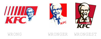
When a brand is created focusing on reassuring, homey, “classic” qualities and is completely redesigned to be “fresh and edgy”, the result reeks of insincerity – and destroys all the hard work of building a “classic” brand identity that preceded it. Gaze upon the face of the 1978 Colonel, designers, and take heed.
One strange thing I’ve noticed is that while KFC is generally very consistent in its branding, one instance of the 1978 Colonel logo survives – the embossed lids of the small salad containers, at least here in Quebec. It seems strange that this one thing has remained unchanged for nearly 25 years. I’ve contacted corporate to see if there is a reason, and I will update this article when I receive a response.
One of my friends recently noted that when visual artists incorporate text into their work, choosing the wrong font cheapens the overall impression.
The first was a video work of majestic nature projected on an entire wall, and I was totally distracted by the use of comic sans for the captions at the bottom. This was a painter crossing over into other areas, which is great, but that font made no sense…
– Chris Healey (the ALP Blog)
This got me to thinking – what is a “bad” font, and why is comic sans one of them? People love to hate comic sans, not just because of its ubiquity and subsequent misuse, but because it’s poorly crafted. Its weights are uneven, and its kerning is so poorly done that legibility suffers. Reading an entire page of comic sans is like trying to walk briskly through the ball pit at Ikea. There are options, of course – if you want a rounded font there’s lots of well-crafted ones like Futura round SG, or if you want to stick to Microsoft fonts, Arial Rounded MT. The important question to ask yourself, however, is whether comic sans is even appropriate.
That typography and font choices communicate meaning is one of the core principles of graphic design, as Carolyn Knight and Jessica Glaser point out in a Smashing Magazine article discussing “the interaction between the look of type and what type actually says” :
The role — and, in fact, the obligation — of the designer in establishing a tone that adds meaning to the verbal message is a matter of regular debate. Many graphic designers and academics argue that the designer has a responsibility to add “flavor” to their work, not only helping to convey and enhance meaning, but also making the message enjoyable and encouraging to “read” and also memorable.
– When Typography Speaks Louder Than Words
In this example, we have an Orange County, Florida squad car on the left, and a Los Angeles squad car on the right.
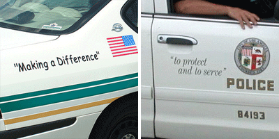
The implied insincerity communicated in both examples by a shocking misuse of quotation marks aside, the LA example is clearly superior. The impression it gives is sophisticated yet casual; there’s a reassuring early 60’s-esque quality to the font that makes you think of the police as a homey kind of institution, shades of the Andy Griffith Show. The Orlando example, on the other hand, could be written on the awning of a daycare and not look out of place. It’s not just inappropriate – it’s disrespectful of the importance of city police, and of their relationship with the community at large. Why, the designer that came up with this must be some kind of TRAITOR.
Well, maybe that’s going too far.
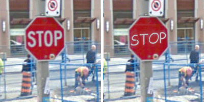 There’s also the question of legibility – imagine if a city decided to use comic sans for its traffic signage instead of Highway Gothic. Hideous AND hard to read. Of course, legibility isn’t the only concern, but it’s often an important one – not just in traffic signs or body text, but in branding.
To my mind, the strongest argument against using comic sans in any situation is that it’s simply trite. While it may be conventionally appropriate to uses like play areas and daycares, the font is so overused that it has become the equivalent of Chinese restaurants that use faux brush script on their signs; the message comic sans gives is “this place is lame at best”.
So there you have it – next time someone says, “I know designers hate comic sans, but why?”, you can simply explain that comic sans is a sloppy, hard to read, insincere font that even where hypothetically appropriate is so overused it will make anything you use it for look like a joke.
Jarek Puczel (Jarosław Puczel) is a Polish painter whose take on representational realism is to bring focus to the signs and signifiers of meaning in a scene by rendering the rest of the scene as flat expanses of colour. The overall effect is oddly intense, and very evocative.

(A) presented object belongs to something bigger, that determines or expresses it. Simultaneously, art form engages it in a specific game of illusion. Something belongs to the world of matter, most often a sensual element, like hair or flowers, and something is already a sign of belonging to a larger, undefined space.
– Artist’s statement

As the French music composer Claude Debussy once said, “Music is the space between the notes”.
I think that also applies to Puczel’s work.
I’ve been seeing a lot of Sonnenzimmer around the interwebs, for good reason – their work is really fantastic. The Chicago-based duo, Nick Butcher and Nadine Nakanishi, teamed up in 2006 to create (amongst other things) pleasantly minimalist posters for a variety of purposes. While all their work is very good, their music posters really tickle my fancy.
Here’s a couple of samples – if you have the time to peruse their site, I strongly encourage you to do so.
EDIT (June 8): Nick and Nadine just let me know that they are currently working on a kickstarter-funded limited-edition book project, “Warp and Weft: Poster Construction by Sonnenzimmer“. Look like a cool project!
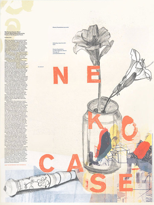
Sonnenzimmer - Neko Case poster, 2011
Poetry commissioned this poster for Neko Case‘s concert in conjunction with the opening of Poetry Foundation’s building. It was to function as a gig poster and broadside. A huge challenge printing an essay in 9 point type over the course of 350 posters, keeping it legible, integrating it with the image. With a still life in mind, that hints, through symbolism, at the text’s content, we found pop! We had a blast typesetting the rag. Good thing, the hyphenation zone worked out.

Sonnenzimmer - Throbbing Gristle poster, 2009
It’s a honor to make a poster for such sonic pioneers! We wanted this poster to reflect Throbbing Gristle’s harsh and epic music, yet still make it nice to look at. We improvised our entire way through this 5-color poster using discarded films from the Waiting Out The Rain Poster and some old painting scraps we had laying around. We just went color by color. The blob breaking out of the frame really sets this one apart from our more tightly constrained pieces. This poster was for the gig in the Logan Square Auditorium, Chicago.

