Most designers know about gestalt theory as it applies to art and design. Even if you’ve never heard of the term before, the principles of this cognitive theory explain how we perceive 2-dimensional compositions, and we use them every day even if only intuitively.
At its simplest, gestalt theory describes how the mind organizes visual data. The stronger the clarity of form, the more effective the design.
– Michael Tuck
Gestalt is a German term meaning “whole”, or “form”, and was originally developed as a theory of psychotherapy. In essence, how an individual derives an understanding of something based on the relationships of its parts. Its application for designers is in how it explains the workings of visual perception. Although opinions vary, I think that gestalt theory can be broken down into 4 major components: closure, continuance, similarity/proximity, and alignment.
 Closure is how we “fill in the blanks” – for example, in the image to the left, we see four circles framing a square. The square is completely implied, but we read it in much the same way as we can recognize a person’s face even if it is partially obscured.
This is useful in a number of ways – like using a dotted line to create a divider in a page layout without the heaviness of a solid line, or in using negative space in logo design like the arrow in the FedEx logo. It can also be used to establish groupings within a page layout, in the sense that strongly defined boundaries create an active negative space – if you have a darker background, it draws attention to your main layout; if you have a clearly defined boundary in one area, the adjacent areas will be defined accordingly.
 Continuance is how a viewer’s eye is drawn through a composition. The circle on the right grabs your attention first. Part of the reason is that it’s bigger, but also, it’s the direction you’re used to moving your eye across a page.As audiences in the western world read text left to right, top to bottom, it takes a bit of effort to guide a viewer’s eye and keep their interest. you can group all of your important information at the top left of a page, but there are other methods at your disposal, too.
 In this cutting-edge example (okay, it’s meant to be descriptive, not get an Oscar for graphic design), the circle on the right clearly takes precedence. To ensure that the most important elements in a composition attract sufficient attention, a designer has several tools at their disposal: shape, like an arrow, pointing hand, or angled layout grids implying perspective; text, such as call-to-action or descriptive phrases; design conventions, like making URL links stand out from copy with different colour or underlining.
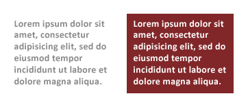
Another way to manipulate continuance (or change focus, draw the viewer’s eye, etc.) is through the use of colour, such as intensity and contrasts. Another example common in web design is to place text on a coloured panel, making it stand out more as in the example shown below. This also serves to illustrate another point – text on a coloured background appears slightly smaller – the font on the left and the font on the right are the same size. This is why, when reversing out text (making the text lighter than the background) it’s important to make it slightly bigger so it looks the same as other text on the page.

Poor sign gestalt
Similarity is how we categorize things in a composition, like how we visually recognize the difference between the figures from the background in a painting. Designers create a hierarchy of meaning in a page layout like titles, headers, and body text by using size, colour, and shape. Another important aspect of similarity is proximity. Close edge is especially important in letterspacing and implied continuity – bad kerning can transform “FLICK” into a profanity, for instance.
Close edge also affects how we recognize groups – touch evokes strong grouping, and overlap, the strongest. Too much space between phrases or not enough can change the meaning of a phrase, like the unintentionally hilarious sign on the left.
An excellent example of this element of gestalt design can be seen in drop-down menus – main areas of interest are presented as top-level navigation categories, and when the user clicks on one of them, the subcategories are displayed – an efficient way to display hierarchical navigation links that is easy to understand.
Similarly, If design elements are too similar to one another, a conflict arises in that it’s difficult for the viewer to recognize what they are being presented with. In laying out a form on a web page, for example, it is important to clearly separate blocks of information, such as grouping item description fields separately from name and address fields in a shopping cart interface so the user can readily identify information groupings.
Alignment is another way that elements are recognized as a group – 2 columns of left-aligned text are easier to recognize as separate groups than 2 columns of center-aligned text. Going a step further, using a design grid allows a designer to not only imply grouping but also to guide the viewer’s eye, and create a sense of harmony in a composition.
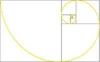 The most important element of alignment is using a design grid. The simplest version of a design grid is the rule of thirds, related to the golden ratio. If you aren’t familiar with design grids, the rule of thirds, and the golden ratio I strongly urge you to follow those links, they will make your life and work as a designer much, much better. If you take nothing else away form this article, at the very list understand design grids!
So there you have it, gestalt in design: Jedi mind tricks for the cunning designer.
I’ll be honest with you, I’ve had a pretty busy day. I didn’t get a chance to write about any of the artists or ideas I’ve been rolling around my chalky headbone over the weekend, but it’s all good; I have an ace up my sleeve. I really like street art. Murals, wheatpasting, stickering, stencils, bombing & burning, you name it. I even like tags if they have good placement and technique. Fortunately, I live in Montreal, Quebec – one of the best cities in North America for street art.

Zïlon – alley west of the main, north of prince arthur – now vanished
There’s a Spanish saying along the lines of “Kissing a man without a moustache is like eating an egg without salt”. I think a city without graffiti is like eating an egg without salt, too. No, I don’t have a moustache. But I do like to eat eggs.

Produkt, saint-dominique garage door – now vanished
There is charming immediacy to street art, but in a city where it is more-or-less tolerated artists will really push the boundaries in style, execution, and materials – the inventiveness of the Montreal street art scene never fails to impress me.
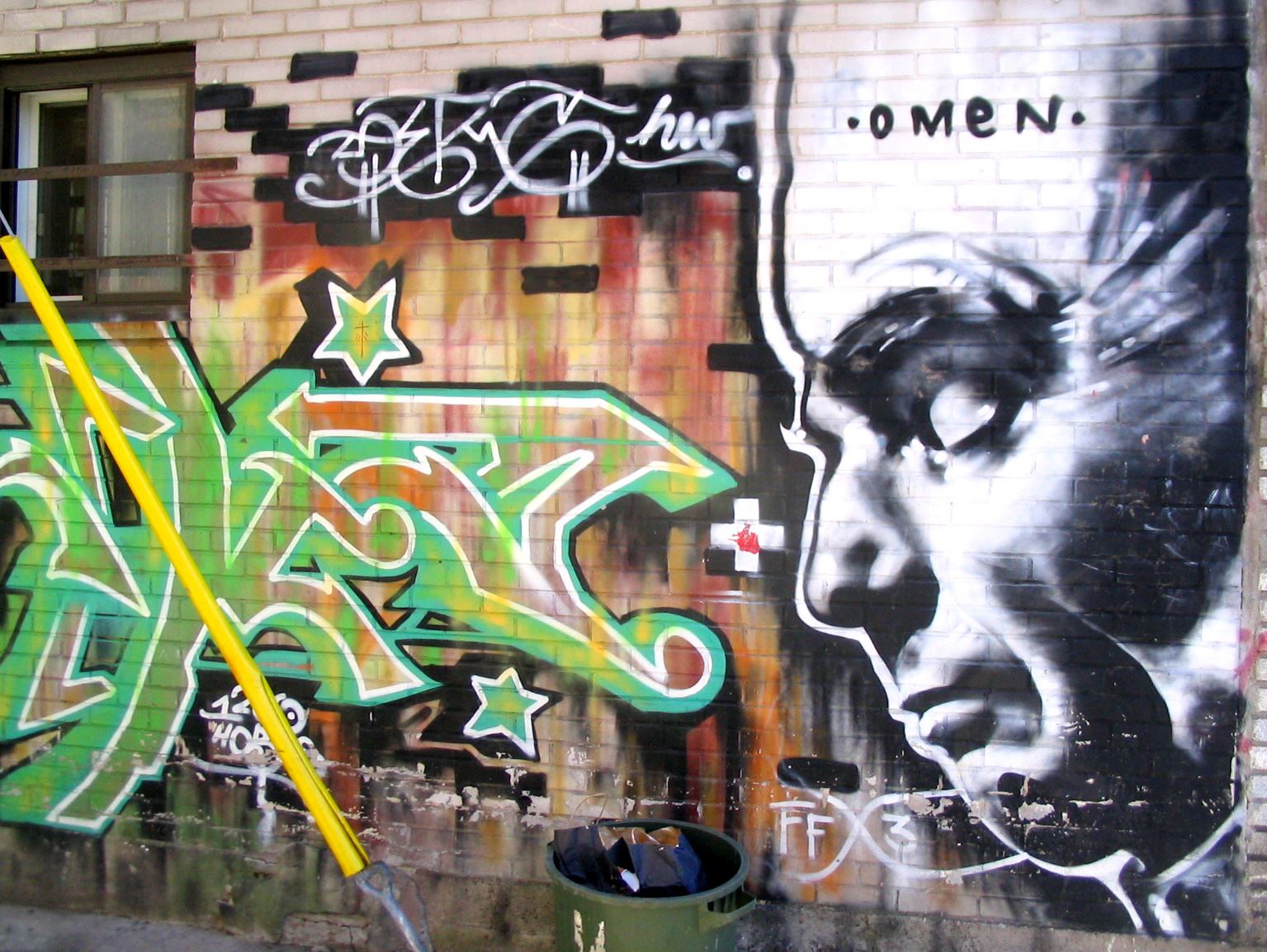
Omen – alley off the saint-viateur strip – now vanished
Anyhow, Zïlon, Produkt, and Omen are my three favourite Montreal graffiti artists, but there’s lots more work that I love de chez nous – Montreal is a pretty happening place for street art. Here is a selection of over 800 photos from my collection of Montreal street art that I’ve taken over the last 10 years (almost) – 2002 to 2011. I haven’t added in 2012 because it’s not over yet, and there’s always lots of fresh, new work every year.
You may have heard of James Jean and Kenichi Hoshine already – they are both prolific, well-known, and exceptionally talented artists. James Jean was born in Taiwan and raised in New Jersey. Kenichi Hoshine was born in Japan, and also raised in New Jersey.
Jean does a lot of varied work and is known for award-winning work in a variety of modes – illustration for many high-profile clients, his work in comics (cover artist for Fables and The Umbrella Academy), and his work for fashion clients such as Prada and Philip Lim.
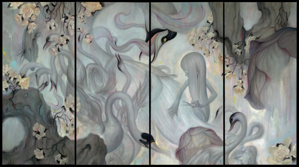
James Jean - Swan. Acrylic, Oil, & Pastel on Linen, 50 x 88", 2008
Hoshine, on the other hand, leans more towards fine art exhibitions, with dreamlike mixed media work mostly in oils, encaustic (wax mixed with paint & pigment) and charcoal.
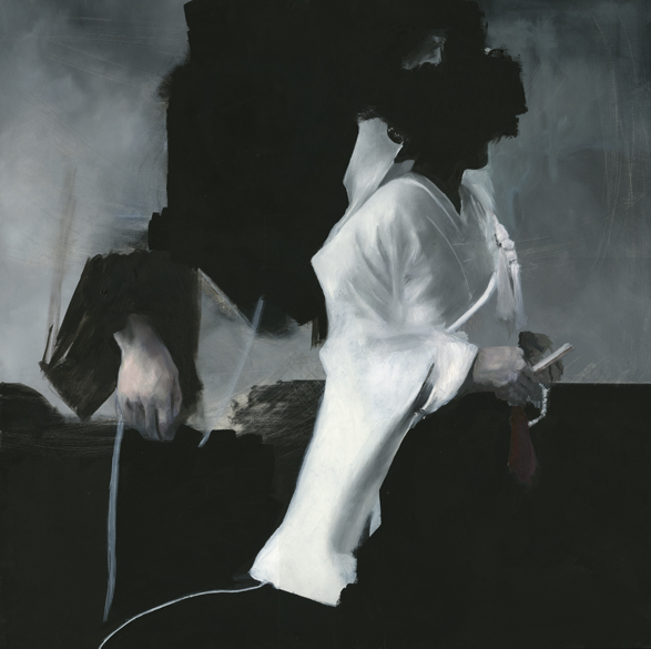
Kenichi Hoshine - Untitled, oil, Acrylic, acrylic emulsion on wood, 30 x 30 in.

Kenichi Hoshine - Untitled, charcoal, acrylic, and wax on wood, 22 x 22 in.
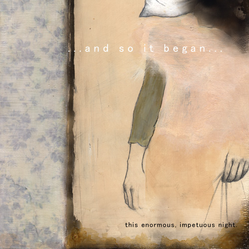
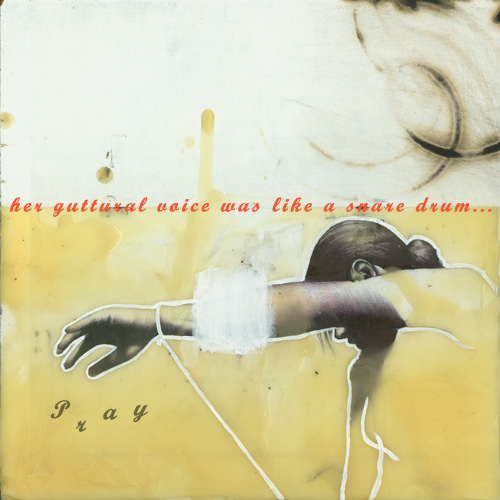
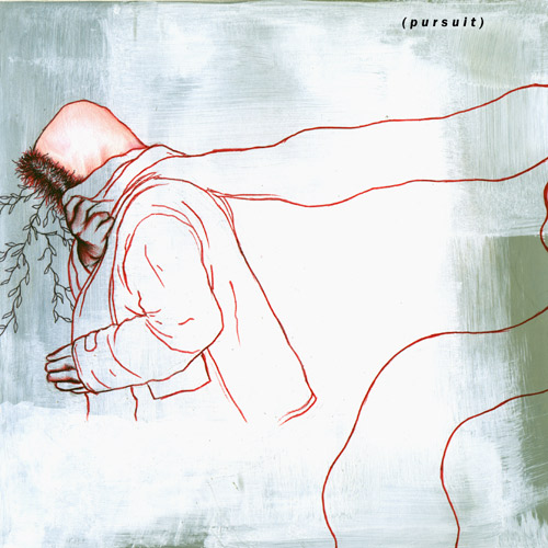
Jean was living in LA and Hoshine in NYC when they started their artists’ dialogue “A Polite Winter” in 2004. I know; 2004. The graphic design is sometimes dated, the freshness is now a museum piece. Well, not quite. This is such a great back-and-forth that it bears revisiting & holds up under scrutiny – there is playfulness and virtuoso skill in this exchange that is more than relevant today.
There’s something about an artists’ dialogue that is intriguing in of itself, whether collective work, collaborative work, or even the simple cadavre exquis approach. The sensibilities and approaches of each artist play off of one anothers’ imagery and concepts, creating a richness fraught with implied narrative, with lots of subtle inter-referential elements that may or may not be apparent to the casual viewer. The speed with which these dialogues unfold is also an interesting element – unlike a personal project that can develop slowly and be worked on and reworked for months or even years, for a dialogue to not simply fizzle out, the artists need to produce their responses more quickly, so there’s a freshness and immediacy that is an essential aspect of the work.
Without any further blah blah blah, I direct you to the dialogue: A Polite Winter. I am including only a small selection below as you really must visit the site to see the work in its “native” context. Enjoy!

This TED talk by Sunni Brown raises some interesting points regarding doodling – long thought of as a sign of a distracted, disengaged, or frivolous mind, it turns out that doodling represents a much more complex, creative, and innovative mindset.
Studies show that sketching and doodling improve our comprehension — and our creative thinking. So why do we still feel embarrassed when we’re caught doodling in a meeting? Sunni Brown says: Doodlers, unite! She makes the case for unlocking your brain via pad and pen.
– http://www.ted.com
I’m sure that by now most of you have seen this wonderful lecture on creativity by John Cleese, but you haven’t, you absolutely must. It’s fascinating, insightful, and will quite simply make you a better person. Normally I’d be joking when saying that, but in this case I am categorically not – though I have not abandoned my sense of humour, of course. The importance of a sense of humour will be clearer after you watch this instructional short film:
Should you be disinclined to watch a 36 minute video on youtube, here is a text transcript. The merest snippet:
“Because, as we all know, it’s easier to do trivial things that are urgent than it is to do important things that are not urgent, like thinking.
And it’s also easier to do little things we know we can do, than to start on big things that we’re not so sure about.”


