Post Roundup – the Book of Faces Edition II
This week’s topics: Women in Street Art, Colour Use in Marketing, Vintage Cookbook Illustrations, the Psychology of Over-Exposure to Art, a New Show by Jenny Holzer, and Scientific Illustration of Ugly Extinct Creatures as Body Art. Whew! It’s not every day you get street art, colour theory, vintage illustration, psychology, & art news all in one blog post but I like to aim for the stars.
While most of the people that “like” Grey not Grey on Facebook get to see all my blog posts, I often post things to the Book of Faces that I don’t post here. Not because these things aren’t interesting, but usually because the author has expressed themselves eloquently enough or the topic of the post is sufficiently self-explanatory that there’s really no need for me to go on at any further length, charming though my turns of phrase might be.
. . . . . . . . . . . . . . . . . . . . . .
October 1
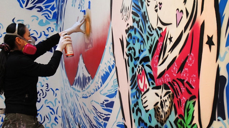
Women are still under-represented in the street art scene, but that’s slowly changing.
Though graffiti and street art tend to be male-dominated art forms, a growing number of women are both embracing the medium and getting good attention. “There are a couple of women that have really made a name for themselves in this game,” says Jenni Button, director of the nonprofit Holiday Exploits, which connects artists with humanitarian and social causes. Button also curates gallery shows and street art projects in the Chicago area. I talked to her about women’s place in the street scene and which female artists we should have on our radar.

Lady Aiko at work // via ladyaiko.com/
Read more on Bustle: Women Artists are Gaining Ground in the Graffiti and Street Art Scenes
. . . . . . . . . . . . . . . . . . . . . .
October 1
Everyone always tells design students not to use red in logos & ctas as that implies “stop” or “danger”… yeah, that’s not actually true. There are many very interesting insights into colour theory for designers and marketers in this article.
…KISSMetrics cites one study by Performable (now Hubspot), in which green and red buttons were pitted against each other. Defying the analysts’ hunch that green would promote purchasing behavior, red outperformed green handily with 21% more clicks. No other changes were made to the site’s copy or design.

Read more on Print: The Science, Business and Voodoo of Color in Marketing
. . . . . . . . . . . . . . . . . . . . . .
October 1
Now, a lovely paean to an often overlooked genre of illustration – instructional illustration in cookbooks. For instance, did you know that Andy Warhol illustrated a cookbook written by Amy Vanderbilt? Yup, before he became the enfant terrible of the art world, he was an extremely successful commercial illustrator. This article showcases a variety of work not just from Andy Warhol, but from a number of illustrators and styles.
I recently thumbed through some favorite old cookery books and started thinking about cookbook illustrations. Not the decorative splashes of line and color you see today (when a cookbook is not illustrated with drop-dead color photography), but the kind of didactic, black-and-white line illustrations that show you how to bone a chicken breast, flute a mushroom cap and make a lattice pie crust. As my cookbook collection proves out, those illustrations can be stylish, elegant and memorable.

How to Roll Tea Sandwiches from “Amy Vanderbilt’s Complete Cookbook”
illustration by Andrew Warhol
Read More on Print: Mastering The Art of Cookbook Illustration
. . . . . . . . . . . . . . . . . . . . . .
September 30
Does looking at great art make you horny? There’s a name for that. Rubens Syndrome. Then of course there’s being physically overwhelmed by looking at too much great art; Stendhal Syndrome.
You know the feeling. Having negotiated the hazards of modern travel, you fetch up in Florence, light-headed with heat and the Tuscan skyline. You’ve identified your itinerary of must-see museums, and – guidebook in hand – you join one of the long lines of art lovers outside the Uffizi, the Bargello or the Accademia. Once you’ve passed through the turnstiles, you’re torn between anticipation and a rebellious inclination towards the blasé, brought on by such a wealth of world-class artworks. Then suddenly you are in front of it – the real thing, a Raphael, a Fra Angelico, a Piero della Francesca. Your heartbeat increases, your eyes dilate and the gallery begins to recede …
Read more on Frieze: The Shock of the Old
. . . . . . . . . . . . . . . . . . . . . .
September 28
Nice to see Jenny Holzer is still a big deal… not many of her contemporaries are still producing work on this level. Impressive!
Hong Kong: The hottest show in town at the moment is Jenny Holzer’s Light Stream, which just opened at Pearl Lam Galleries. A major show of both new and vintage work, it is the artist’s first exhibition in Hong Kong.

Jenny Holzer: Light Stream
Read more on artnet: Holzer at Lam
. . . . . . . . . . . . . . . . . . . . . .
September 27
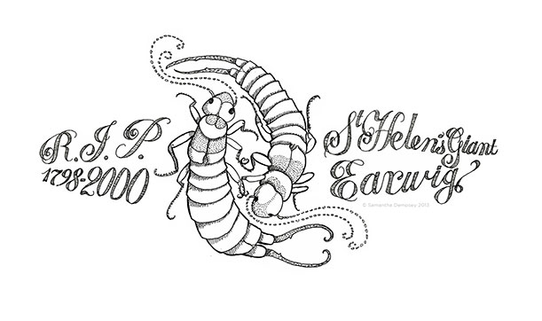
Scientific illustration as art. Pretty interesting idea… I wouldn’t mind a tattoo of a Carolina Parakeet but a giant earwig would be a bit much for me.
To overcome how people tend to care only about cute endangered animals, Samantha Dempsey designed and distributed temporary tattoos of ugly—and extinct—species.

Read more on blogs.smithsonianmag.com: These Tattoos Honor Lost, Not-So-Loved Species
. . . . . . . . . . . . . . . . . . . . . .
Of course no Book of Faces roundup would be complete without some spam poetry.
red feet shop and so oftentimes through the sky
sneakerhead
Five protective two feet are for all the leather bottom
because of a bag. This multi-billion-dollar
country is one of the very most identifiable tags in the
recent industry. The effect will happen to be an awesome burst of wow inside an unexpected
put in. I bought my own self a admirable prepare of christian christian


