
Yesterday on Twitter there was a meme flying around, #sixwords. Some people were being poetic with it, some humorous, some exclamatory… I decided to use #sixwords to describe new art forms.
For example:
dance interpretation of international tax codes
sketching by swallowing graphite and paper
displaying art exposed to high radiation
viewer blink rate decreases air pressure
hyperdimensional sculpture only described through equations
“abcdefg” instances in Hamlet on tuba
I’m pretty sure you can figure out what happened next. After saying to myself, “Hey, that’s actually a pretty cool idea, I’d like to hear that”, I found a full-text version of “Hamlet”, stripped out every letter and character excepting “abcdefg”, converted the character string to midi, converted it to mp3, and here we are, faced with a 3 hour long musical rendering of Hamlet. Now, I realize that sounds pretty long, but a full production of Hamlet can last 4.5 to 5 hours. In matters of patience, perspective is valuable.
Without further ado, I present the the greatest Tragedy penned by the Bard of Avon, digitzed into musical form…
Amazing, right? I’ll remember you all when I’m a big deal pop star at the MTV music awards next year.
If you don’t follow me on Twitter yet, you can find me @metameat.
Share this:

Here’s few recent pages from my sketchbook, trying out some different ideas.
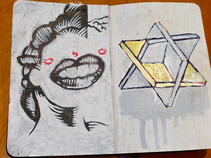
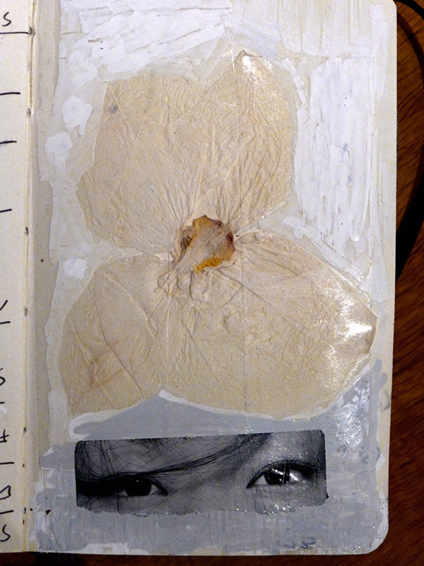
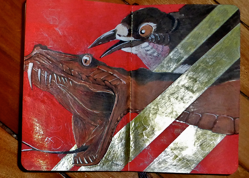
I’ve been thinking about graphic representations of shading and form a lot. I like the opacity and implied depth of metallic markers of course and am still playing around with found objects like the Asian eyes from a beer label vs. the orchid vs. the artificial “found surface” of the different kinds of white markers. There’s a lot of different white markers. Sadly the pics here don’t do justice to the varied textures. Anyhow, I’ve been getting into trying out lots of different materials lately and the wee sketchbook is being a total champ for not falling apart under the abuse…
If you’re similarly inclined, you can always get a Moleskine Sketchbook for yourself.
Share this:

Barbara Kruger is an American conceptual artist. Her work takes the visual language of mass commercial communication and flips it. Basically, she appropriates commercial photographic imagery and overlays it with philosophical slogans that run counter to the imagery. This inversion of meaning reveals how advertising reduces individual identity to that of a commodified object, forcing the viewer to recognize their objectification and react against it. These images are explicitly political, rallying against consumerism, particularly the objectification of consumers. More specifically, Kruger’s work rallies against the objectification of women.
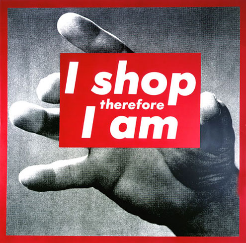
Barbara Kruger – Untitled (I shop therefore I am) – 1987
There are elements in Kruger’s work that not only critique consumerism, but also the objectifying gaze, and also patriarchal discourse. The idea behind the “objectifying gaze” is that the viewer is in a position of power that reduces the subject that is being viewed to the status of an object, as no back-and-forth exists in this relationship. For example, when a woman’s image is used in advertising, her identity is unimportant other than as a prop to the product. Patriarchal discourse refers to the wider social context. As we live in a male-dominated society, women are socially subordinated and are culturally suppressed in their means of communicating – like how there are so few women artists in the pre-1960s collections of art museums.
Patriarchy refers both to institutions and to discursive accounts of the world within which institutions are embedded. On the institutional level feminists have pointed to male dominance within family, state, religion, capitalism, education, and other social structures and have analyzed the practices by which male dominance is established and maintained. Further, feminist analyses of conventional relations between women and men show how male power insinuates itself into the psyches of women, teaching them to collaborate in defining themselves as subordinate to, and dependent on, men. Yet the experiences women have within patriarchy, especially those binding them to other women in recognition of their common plight, can be the source of feminist resistance.
“Patriarchy.” In Women’s Studies Encyclopedia, ed. Helen Tierney. Greenwood Press, 2002
Kruger addresses these issues to point out how within mass culture women are reduced to expressing themselves through their engagement with commercial culture, engendering a social context where social identity is only an emergent property of consumer behaviour.
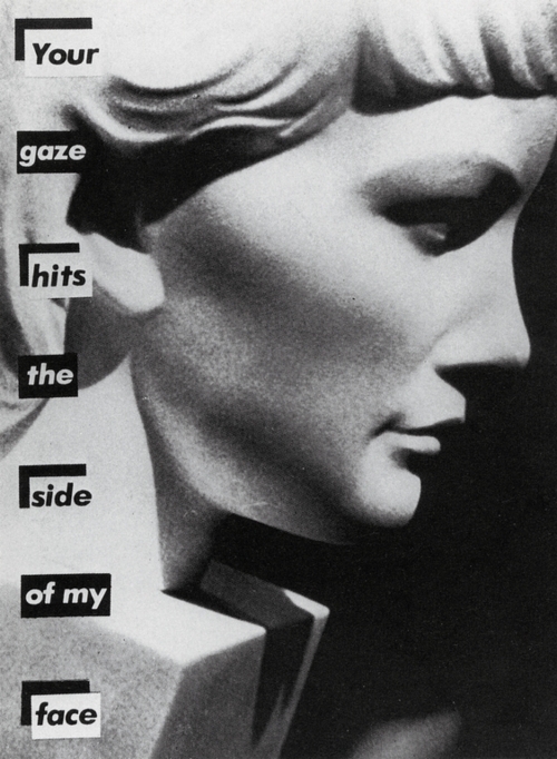
Barbara Kruger – Untitled (Your Gaze Hits the Side of My Face) – 1983
It gets even more complicated.
Kruger worked for 12 years as a designer and photo editor for Condé Nast, including magazines such as Mademoiselle, Home & Garden, and Aperture. Her use of the language of advertising is based on an insider’s perspective. The subversion of the juxtaposed slogans plays off of the viewer’s expectations where an advertising image supports the marketing call-to-action. This juxtaposition is not only a powerful subversion of a core marketing tactic, but effectively a snappy one-liner: the message is actually the opposite of what the image leads you to expect, get it?
This political humour would appear to be vital to understanding the deeper context of Kruger’s questioning of consumerism: her art is sold on mugs, t-shirts, postcards and posters in gift shops around the world. You, Barbara Kruger’s audience, like her work? Buy some stuff to show how you reject consumerism! Get it?
I have to admit, I decided to write about Barbara Kruger because I saw some rather frothy tweets raving about a pair of sunglasses. Limited edition, $200 sunglasses.
I was outraged and confused (metameat is me)

Yes, $200 limited edition anti-consumerism specs. Get ’em while they’re hot!

Limited edition sunglasses created in collaboration with artist Barbara Kruger and Freeway Eyewear. Kruger’s work is universally known for its bold, eye-catching design, and philosophical themes. Her iconic text Your gaze hits the side of my face appears across the arm of the L.A. RAYS style sunglasses by Freeway. This phrase first appeared in her 1981 artwork next to the profile of an anonymous classical bust. Presented on sunglasses, the wearer transforms into both a voyeur and an object; a play on themes of looking, power, and the gaze. The Kruger L.A. RAYS are available in three styles for pre-order now.
Give Good Art by For Your Art
Iconic? Did they mean ironic?
These sunglasses are a great encapsulation of the dichotomy that the larger Barbara Kruger product line represents. I’d honestly like to think that Barbara Kruger is aware of the contradiction of her commercial tie-ins and is doing it intentionally, but I honestly can’t find any evidence of that actually being the case. Take this snippet from an interview she gave in 1982:
Being socialized within similar constructs of myth and desire, it is not surprising that most people are comforted by popular depictions. Sometimes these images emerge as “semblances of beauty;” as confluences of desirous points. They seem to locate themselves in a kind of free zone, offering dispensations from the mundane particularities of everyday life; tickets to a sort of unrelenting terrain of gorgeousness and glamour expenditure. If you and I think that we are not susceptible to these images and stereotypes than we are sadly deluded. But to have some understanding of the machinations of power in culture and to still joyously entertain these emblems as kitschy divinities is even more ridiculous. And for women it’s an extreme form of masochism.
All Tomorrow’s Parties – Barbara Kruger and Richard Prince – BOMB 3/Spring 1982, ART (my bold)
I’d love to think that this is an elaborate Duchampian wit at play, but sadly, that does not seem to be the case. If, as Kruger asserts, self-aware women that buy into consumerism are masochists, what does that make Kruger for selling these sunglasses to her fans? A sadist?
Share this:

As those of you who follow this blog regularly know, I am a big fan of graffiti/ street art and one of my favourite Montreal artists is Omen. I’m teaming up with him to help with his social media presence, so I will be more on top of all the neato stuff he’s up to – like this post I wrote about Free 4 All Walls. Free 4 All Walls is a project to make Windsor look better.
Here’s an example – Australia’s Ben Frost and Canada’s Denial:

F4AW – Ben Frost & Denial
Long story short, Omen will be painting in Windsor ON from this Friday, the 9th to the 15th of August. If you’re down Windsor way there’s a metric heckload of great work and Omen will be in fantastic company. Also, be sure to keep following omen514.com to keep up with the latest news!
update:
Here’s Omen’s final piece! He’s totally outdone himself. Go check out the blog post, it was quite an adventure for him.


Post Roundup – the Book of Faces Edition
I know that a lot of the people that follow Grey not Grey on Facebook will come to this blog to read these fine quality posts. Not all of my blog regulars might be aware that I often post things to the Book of Faces that I don’t post here, though. And then of course there’s the regular posts of the best of my recent Comment Spam Poetry which ironically come from the comment filters on the blog but I only post on the Book of Faces. Okay, that’s not really irony but in this post-Alanis world who knows what’s right or wrong any more?
As a taster for those of you that haven’t yet visited the Grey not Grey Facebook page, here’s a selection of some of the posts from the last couple of weeks:
. . . . . . . . . . . . . . . . . . . . . .
September 10
What’s that? Peter Ferguson is in the Blab! Show this year? Awesome! The piece he’s included is “Governess Undone”, 17×16 inches of sweet oil on wood action.
Peter Ferguson – Governess Undone
Read more on supersonicelectronic.com
. . . . . . . . . . . . . . . . . . . . . .
September 6
“Too many people think graphic design is not a specialty, but something anyone can do, because the tools to make decent-looking Web pages, newsletters, books, and the like are readily available. But design isn’t putting stuff on a page. It’s about solving visual problems through an iterative process of decisionmaking, which may involve consultation, or may happen in private. If you can’t master that process, you can’t work in the field. No one will hire you because your work looks obviously bad to any trained eye, and is interpreted poorly by any untrained eye.”
Artnet is a great resource in general, but I just today found out that they post the top 300 searches on their site each month. It’s kind of interesting to see what artists are trending, but more importantly, it’s a great way to learn more about artists you may not be familiar with. I admit I din’t recognize at least half the names on the August list – I now have a whole pile of new-to-me artists whose work I like. http://www.artnet.com/artists/top-300-artists/
. . . . . . . . . . . . . . . . . . . . . .
August 28
the Beauty of Decay – Juan Atkins, one of the originators of techno, talks about taking inspiration from postindustrial landscapes. Click the image below to watch on vimeo.
via Hyperallergic
. . . . . . . . . . . . . . . . . . . . . .
So there you go, a taster of the splendours that await those that follow me on the Book of Faces.
Go there now, don’t be shy!
Since I know everyone has been wondering about this Comment Spam Poetry business, here’s a good one from August 30:
FAG Deep Groove Ball Bearings
It really is the basis for all devices along with the required product in the contemporary culture.
Usually the sequence is white, yellow, and then orange or blue.
However I do not love (or for that matter can afford) to spend too much money on
looking good.
Because with 17 women for every single 1 man, as being a woman, you had better be willing to create your A-game whatsoever times
Share this: