
I make no secret of my love for graffiti & street art, and Montreal is a fertile breeding ground for this expression of cultural vitality. Checking out the April 2013 edition of Cult MTL I see that Yves Laroche Gallery is having a show of work by one of Montreal’s best-known “public artists”, Stare.
…this month the NME crew co-founder mounts his first-ever full-fledged solo exhibition. Entitled “Star d’un Soir”, the show at Yves Laroche is timed to coincide with the launch of a small-run art book of the same name.
…Unlike many outdoor artists who take their work indoors, Stare doesn’t just reproduce his street art aesthetic in the studio and then hang it in a gallery. “Star d’un Soir” is a meta-commentary on street art’s relationship with documenting itself, staged by reproducing several of his own since-buffed murals as paintings of Polaroid photographs.
Emily Raine “Staring Stare.” Cult MTL (April 2013)
This reminds me a bit of the work of Kevin Cyr who photographed NYC delivery vans, created tiny scale models, then created prints based on the models – or that of Jessica Hess who does oil paintings of urban scenes full of graffiti. Stare really does kick it up a notch conceptually by reproducing his own outdoor work, though.
I’d love to show you some pictures from the exhibition but oddly Cult MTL doesn’t have an online version of the article, Stare doesn’t appear to have a website, and Yves Laroche gallery hasn’t put any tasters online – but they have put up a video teaser for the show:
Here are a few examples of Stare’s work from my Montreal street art/graffiti 2002-2012 collection:

- Lachine canal bike path

- Fattal Lofts

- Mile-End warehouse

- Van Horne Bike Path

- Van Horne Bike Path

- Van Horne Bike Path
Needless to say I’m pretty excited to go check out the show, and those of you similarly inclined should do so, too. Yves Laroche gallery is at 6355 Saint-Laurent (just a bit south of Beaubien), and the vernissage is this Wednesday from 5-9. The show runs until April 26.
Share this:

There are few artists whose work I admire more than that of Robert Rauschenberg. Not only for his work itself, but how it pushed boundaries of how art was considered.
In 1964, after Robert Rauschenberg won the Venice Biennale Grand Prize, the Vatican newspaper L’Osservatore Romano deplored the event as “the total and general defeat of culture.”
from a Review of “Combines” by Jorg von Uthmann 2006
For me, in many ways, Rauschenberg’s work exists outside context. What I mean by that is that he wasn’t really associated with any one specific movement, and as his work evolved a lot over his very long working career, it’s hard to peg him down to any one specific style or even medium. Many of his pieces mix genres and art media freely, and while there are obviously some commonalities with his contemporaries, for the most part his work is its own context more than anything else that was going on in the art world at the time.
Robert Rauschenberg (October 22, 1925 – May 12, 2008) was an American painter and graphic artist whose early works anticipated the pop art movement. Rauschenberg is well known for his “Combines” of the 1950s, in which non-traditional materials and objects were employed in innovative combinations. Rauschenberg was both a painter and a sculptor and the Combines are a combination of both, but he also worked with photography, printmaking, papermaking, and performance. He was awarded the National Medal of Arts in 1993.
The one piece of Rauschenberg’s I most admire is Monogram, a mixed-media sculpture/ collage/ painting made of manipulated found objects. It appeals to my own aesthetic sensibility for many reasons, and in many ways. When I was in high school, our art teacher told me that Rauschenberg used to walk around his block in 1950’s New York, and pick through the trash in the empty lots, alleys, and garbage cans. If he found anything he thought he could use, he’d take it back to his studio. If he didn’t, well, he wouldn’t make any art that day. This may or may not be apocryphal but it appeals to me – not just as a fellow artistic trash-picker (you can find some great stuff, you know), but in that there’s a kind of poetry in working with the detritus of modern civilization; making objects of cultural relevance from the leavings of that culture. Then there’s the notion of the city’s cast-off items giving hints to a meta-narrative of what it is to be in the city, to the extent that the things you find in the trash are a key to the secret language of the city itself, like in Paul Auster’s story City of Glass from his New York Trilogy.
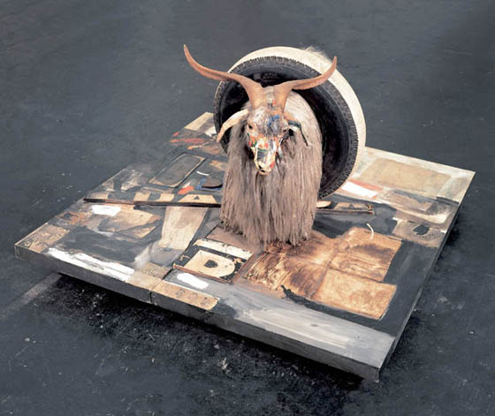
Robert Rauschenberg – Monogram (1955-59) mixed media
Now, I realize it reads like I’m over-analyzing, but hey, that’s what modern art’s all about. Like this bit from an awesome article about Rauschenberg on ArtNet:
That looking turned breathless in 1959 when Rauschenberg completed Monogram, one of the most outlandish and barbarous works of art ever made. Monogram features a stuffed Angora goat encircled by a tire. The goat, whose snout is covered in multicolored war paint, is standing on a painting, as if grazing at pasture. A sort of gargoyle or ravaging scavenger guarding over and also destroying art, this cloven-hoofed creature is a shamanic manifestation of Rauschenberg. In early Christian art goats symbolized the damned. This is exactly what Rauschenberg was as a gay/bisexual man and an artist, at the time. A dingy tennis ball behind the animal suggests it has defecated on painting. Allegorically, Rauschenberg is a bull in the china shop of art history, a satyr squeezing through the eye of an esthetic/erotic needle. As Johns’s Flag (1954-1955) is a Delphic rebel yell that says, “I create and am a part of this symbol of American openness even though as a gay man I am shunned by it,” so Monogram is Rauschenberg’s credo, a line drawn in the psychic sands of American sexual and cultural values. It is a love letter, a death threat, and a ransom note. It is Rauschenberg carving his monogram into art history.
– Our Picasso? from Artnet, by Jerry Saltz
I love the idea of the horny old goat as a tongue-in-cheek self portrait feeding off the art field while remaining disdainfully above it. So delightfully apocalyptic and a witty exploration of many of the concerns around figuration and modernism of the day – contrast this with the Abstract Expressionists’ obsession with the picture plane or Pop Artists’ with consumer culture. Anyhow, I like it, whether you think of it as a critique, a celebration, a sexual banner, a tongue-in cheek artistic in-joke, or some combination thereof. Monogram speaks to me not just as art, but as a window into Rauschenberg’s work and thought processes. If you would like to see more of Rauschenberg’s work, MoMA has a pretty decent online selection, or you can check out the online info related to the 2006 show focusing on Rauschenberg’s combines at Centre Pompidou in Paris. If you’re interested in a more detailed exploration, there’s always Robert Rauschenberg: Combines for a look specifically at the period of his career where he made “Monogram”, or a more thorough look at his, well, art and life can be found in Rauschenberg: Art and Life.
I leave you with this photo of Rauschenberg taken by Dennis Hopper at Claes Oldenburg’s wedding in 1966.
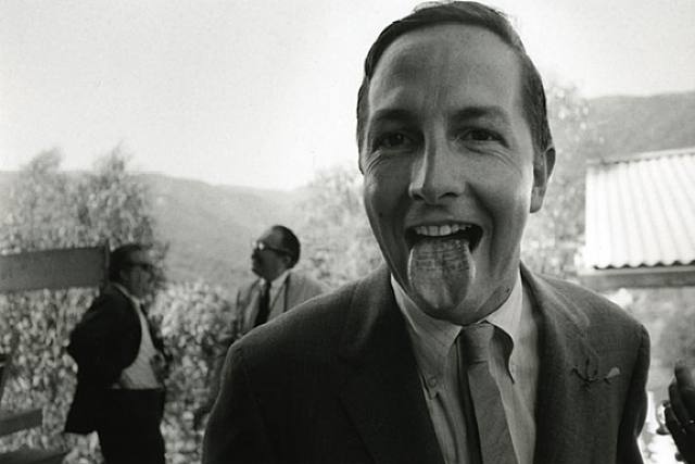
Dennis Hopper’s 1966 photo of Robert Rauschenberg with his tongue stamped “Wedding Souvenir, Claes Oldenburg”
Share this:

Well, it’s been some time since I’ve posted. I’ve been super busy with home & work but that’s no excuse, right? Here’s a look at my sketchbook for now.
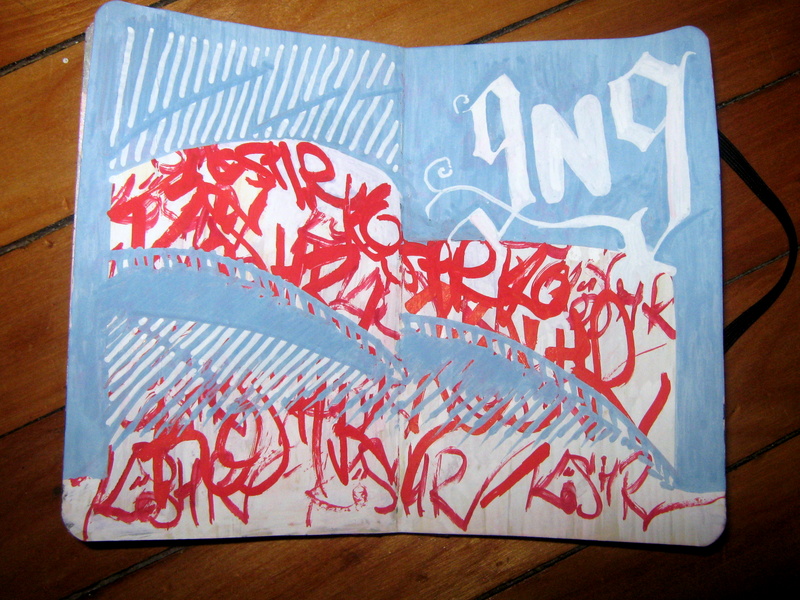
I read an interesting article (I forget the source, sorry – getting old I guess) about how handstyles are looked down on, as tags are mostly crap… At the same time they’re the entry point to graffiti for most people ) and they’re effectively the last remainder of calligraphy and actually doing lettering in any meaningful way. There’s some value to that. Sure, many are crap but it’s people starting out so that’s to be expected. Nobody likes to wake up to see their front door toy tagged but whatever. I don’t hate tags but I do look at pieces as more impressive, but maybe that’s because my background is fine arts instead of graf. I don’t look down on graf (at all) and actively love street art (I’m beginning to understand the reasons for the division between street art and graffiti even if I don’t think it’s that important) but the thought that tags are essentially calligraphy is a very charming one.
In any case this is me thinking about all that, playing with acrylic markers and my sketchbook. Make of it what you will. As always this is in my Moleskine… if you like to beat the heck out of your sketchbooks and are looking for a nice pocket-style book, you can always get a Moleskine for yourself.
//edit – I found the article! It was on imprint, about Christian Acker.
“We tap keyboards far more frequently than we touch pen to paper,” designer and author Christian Acker says in his introduction to Flip the Script: A Guidebook for Aspiring Vandals and Typographers (Ginko Press, 2013). “Graffiti may well be the last great execution of highly practiced penmanship in popular culture.”
Flip the Script seeks to contextualize the tagging styles of American graffiti writers from different periods and regions in visual history. This is the first book of its kind, and it is vast in its scope. Flip the Script documents over 500 signatures, or “tags,” the calling card of the street writer. Acker systematically analyzes historic hand styles by collecting a remarkable body of work from the most influential US cities, and searching for the common threads that connect cultures.
Share this:

A friend of mine, Aaron Morgan, has been putting together crowdsourced art books for some time now. His latest venture is Oh! Daddy – a collection of erotic art and writing, featuring the art and writing of 20+ people from all over the place. Aaron invited me to contribute, and the images below are the 2 pieces by me that will appear in the final edition. For the first one I was taking a photomontage kind of route, rocking my photoshop skillzorz, thinking about voyeurism as a theme.

Ian Rogers – Wunderkammer
For the second one, I turned to drawing (in illustrator this time), thinking about how erotic fixation can be a thematic thing that lends itself towards a collage-like approach.
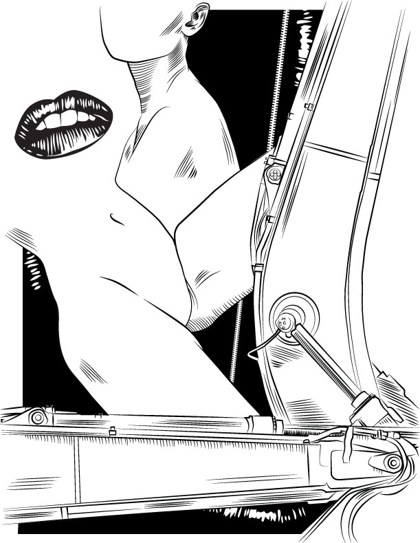
Ian Rogers – Eros & Thanatos
The thing I like about crowdsourcing conceptually is that it’s an obvious development on the independently published zine format, allowing creatives the ability to access forms of publishing historically only available to commercial publishing by getting the funding up front. Beyond that of course is that a wider public can be reached by independent art workers via the magic of the interwebs, so whether you’re in Seattle like Aaron or in Montreal like me, you can get together with like-minded people and create some really interesting work.
Support independent artists, reserve an advance copy of Oh! Daddy – a collection of erotic art and writing today …there are also lots of very cool perks for different donation tiers, so check it out.


Don’t Do Spec Work
I got this email today via this blog:
Hey Ian,
Hello,
We are [redacted], a design your own custom quality skateboard company. We are contacting you because we thought your readers might be interested in our Third Thursday monthly design contest that we are starting. We have run successful design contests in the past, but wanted to bring it back to a monthly thing with different themes. Every month will involve a new theme and each winner will receive a $100 cash prize as well as their design printed on a skateboard deck. Each winner will also receive a spot in the new limited edition Third Thursday shop creating a ongoing catalog of winners and representation for those artist. Details can be found here [redacted], but if you have any questions or would like any further information or [redacted] materials please feel free to email me back.
Best, – [redacted]
My reply:
Hi [redacted] –
On one level this sounds like a cool way for artists to get their work seen and maybe make a couple of bucks. On another level, you’re asking artists to work on spec, and that’s not cool. Everyone has to make a living, right? If you have a bunch of people submitting their art and you only pay the one that wins, everyone else worked for free. That works out pretty sweet for you, but not so much for everyone else. As a creative professional, I can’t support this contest – getting people to compete to get paid for their artwork is part of the reason it’s hard to make a living as an illustrator. Threadless basically does the same thing for t-shirts and lots of people go for that, so you’ll probably do well with this initiative anyhow, but I’m going to have to politely decline your suggestion that I do free advertising for your contest to maybe get paid.
– Ian
Share this: