
Checking out one of my favourite blogs, but does it float, I came across the work of a collage artist with whom I was entirely unfamiliar – the Czech artist, Jiří Kolář(1914-2002). This is really incredibly exciting for me, not only because it’s always exciting to find a new artist to enjoy, but because a lot of the approaches he employs in his collage are very similar to the obsessive deconstructivist collage experiments I engaged in when I was in art school. In all honesty I thought I invented these techniques (typical of the kind of naive cockiness an artist in their mid-20s has in spades) but no, it was Kolář who invented these approaches some 30 years before me.

Unknown letter from Goethe on his discovery of the planet of the birds
His first exhibitions in 1937 focused on his collages. In the 1960’s Kolář first combined painting and poetry but gradually turned completely to experiments in visual art. In his work he used a scalpel to cut pictures out of magazines. He produced colors in his collages by gluing on printed papers. His collages were intended to influence the viewer’s outlook on life; to raise the viewer’s level of consciousness. He invented or helped to develop new techniques of collage – confrontage, froissage, rollage etc.
– Wikipedia
For an explanation of confrontage, froissage, and rollage, check out this excellent article on collage terminology. So many options. Interestingly, Kolář is best known in his homeland not for visual art, but as a writer.

Birds (untitled no. 5)
His poetry had an immediate impact on the literary underground of the late 1940s and 50s, and saw numerous samizdat editions in the 1970s and 80s. But though his greatest impact on Czech culture came from his verse and documentary prose poems, he is known abroad for his collages, crumplages and button-up collages, which open up to reveal a second layer.
Kolar never learned to draw or paint, and always claimed that his training as a carpenter enabled him to cut the straight lines he needed for his collages, or “picture-poems”, as in his 1969 montage Birds For Hans Sachs. His first exhibition abroad was in London in 1963, and a retrospective was mounted at the Guggenheim in New York in 1975; he also held exhibitions in Canada, south America and Japan, quite apart from Prague. His collages manifest both ironic wit (for example, his one-eyed self portrait of 1980), but also his horror at cultural and political disintegration – the best-known examples being his scenes of a distorted Prague.
– excerpt from the Guardian UK obituary

Collage with an ermine
But yeah, Jiří Kolář. Wow. As Max Ernst famously stated, “Collage is the noble conquest of the irrational, the coupling of two realities, irreconcilable in appearance, upon a plane which apparently does not suit them.” Kolář’s work definitely fits this bill, and in some senses maybe even more than Ernst’s work, I think. While I truly adore Ernst’s approach to collage, Kolář’s approaches of superimposing images over one another using grids, using the forms of collage elements as windows into other elements, or simply placing elements discretely side-by-side forcing an implied narrative are all approaches that are near and dear to my heart.

Homage to movie stars
True to his writer’s mission, Kolář compiled a Dictionary of Methods, published in Paris in 1986, in which he articulates all the other techniques of his invention such as ventillage, crumplage, kinetic collage, and which underline further still his affinity to conceptual classification, lexicography, systematization, seriality: not only an implacably anti-Romantic attitude to the image, but one attuned to the linguistic as such. ‘The world attacks us directly’, he has said, ‘tears us apart through the experience of the most incredible events, and assembles and reassembles us again. Collage is the most appropriate medium to illustrate this reality’.
– excerpt from Collage: The Making of Modern Art, by Brandon Taylor

Toaleta
Working with computer graphics some of these conceptual approaches might seem more obvious than back in the ancient times of glue, magazine and sharp knives…I know I’m dating myself, but yes, I come from before the internet. I wonder if these works would resonate with a “native”. Any millenials that would care to pipe up, I’d love to hear your perspective.
Share this:

When I was in art school, my teachers often cautioned against making work too attractive. They would dismiss work that was visually appealing as “too easy”. I guess in retrospect what they meant was that it’s easy to enjoy decorative work but it’s also possible to have your work dismissed as merely decorative if it’s too attractive or whatever. I disagree with this worldview, and think it’s a real disservice not only to art, artists, and art lovers but the visual landscape as a whole. No, I don’t think people should buy art prints to match their sofa, but that really has nothing to do with the art itself. In this vein, when I was introduced to the work of Sherrie York through the Lines and Colors art blog, I was immediately captivated by the rich visual pleasure I experienced but more than that, the craftsmanship and oh, I don’t know… honesty? There’s something deeply refreshing about somebody who simply makes art based on their experience of nature. We don’t all have to be exploring the implicit tension between modes of art history or whatever.
Longing – Hand-Printed edition of 10 – 12″ x 16″
York is a Colorado-based artist whose primary method of artmaking is printmaking with reduction linocuts. Basically, she does successive prints with the same carved block, carving away a bit more of the surface with each successive layer of the print. The resulting images are a bit reminiscent of late 19th century graphic design but have an entirely modern sense of colour and form that are simply exquisite. She explains the process in some detail here. As craft this approach is really quite impressive, and York’s technical execution is impeccable.

Decay, Comma – Hand-printed edition of 15- 12″ x 9″
More of York’s work, much of which is for sale (hint, hint) can be seen on her portfolio website, her Facebook page, or her blog, Brush and Baren.
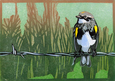
Wired (Myrtle warbler) – Hand-printed edition of 10 (variable) – 5″ x 7″
Share this:

So, when the end of the year comes around I like to take time to recollect things – I was perusing some of my older sketchbooks and this is one of my favourite double spreads from the last couple of years. This was a mixed media collage in my Moleskine sketchbook at the time. I like to use Moleskines because they hold up to a pretty fair amount of abuse, and I often like to revisit my sketches for this layered kind of effect. If you’re similarly inclined, you can always get a Moleskine Sketchbook for yourself.

Share this:

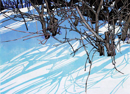
It looks like we’re getting a good start to winter here in Montreal, with a record snowfall yesterday of 45 centimetres – when you factor in the snowdrifts, that’s a pretty impressive one-off, the snow was up to mid-thigh in the alley behind where I live. Now, it’s no winter of 1892 but hey, we make do.
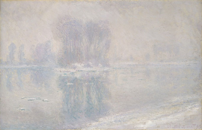
Ice Floes – Claude Monet
The prolonged freeze and heavy snowfalls in the winter of 1892–93 inspired Monet to capture their effects on the Seine in a series of paintings for which he chose a vantage point not far from his home in Giverny. The river had frozen in mid-January but began to thaw on the 23rd; the following day, in a letter to his dealer, Durand-Ruel, Monet lamented that “the thaw came too soon for me . . . the results—just four or five canvases and they are far from complete.” By the end of February, however, he had finished more than a dozen paintings, including this view of the melting ice floes.
– the Metropolitan Museum of Art
Actually, Montreal did break the record yesterday for the most snow in a single storm (or for the entire month of December for that matter) as far back as anyone’s been keeping track, so I guess it was more snowy than 1892. No sign of Claude Monet, though.


Sweet Montreal Graf Part 2
This is not my first post about Montreal’s street art/ graffiti. Back in June, I waxed poetic at some length. Montreal is, as I said back then, a pretty happening place for street art/ graffiti, with a lively and inventive scene.
waxhead – Plateau alleyway behind the Main
Graffiti is a term rife with drama these days as people fight about legal versus illegal, street art versus graffiti, writers versus muralists versus taggers versus stencilists, and nobody ever really wants to acknowledge whether gluing things in public places, wheatpasting, stickering, drawing with chalk, scratchiti, or all kinds of other explorations really counts as graffiti or not.
Omen – Rue Coloniale on boarded-up windows, Plateau Mont-Royal
Then there’s the whole division between political graffiti and more traditional b-boy culture graffiti versus art graffiti. Personally, I don’t care. As long as it’s visual art (and I really do think that all these forms count as visual art) and it’s in the public eye, I applaud it. I am sick of the discourse of public visual space being dominated by advertising media, with the police and other authorities trying to suppress the discourse implicit in graffiti.
Labrona, Gawd, Peru and friends – Mile-End garment district
Sure it’s vandalism, but there’s tons of illegal billboards in every neighbourhood that somehow slip under the radar – how does a freaking BILLBOARD squeak through but a guy with a marker is suddenly considered the more serious problem, worthy of police crackdowns, special announcements from the mayor, and public advertising campaigns (oh the irony).
Artung – Plateau Mont-Royal advertising kiosk reclamation (these kiosks were declared illegal by the borough but the ad companies continue to use them while they counter-sue)
And yet, Montreal is one of the most graffiti-friendly cities I’ve seen. It’s one of the many things I love about this place. Back in June I said:
Well, now it’s nearly a thousand images: Montreal street art/graffiti 2002-2012. Enjoy!
What Is Adam – wheatpaste – Mile-End alley behind the Main
Share this: