

New Artwork – Ian Rogers – My Sketchbook
Well, it’s been some time since I’ve posted. I’ve been super busy with home & work but that’s no excuse, right? Here’s a look at my sketchbook for now. I read an interesting article (I forget the source, sorry –…
Share this:

New Artwork – Ian Rogers – My Sketchbook
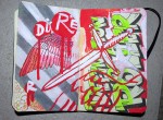
WOOHOO new art supplies – I picked up my first acrylic markers (where you babies been all my life) and man, this is a game-changer. This page all started from an Albrecht Dürer illustration of the wing of a blue…
Share this:


Colour Theory Monday – Colour Temperature
Last week I explained how simultaneous complementary contrast can be used to make a low-saturation composition appear more dynamic. Carrying that idea one step further, I’m going to explain contrast of temperature and show how warm and cool greys can…

