
When I first moved back to Montreal in 2002, I was living in Little Burgundy by the Turcotte Expressway, and started seeing these really unusual drawings on the walls in the area, all painterly faces and stuff… I was used to seeing marker and spray paint, but some guy was actually drawing using oilstick – and not the standard hip-hop imagery and wild style lettering, but actually drawing stuff, with an uncharacteristically rough-hewn tag, “PRODUKT” or in this case, a tag that was actually a legit signature.

PRODUKT 2005
I kept my eyes open and kept seeing work by this Produkt character in side streets, alleys, and industrial spaces all over town, from the Plateau to Saint-Henri, often working within KOPS crew.

Produkt, saint-dominique garage door – now vanished
One day I saw an online article talking about some guy doing live painting on Saint-Laurent (2008, maybe?) and I recognized the artist as Produkt – I wrote to the author of article who had the sense to have an email address attached to his article and thusly ended up meeting Alex for the first time.
He has been one of my absolute favourite Montreal street artists since I first saw his work, and I have made a point of keeping my eyes open for new oilstick drawing, wheat pastes, or anything else of his I could find. Imagine my excitement when he mentioned on the Book of Faces that he was launching a show! No, really, I was super excited. The show, “End Orphans” opened last Friday in the old Bedo space on Saint-Laurent right next to Bifteck.

Here’s the artist’s statement for the show, conveniently arranged on the wall right by the door:
“For over a decade he has wandered the streets and train tracks of Montreal covering walls and other surfaces with portraits and drawings that blend finely-detailed realism with cartoon fantasy. Whether they realize it or not, many Montrealers have seen his work and some might recognize his recurring characters, such as an austere eagle or a man on all fours dressed as a dog”
Well, it’s been well over decade since I’ve seen his work on the walls of the city, but whatever. He did get busted at one point under the stupid graffiti laws so maybe he’s trying to keep his history on the down low, but all the old stuff is mostly gone so whatever.
Now, I’ll be honest with you – most of the time artist’s statements are a load of horseshit, but this one really does sum up Alex’s work pretty well. His work consists of a cycle of re-occurring thematic elements. Sometimes he adds some in, sometimes he drops some out. It doesn’t talk about his motivations or the meaning of his work, but it makes sense within his body of work. I think that because I first got used to seeing his work on the streets instead of a gallery, I didn’t expect any explanation, I was just pleasantly surprised to see reoccurring elements and accepted it at that. The pieces do have titles at the show, but you’ll have to go there to find that out for yourself. Context, right?
Here are a few samples from the show:

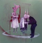
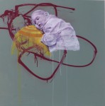
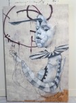
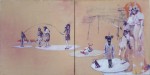
The thing I like best about Alex’s work is that he switches between media and focus very fluently. His work is always figurative, representational drawing & painting, but sometimes it is very much in the tradition of representational realism, and sometimes it is very cartoony. Sometimes he draws scratchy, blunt ciphers, and sometimes he renders line and shadow carefully. Sometimes he paints like he is drawing, and sometimes he draws like he is painting. Sometimes he will slash across a canvas with a loose calligraphic mark, sometimes he will spray a random fog of paint across the surface, and sometimes he will draw a tiny green heart in pen on top of a carefully rendered oilstick form. It’s really quite exquisite, but never precious. If Alex wants his work to look like pen, he uses a pen. If he wants it to look like he’s painting with a brush, that’s what he does. He doesn’t play trompe l’oeil tricks or give in to pure abstraction, but he is still a real painter’s painter and then some.
Alex Produkt is not just an artist that artists will enjoy, by any means. The recurrent themes throughout his work remind me of the way that Mozart or Beethoven would construct a symphony. You see a thematic element, you see it evolve, you see new elements added in, you see them interact, and you see them resolve. It’s not just elements, though, you also see him interpret those elements in different media, like how in a symphony a theme will carry through the woodwinds, the brass, and the strings, showing a different side to the idea each time. In many way I look at Alex’s work as very musical, but through art media.
Anyhow, the show is fantastic and you really ought to go see it of you are in Montreal. I’ll be dead honest, I’m not sure when it’s on until, so you really need to get up off your couch and go check out the first major art show by one of the few Montreal street artists that has figured out how to combine the fine art tradition with street art/graffiti and be totally legit in both contexts.
The show is at 3706 Boulevard Saint-Laurent, just south of Pine on the west side, right next to Biftek.
If you want to keep up to date with is latest endeavours, Alex Produkt has a Facebook page.
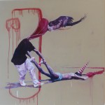
Alex was also involved with this year’s Mural Arts festival in Montreal. Here he is, hard at work making awesome things.

Alex Produkt – Montreal Mural Festival
Share this:

I’ve been brushing up on my German, and I like owls. That’s basically all the meaning there is behind this piece. As far as how the brushing up is going, It’s mostly just spending a lot of time reading. Even so, I actually got to give German tourists here in Montreal directions today, in German. I feel pretty stoked about that. The German in this sketch is the first bit of a well-known quote from Nietszche: “Wer mit Ungeheuern kämpft, mag zusehn, daß er nicht dabei zum Ungeheuer wird.” Or, in English, if you fight with monsters, take care that you do not become a monster. Food for thought, right? Anyhow, good inspiration for some sketching. I’ll be working on the next bit of the quote when I get a chance, but this one’s the taster.

Share this:

I’ve redesigned the Grey not Grey website, complete with a whole new approach to the brand, code, and overall experience. Let me know what you think!
Grey not Grey Creative Services

Share this:

I went on a 4-day road trip to Philadelphia last week, and amongst other things, saw a lot of really good art.
Of course I went to the Philadelphia Museum of Art, my main motivation being that they have an excellent collection of work by Marcel Duchamp, knowing pretty much zilch about the collection other than that. They did have lots of Duchamp, and much more.
One interesting thing about the Philadelphia Museum of Art is that there are copyists in the galleries. I would guess offhand that it must be in affiliation with one of the many local art schools. Here’s one at work copying Sir Lawrence Alma-Tadema’s painting, A Reading from Homer. That’s a pretty old-school (literally) approach to learning to paint, and I’m pleased to see that the kids are still down with that.

Copyist Easel at Philadelphia Art Museum with Sir Lawrence Alma-Tadema – “A Reading from Homer”
One of the things I like best about going to art museums is that you not only get to see work that you have only seen in reproduction, but you also get to really get up close. Take Chuck Close (no pun intended), for example. I really enjoy his work and have seen a bunch of his early photorealist work in real life, and it is impressive in magnitude and execution. His more recent work is a more complex tiling-based approach where each tile contains swirls and loops of a range of colours that, at a distance, cohere into a clear portrait. Take this portrait of Paul Cadmus from the Philadelphia Museum of art as an example:

Chuck Close – “Paul” 1994 102 x 84″, oil on canvas
Pretty cool, right? The thing you never notice in reproduction though is that those tiles are actually really painterly and loose. The brushstrokes are very unrestrained and while the repetition of the tiles themselves is very orderly, the grid lends a rhythmic quality to the freedom of the marks, like the visual equivalent of listening to music. It’s also all the more remarkable to see how much variation in colour really is going on there.

Chuck Close – “Paul” detail
Another fun artist to do this with is James Rosenquist.

James Rosenquist – “Zone”, 1960-61 Oil on canvas 95 x 95½”
One of the interesting things about Rosenquist is that he started out as a billboard sign painter, back in the time when billboards were painted, and you can really see how the apparently finely detailed figurative realism in his work is actually quite loose when you get up close to it.

James Rosenquist – “Zone” detail
When you see details sometimes the work just makes more sense. For instance, Alice Neel – I’ve seen this painting in reproduction a gazillion times and it just does nothing for me. In real life, I saw how it’s this great combination of painterly and graphic approaches, though, and fell in love. I mean really, just look at that knee. Now that’s painting!

Alice Neel – “Julie Hall”, 1964
Then there are some paintings that go beyond mere craft and transcend form entirely. Take, for example, this painting by Henri de Toulouse-Lautrec. Think of the lives he must have crossed paths with in late 19th century Paris, the countless faces shambling through the pains and triumphs of their lives, working, loving, living – all lost to the ages, because Toulouse-Lautrec decided to paint this stupid little dog instead. I love this painting. It’s so kitsch it’s a transgressive act of genius.

Henri de Toulouse-Lautrec – “Follette”, 1890
The Philadelphia Museum of Art actually does have a remarkably good collection on display taking into consideration that it’s not a huge space. Well, it is actually a very big building, but there’s not a lot of gallery space given the physical footprint of the building. It’s really quite massive, but very airy, a bit more reminiscent of a train station than an art museum. With the limited amount of wall space, the work on display is all wheat, no chaff. They have a few very good Monet paintings, for example, that I had no idea were in Philadelphia – including my very favourite Monet of all time.

Claude Monet – “Glaçons, Effet Blanc” – 1894, oil on canvas, 25 ¾ x 39 3/8″
People go on about Monet’s haystacks, his Poplar Series, and his paintings of his garden, but for me, this painting of a winter scene is a masterwork that shows off everything Monet knows about form and colour. Maybe it’s because I’m Canadian, but the subtlety required of a snow scene is to me the finest proof of painterly skill. I mean, really – viridian green? Cobalt blue? This is off the hook.

Claude Monet – “Glaçons, Effet Blanc” – detail
I know, right? Of course you want to see another detail, I completely understand. That’s alizarin crimson in there!

Claude Monet – “Glaçons, Effet Blanc” – detail
The special exhibit is currently a really good collection of Korean art, Treasures From Korea – no photography was allowed inside the exhibit so you’ll have to be satisfied with this shot I took of the display poster. It’s a detail of the larger piece that I found really compelling as it shows off a lot of the decorative motifs common to Korean (and Japanese and Chinese) textiles with a more naturalistic approach. I had no idea the scalloped patterns represent rocks, for instance. In this shot I juxtaposed it against the rigid architecture because that’s how I roll.

Philadelphia Museum of Art – Korean Art detail
There was lots to see, but of course there was the Duchamp. I have written about Duchamp at length so I won’t bore you with repetition, but suffice to say that the Big Glass is far more impressive in real life than in reproduction, which should come as no surprise. One of the things I like best about the room Duchamp’s work is displayed in is that it is very light, and the play of light really brings out the Big Glass in a way I did not expect.

Marcel Duchamp – “the Bride Stripped Bare by Her Bachelors, Even” (the Big Glass) – Philadelphia Museum of Art – detail
After a few hours in the Philadelphia Museum of Art, I made my way over to the Rodin Museum, a couple of blocks away. It is not a vey big collection, but it is the best outside of Paris. Housed in a custom-built edifice that bears an eerie resemblance to the mausoleum in Arnold Böcklin’s painting, the Isle of the Dead. It’s pretty nifty in that you get to see a wide variety of Rodin’s work, from sketchy studies in plaster to fully realized bronzes, as well as a variety of his works in marble. Of course they have “the Kiss” in marble, “the Burghers of Calais” in bronze, etc. It’s pretty remarkable that Rodin’s artistic vision could be fluently expressed through both additive and subtractive approaches. Modelling and carving require very different artistic strengths, and Rodin was a master at both. Right at the front door is the impressive Gates of Hell, a mass of writhing forms depicting Dante’s “Inferno”. Here’s a detail.

Rodin – “Gates of Hell” – detail
Inside, there are a few galleries radiating off of a central gallery that shows a variety of finished pieces including lots of studies of hands. Boy, could Rodin ever do hands.

Rodin – “Left Hand”
One of the pieces I liked best was a small, rough piece called “the Sorceress”. Mike Mignola is an artist best known for the Hellboy comics, and I’m a fan of his work. This particular Rodin sculpture reminds me a lot of Mignola’s Baba Yaga. I wonder if Mignola is a Rodin fan. If not, he should be.

Rodin – “the Sorceress”
In any case, the shots that I have posted here represent only a very small portion of what you can expect to see at the Philadelphia Museum of Art and the Rodin Museum. There’s lots more art to see in Philadelphia, besides these two museums, too. The Barnes Foundation, for example, is supposedly awesome but unfortunately it requires advance reservations to get in, which I did not know (and isn’t explicitly mentioned on their website) so be forewarned. That aside, there really is a lot to see and do. If you should happen to be anywhere near Philadelphia or are considering a road trip that includes a healthy dose of art, I strongly recommend the City of Brotherly Love.


The Redemption of Salvador Dali
One of my personal favourite artists is Salvador Domingo Felipe Jacinto Dalí i Domènech, 1st Marqués de Dalí de Pubol (May 11, 1904 – January 23, 1989), more commonly known as Salvador Dalí. Or even more often, as Salvador Dali – without the diacritic mark on the “i”.
Salvador Dalí 1939, photo by Carl van Vechten
Dali has been largely misunderstood by the critical community until fairly recently, even though he enjoyed mass popularity all along, which is kind of telling. It’s worth noting that he was critically popular before, and then critically unpopular, and then critically popular again and soforth, it kind of comes and goes in waves.
The Persistence of Memory, 1931
As the author J.G. Ballard, an avid collector of surrealist paintings once noted, “The critical establishment absolutely disdained Surrealists, and World War II seemed to confirm their hostility.” [Art Newspaper, 1999] J.G. Ballard Quotes p. 287
I’ve seen that disdain. When I was in art school, my instructors cautioned me against enjoying Dali’s work, and that of most of the surrealists in general. Sure, his work is technically good, they would say, but it’s too easy. We heard that in art school a lot about the work of various artists; too “easy” basically meant not challenging enough, something that could be enjoyed without thinking about it too much, basically implying that anything you could just “enjoy” was decorative work with no real “artistic” value. Now, I personally think that’s a load of crap, but it goes a long way to explaining why fine art has so vigorously turned its back on figurative realist painting – but I digress.
Back to Dali, even those critics who can “forgive” that his work is easy to enjoy like to dig into Dali’s public persona with the intent of explaining away the effect of his art by dissecting his bizarre proclamations and even more bizarre lifestyle, attributing his work to oddities of neurosis and fascist dreamings. I believe that Dali at his prime was never serious, but always sincere.
What counts as his prime is a matter of some debate, though – there are many that insist that Dali never created work of any significance after he was kicked out of the surrealists, and that he wasted much of his genius in self-promotional antics, devolving into self-parody.
I believe quite the opposite of all the negative sentiments; Dali was a true genius, I believe that he was the first real pop artist, bridging early modernism and postmodernism, and I also believe that his antics were a form of self promotion that are not entirely unlike what we now expect from every artist in the age of celebrity from fine artists like Jeff Koons to street artists like Banksy. Basically, Dali was an icebreaker churning up the seas of modernism in a way that can only really make sense to viewers and art lovers in the post-modern phase of painting.
The Temption of St. Anthony, 1946
Now, it is worth knowing that according to Modernist art critics, Salvador Dali ‘s prime ended in 1939. That was when he was kicked out of the Surrealists headed by André Breton, and left Paris for New York. Bréton was a very active socialist and envisioned surrealism as a kind of revolutionary art form something along the model of Leon Trotsky’s notion of art as a revolutionary practice. That Dali refused to disavow the rise of fascism in Spain under Franco was too much for Bréton, who already disliked Dali’s desire to actually make money from his art to the extent that Bréton renamed “Salvador Dali” as “Avida Dollars”. It was a pretty serious diss, but Dali never made a secret of wanting to get rich making art. He also enjoyed the attention of being shocking, which goes a long way to explaining his open support for fascism – especially considering that in his youth he was a communist, at a time when being a communist could get you thrown in jail, which it briefly did, for two months, though the prison records have disappeared.
So that’s the respected art critic Robert Hughes – contrast that with this statement from Dali some 30 years after his “prime”:
I think it’s pretty clear that Dali was well aware of both his clownish reputation and its relationship to his intent as an artist. That said, in recent years Dali’s entire career has been enjoying a redemption in critical circles.
Personally, I prefer Dali’s later work, especially his atomic period. While the virtuosity in his early work like “the Persistence of Memory” (1931) is undeniable, there is a depth and complexity to work like “Portrait of my Dead Brother” (1963) that Dali’s early work only foreshadows.
Portrait of my Dead Brother, 1963
As Dali himself said in 1960,”Compared to Velazquez I am nothing, but compared to contemporary painters, I am the biggest genius of modern times … but modesty is not my specialty.”
Dali’s Mustache – photo by Philip Halsman, 1954
Fun art fact: if you watch the TV show “Archer” you know the pet ocelot, Babou. Salvador Dali actually did have a pet ocelot. Its name was Babou.
Salvador Dali with his pet ocelot, “Babou”
If you would like to learn more about Dali’s work throughout his lifetime, the book “Dali by Dali” is an excellent starting point. Dali himself talks about his life, his work, and his intent, giving a lot of insight than a more academic history. Of course the possibility that he’s making most of it up is a strong undercurrent, but that’s all part of Dali’s showmanship. Of course, if you prefer a more academic history, Dawn Ades played a big part is restoring Dali’s reputation, and her book “Dali and Surrealism” is pretty much definitive.
Share this: